
Components

Button
A clear call to action, with bound labels, variants and keyboard focus.
Link
Connect content with an accessible, theme-aware inline link.
Label
Give a form control a clear label and required marker.
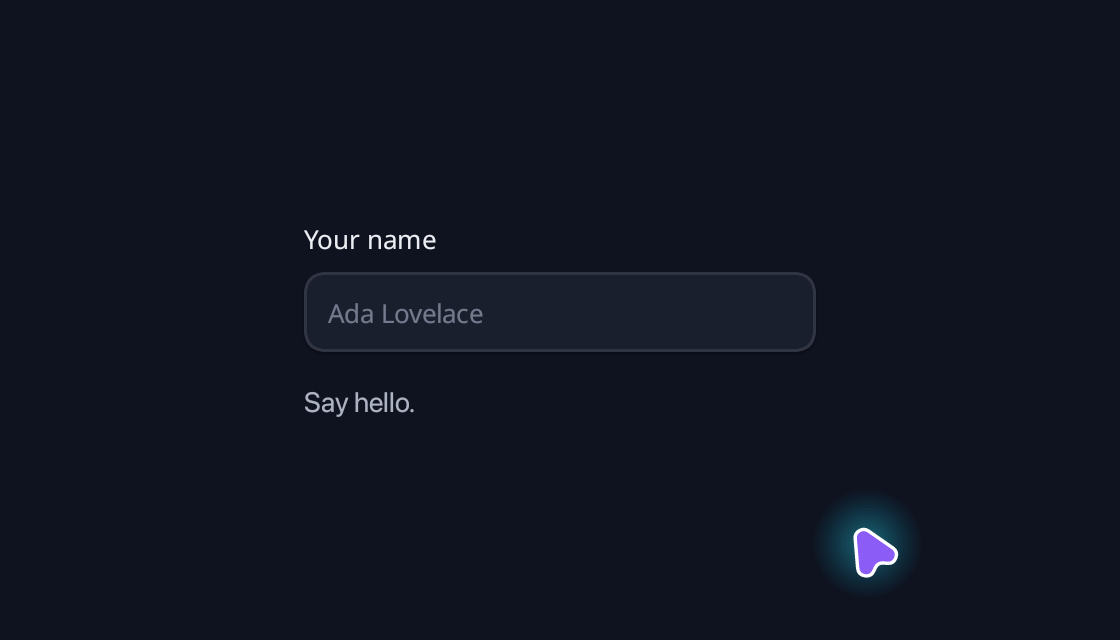
Input
A text field with a label, placeholder, validation and reactive feedback.
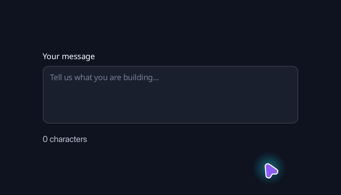
Textarea
Write a message with a themed multiline field.
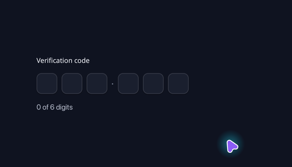
OTP Input
Enter a verification code with automatic advance and paste support.
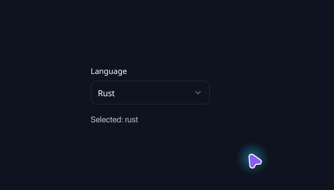
Select
Choose one option from a keyboard-accessible popover.
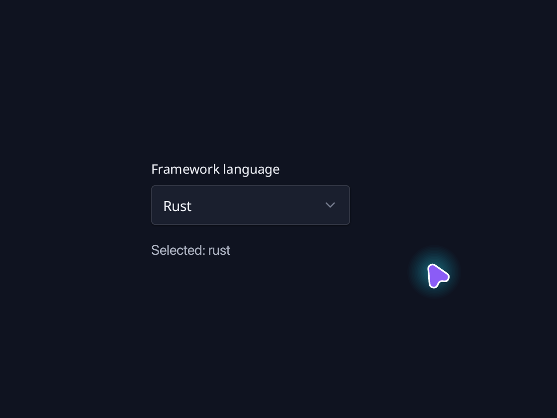
Combobox
Search a list and select an option.
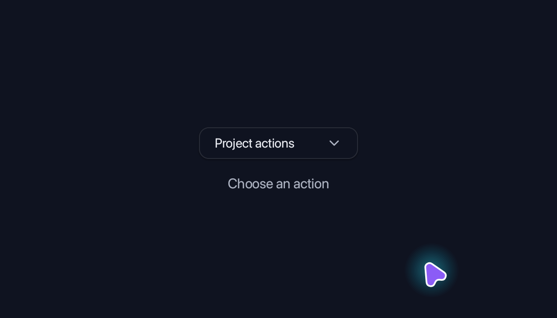
Dropdown Menu
Group actions in a compact menu.
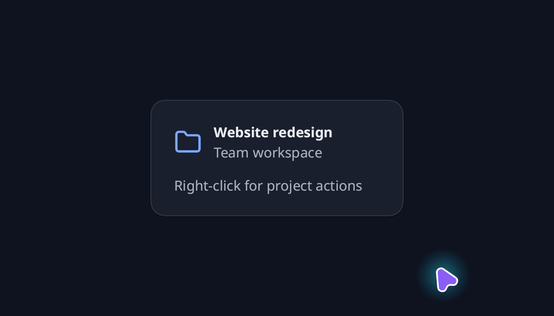
Context Menu
Show actions at the pointer or keyboard-focused target.
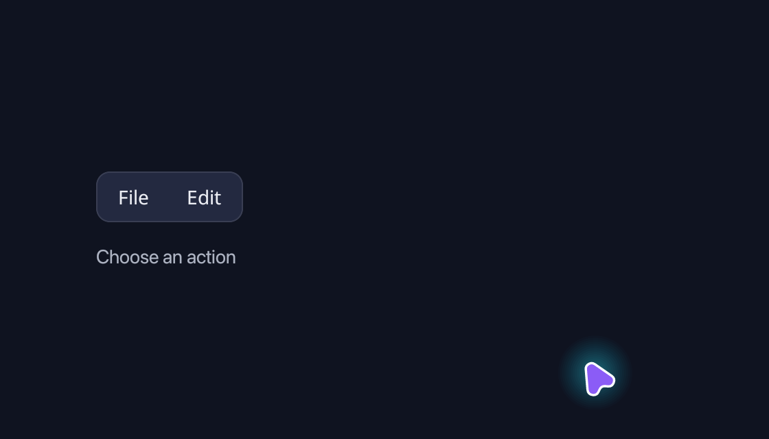
Menubar
Organise application commands in adjacent menus.

Navigation Menu
Mix direct navigation and grouped resource links.
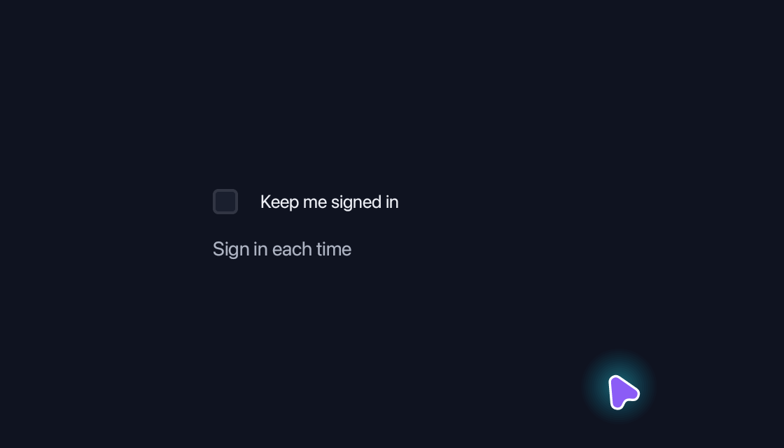
Checkbox
Make a choice that can be checked, cleared and bound to application data.
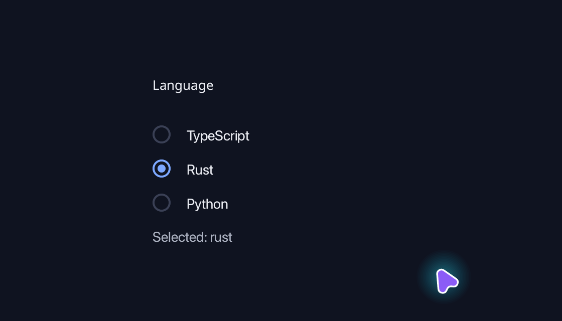
Radio Group
Choose one option from a labelled group.
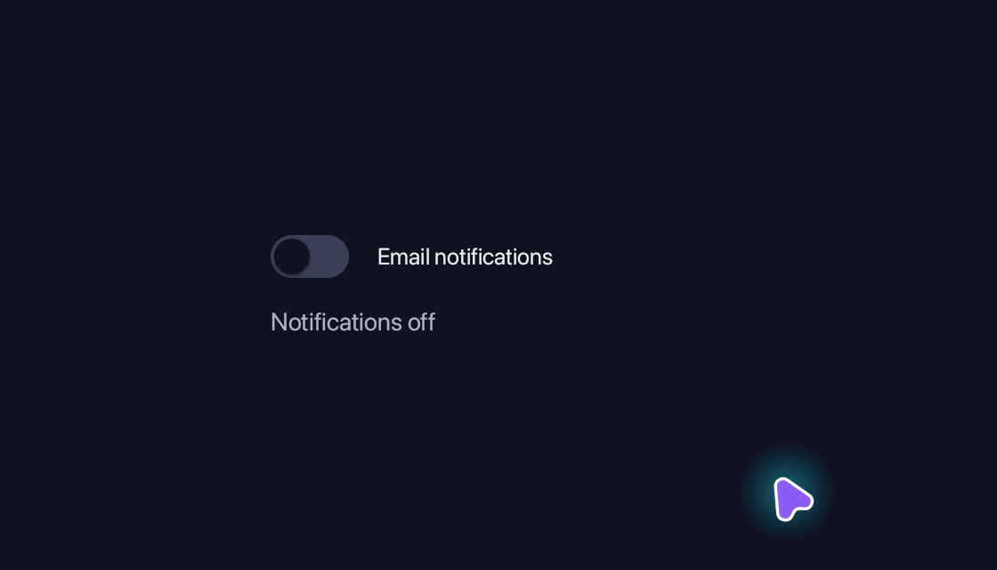
Switch
Turn a setting on or off with clear, theme-aware feedback.
Toggle
Keep an independent action selected or unselected.
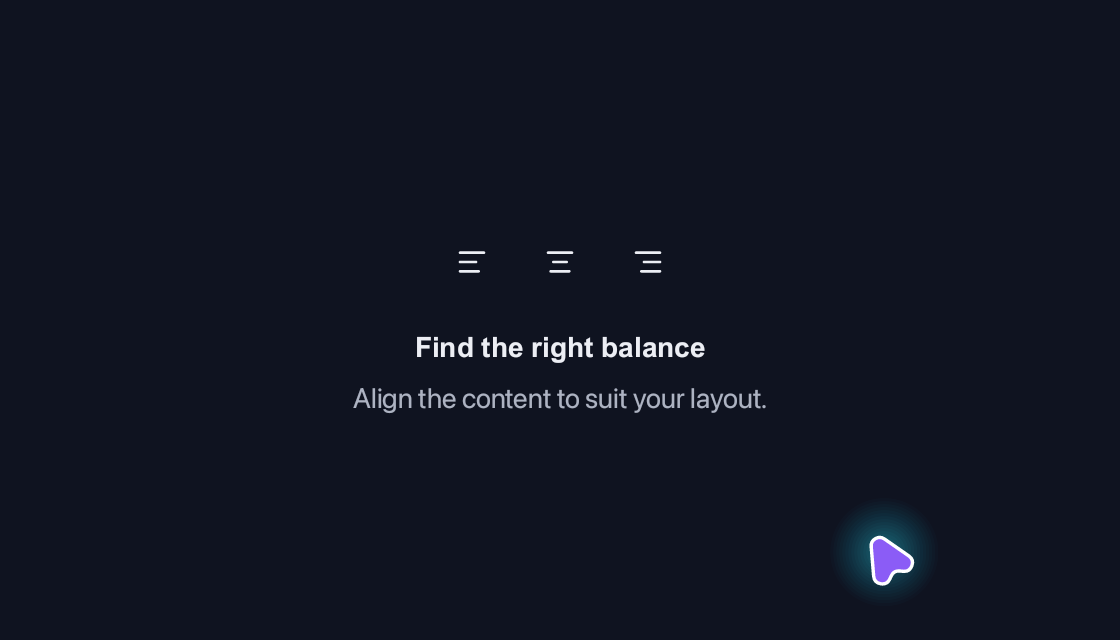
Toggle Group
Switch text alignment with accessible icon buttons and see the content respond.
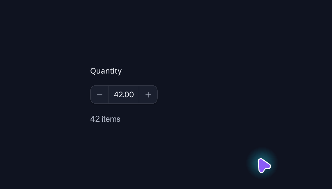
Number Input
Edit a bounded number with typing, step controls or the mouse wheel.
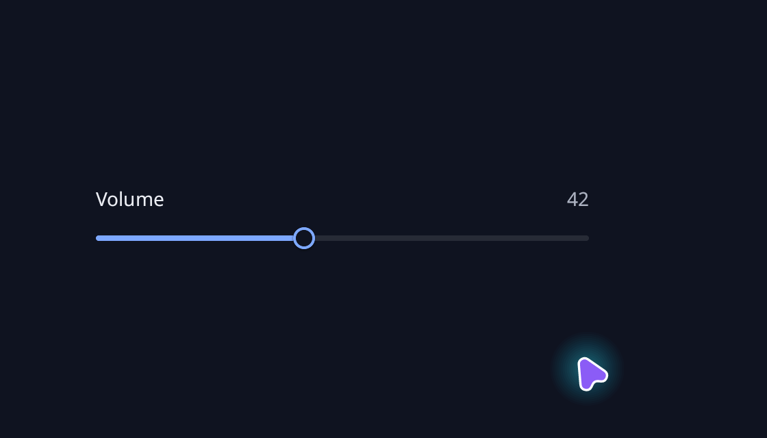
Slider
Adjust a value along a track, with a bound label and readout.
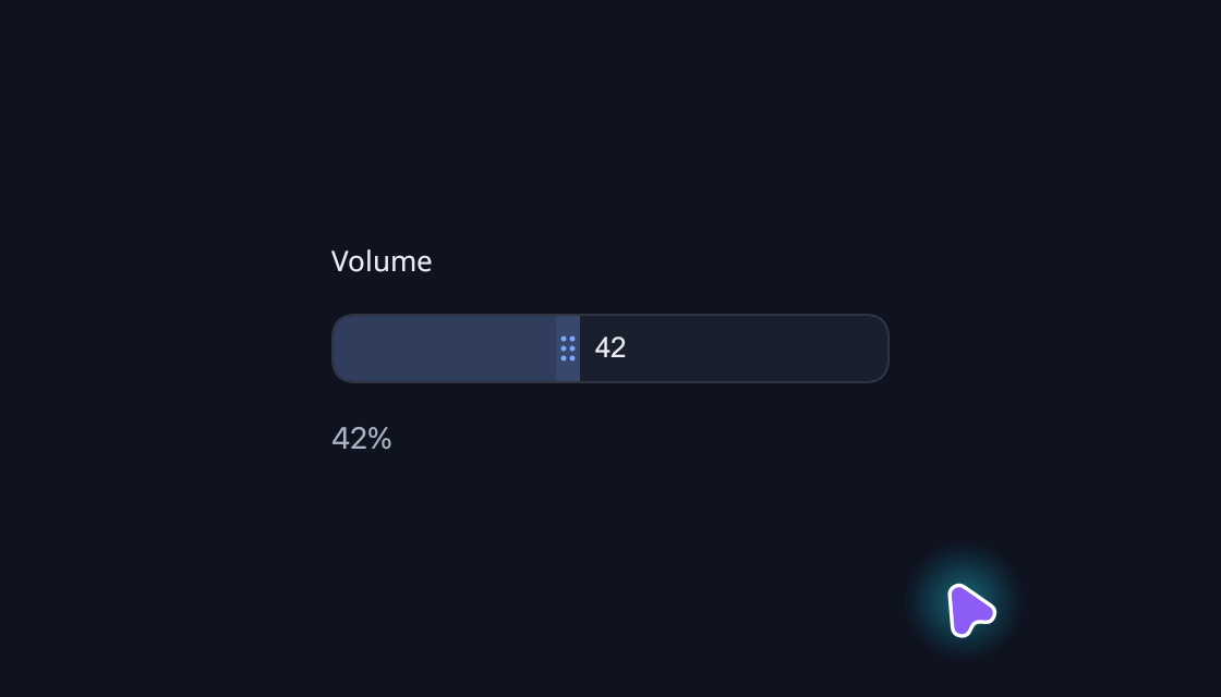
Number Gauge
Scrub a number directly with a compact, draggable gauge.
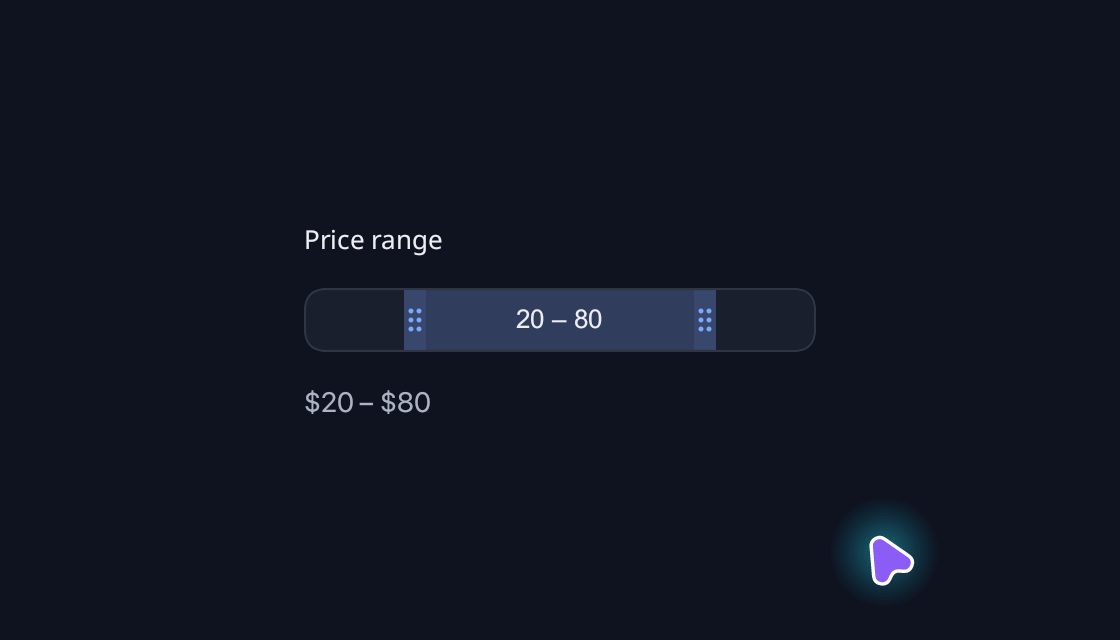
Number Range Gauge
Choose a lower and upper bound together.
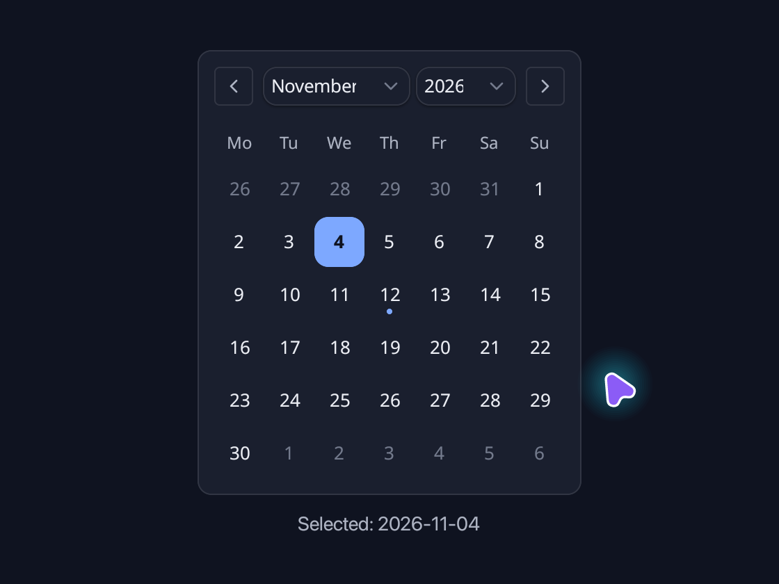
Calendar
Browse months, select a date and mark events in an inline calendar.
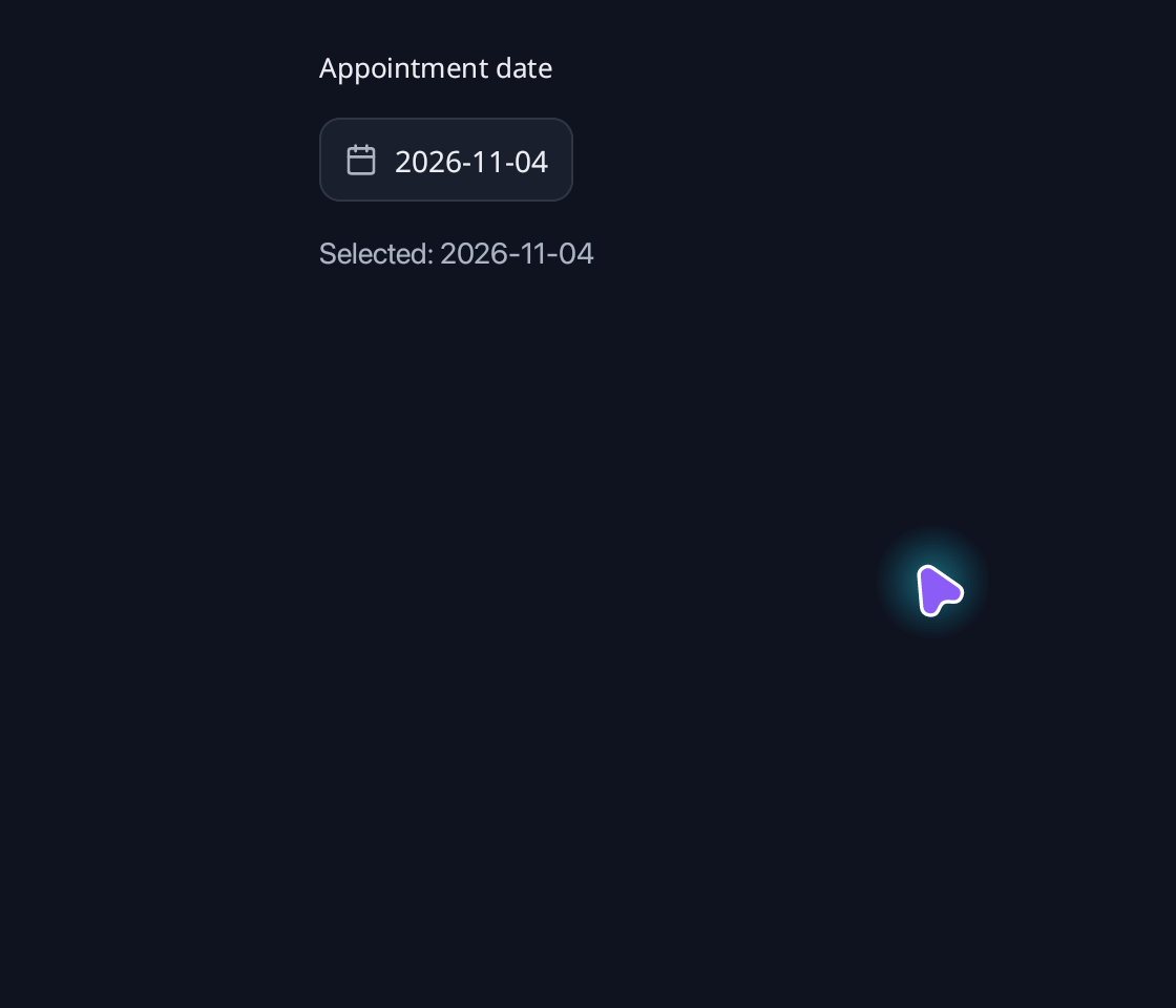
Date Picker
Choose a calendar date in a compact popover.
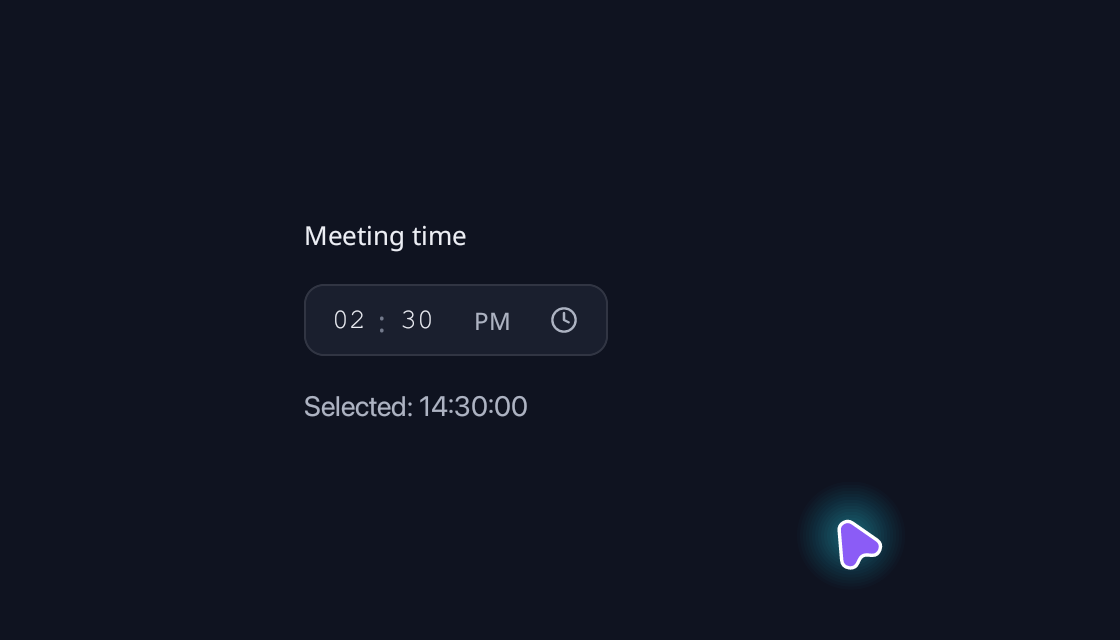
Time Picker
Time Picker built with Blinc.
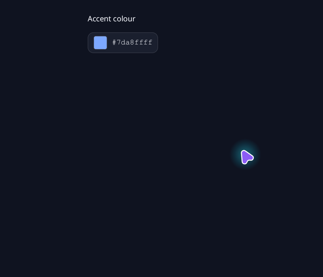
Color Picker
Choose a colour with a saturation field, hue, opacity and saved swatches.
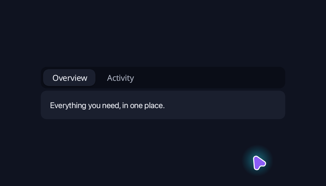
Tabs
Switch between related views in the same space.
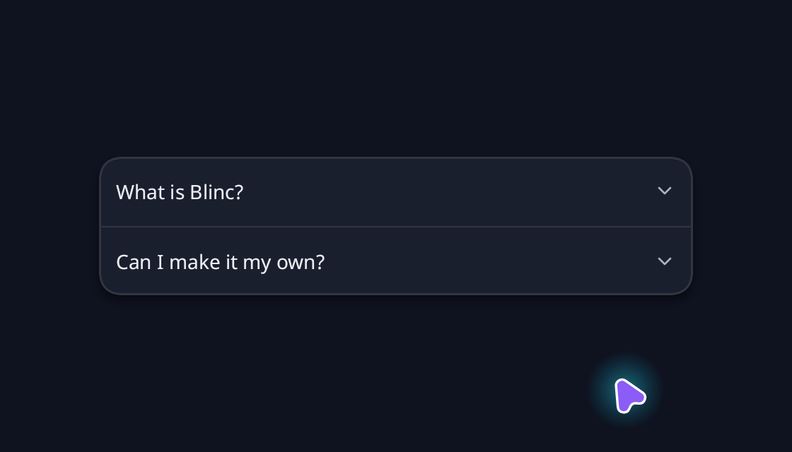
Accordion
Organise related questions into expandable sections.
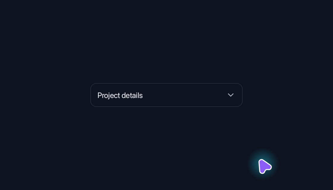
Collapsible
Reveal supporting details without leaving the page.
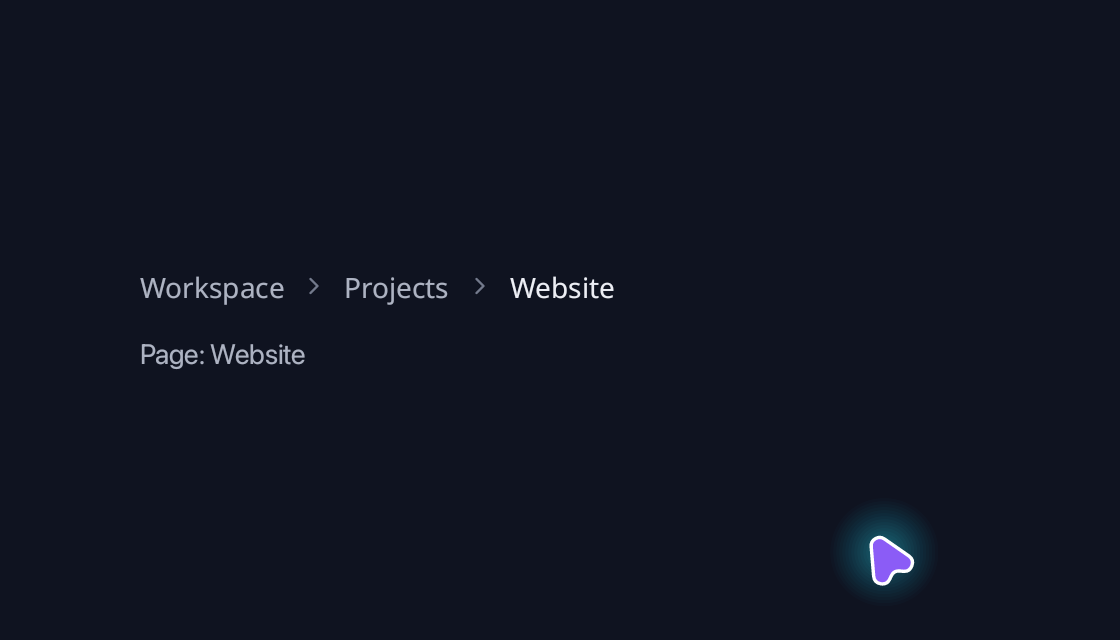
Breadcrumb
Keep the current location visible in a navigation trail.
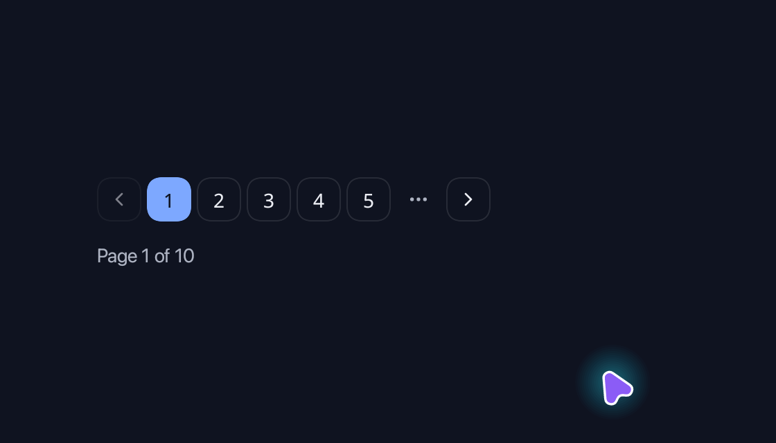
Pagination
Browse a larger collection a page at a time.
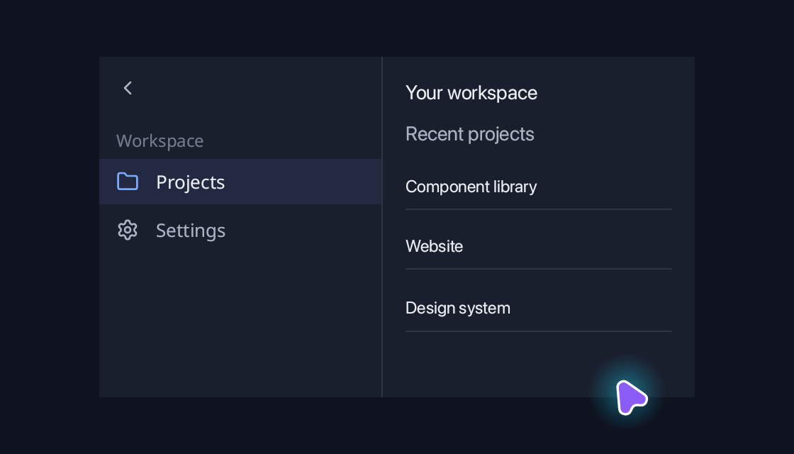
Sidebar
Keep the main sections of a workspace in a collapsible rail.
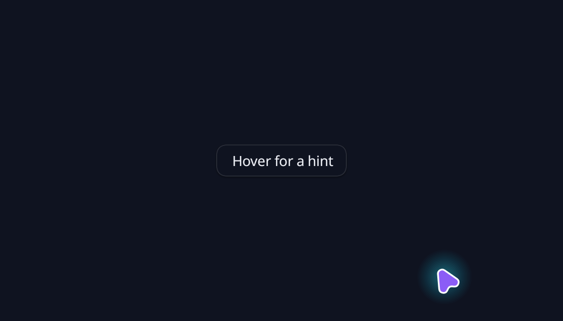
Tooltip
Explain a control with a short hint on hover.

Hover Card
Reveal supporting information alongside its trigger.
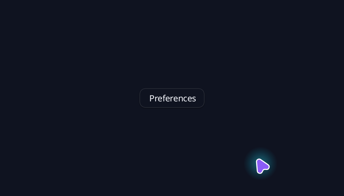
Popover
Keep a small set of preferences close to the control.
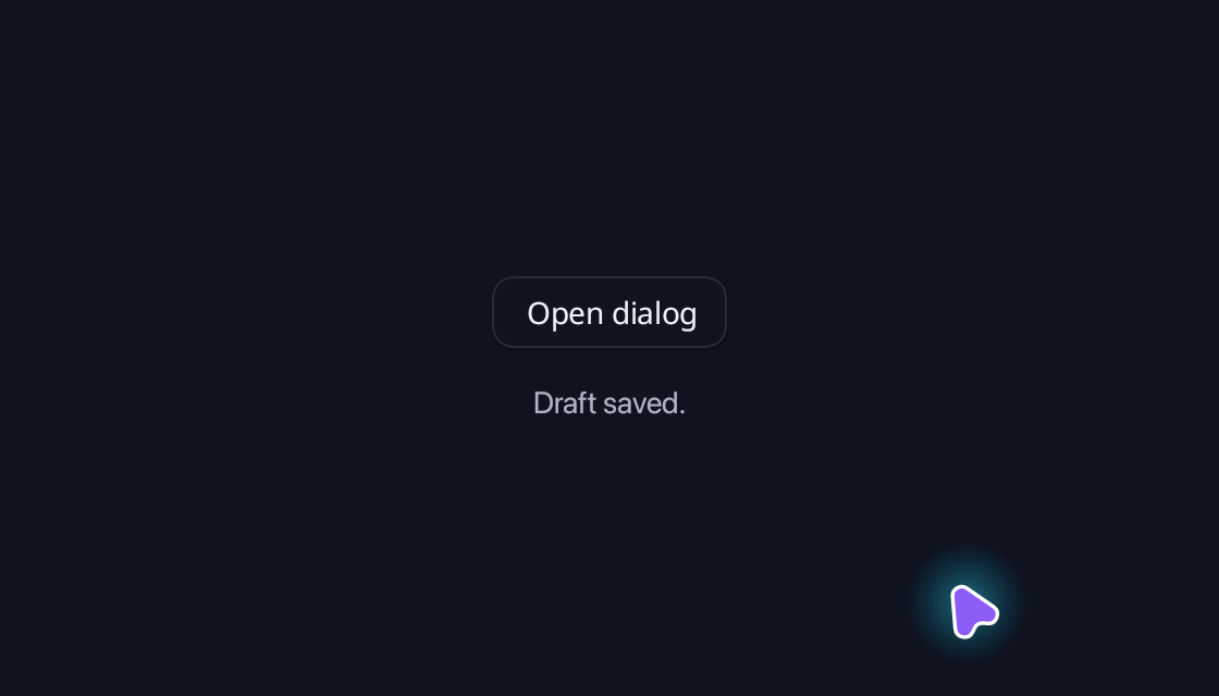
Dialog
A focused confirmation step, with dismissal and trigger focus restoration.
Sheet
A bottom sharing panel with project members, guest permissions and a clear completion action.
Drawer
Inspect a project’s files in a side drawer with selectable rows, file details and sync status.
Toast
Confirm a completed action without interrupting the workflow.
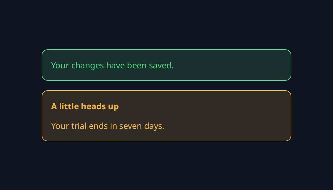
Alert
Keep important feedback visible within the page.
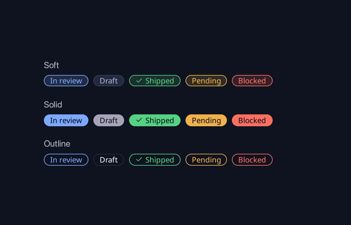
Badge
Compare all five semantic variants in soft, solid and outline styles, with an optional status icon.

Avatar
Represent people with initials, status and grouped avatars.
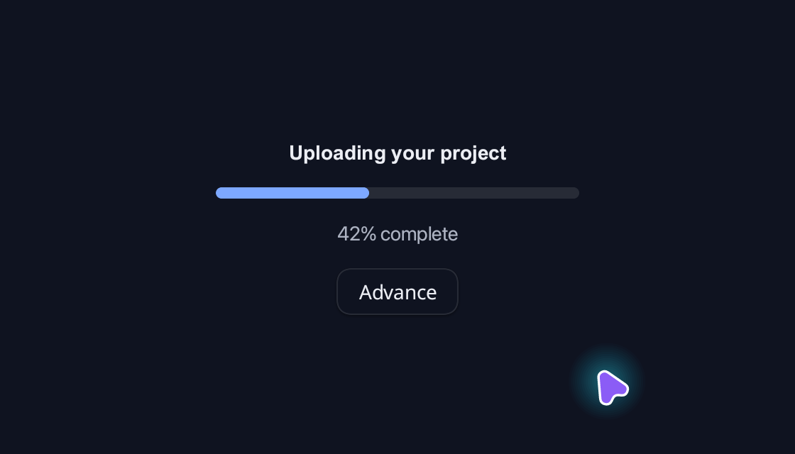
Progress
Show a changing value with an eased, CSS-styled progress bar.
Spinner
Indicate work in progress with theme-timed motion.

Skeleton
Reserve a calm placeholder while content loads.
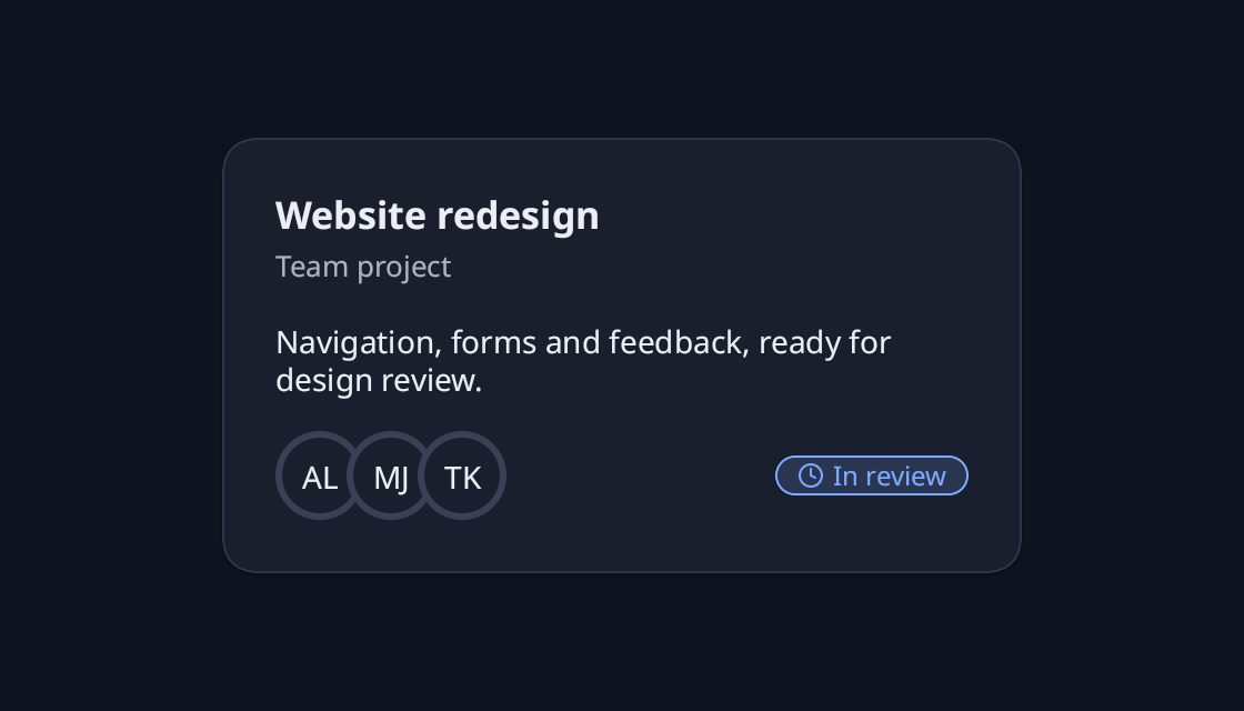
Card
A project summary with a clear heading, a short brief, reviewer avatars and its current review status.
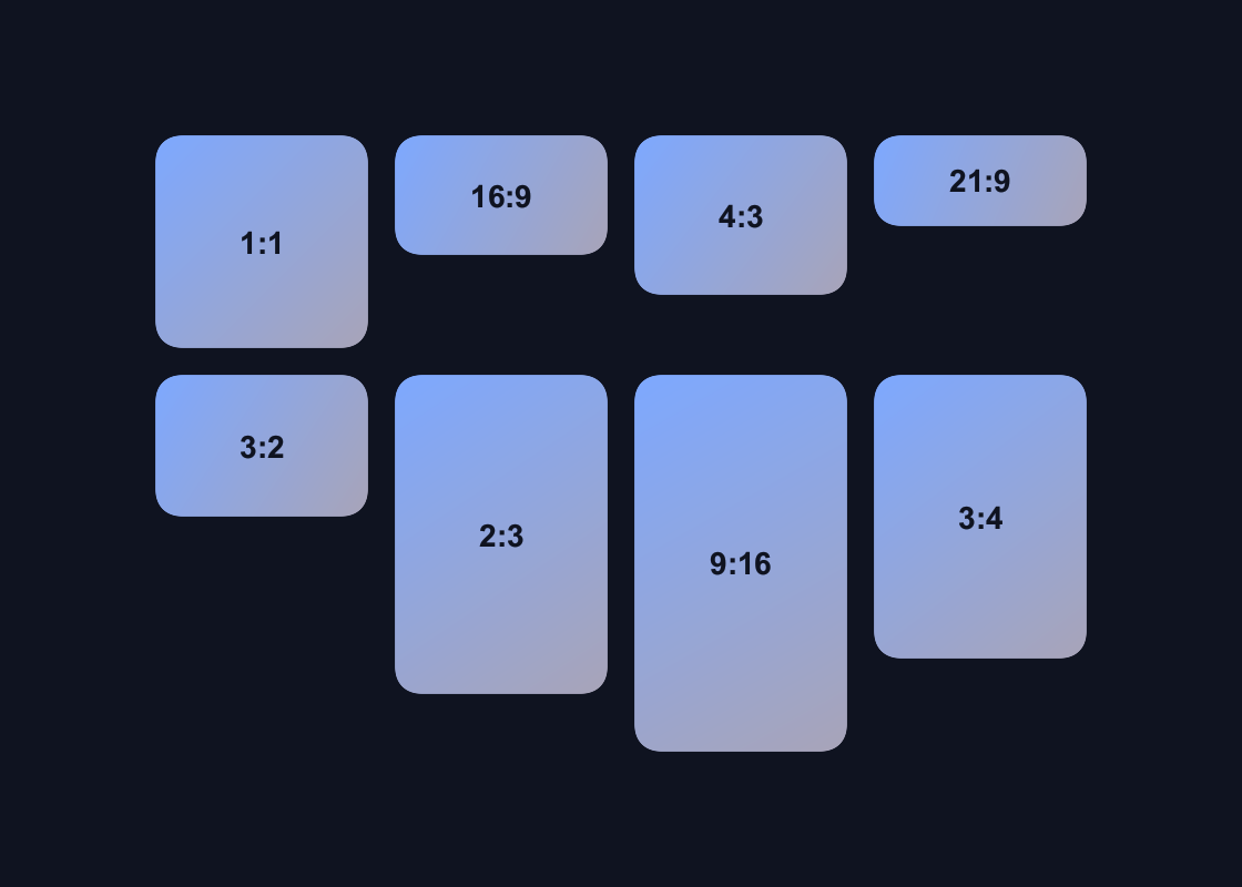
Aspect Ratio
Compare eight common ratios, then change the native aspect-ratio layout constraint directly with CSS.
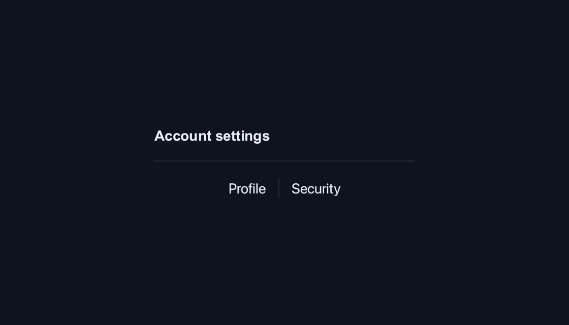
Separator
Separate related groups of content with a themed divider.
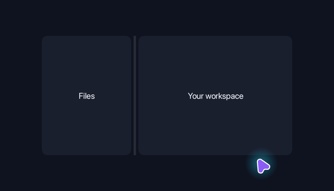
Resizable
Let people divide space between neighbouring panels.
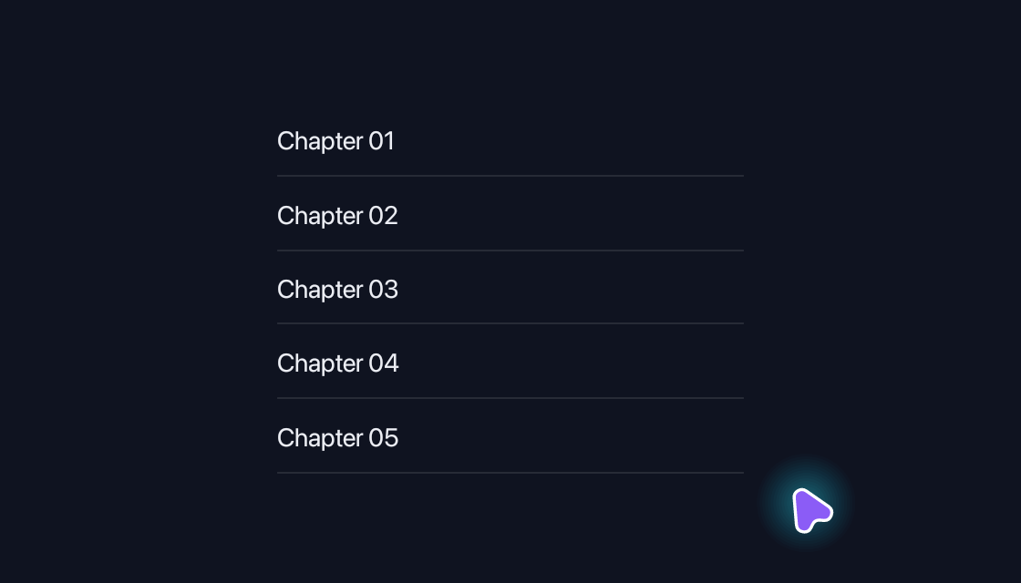
Scroll Area
Browse overflowing content in a themed scroll container.
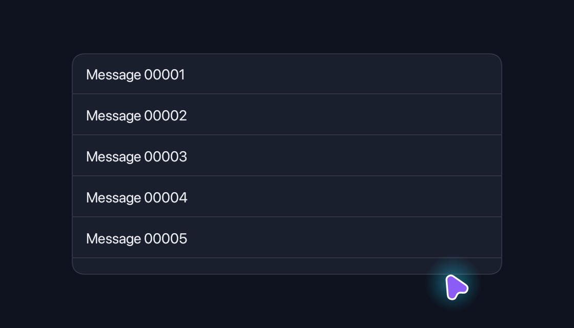
Virtual List
Browse thousands of rows while mounting only the visible window.
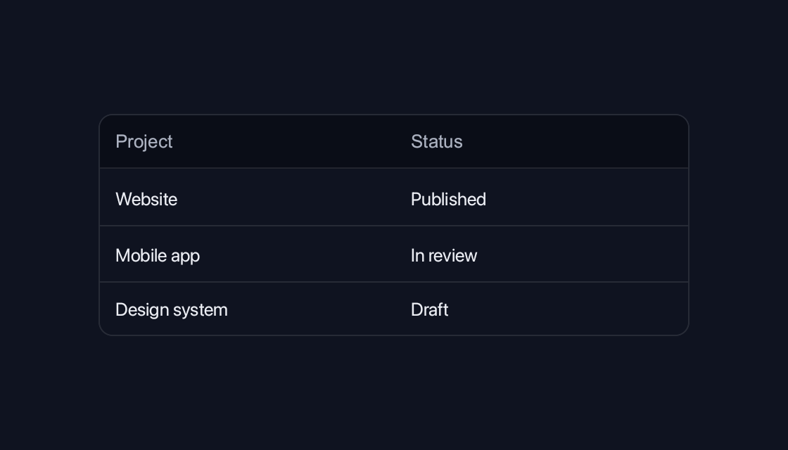
Table
Present related values with themed headings, rows and cells.
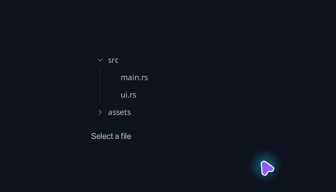
Tree
Browse hierarchical content with expansion and selection.
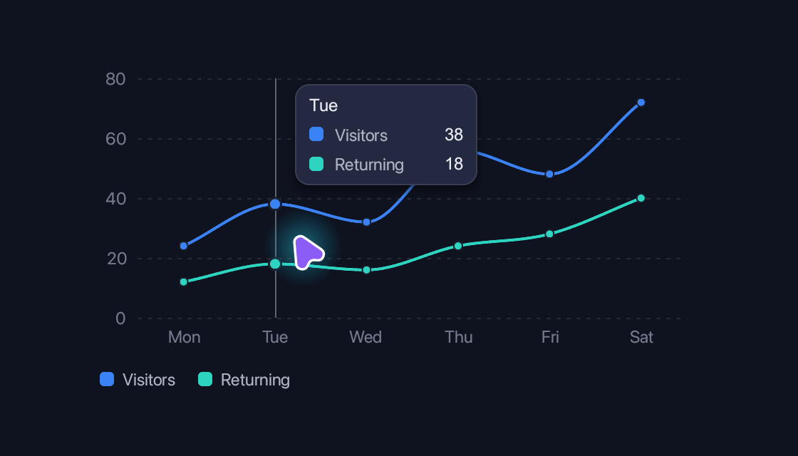
Charts
Line, area, bar, pie, donut and specialised charts, each with its own interactive example.
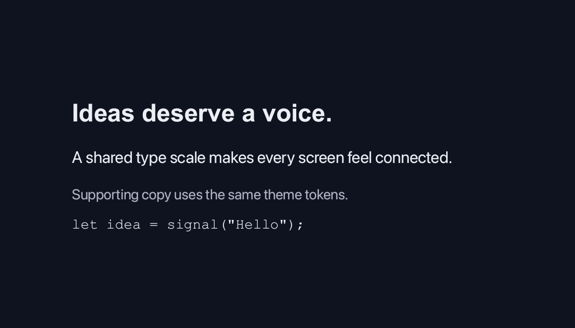
Typography
Build a readable hierarchy with a shared type scale.
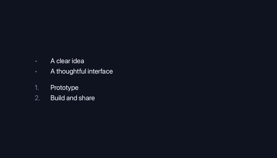
Lists
Structure short sequences with bullets and numbers.
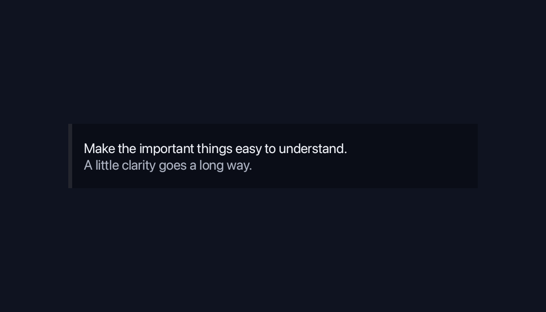
Blockquote
Give quoted content a clear place in the reading flow.
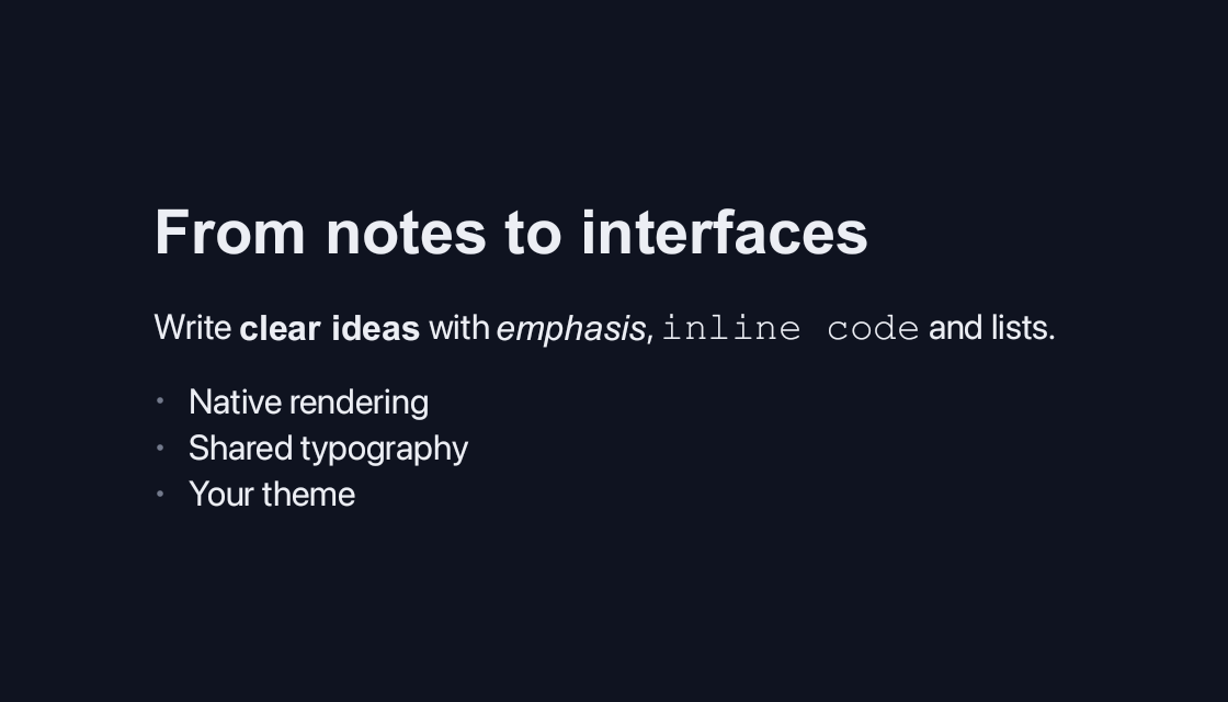
Markdown
Render formatted content directly in the native layout.
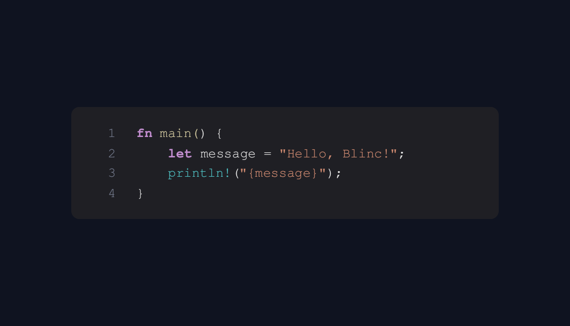
Code Block
Present highlighted source without an editable field.
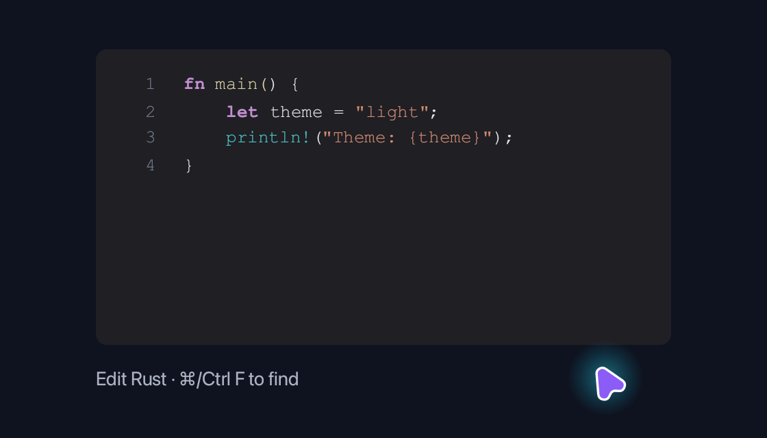
Code Editor
Edit source with syntax highlighting, line numbers, search and selection.
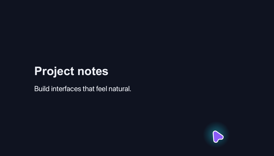
Rich Text Editor
Write formatted prose with headings, emphasis and a selection toolbar.
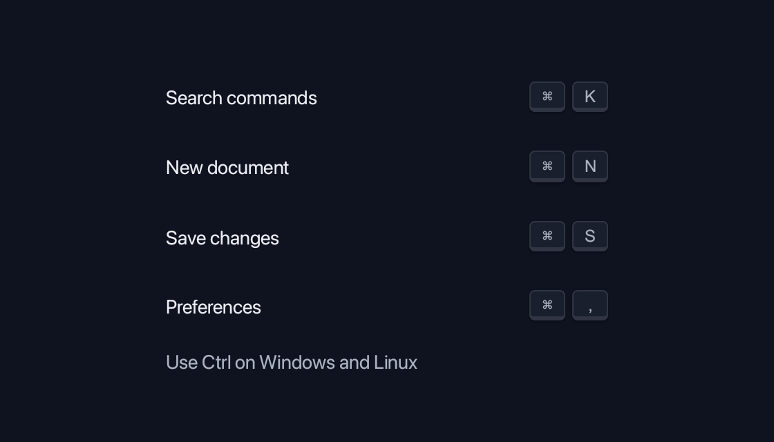
Keyboard Shortcut
A compact keyboard shortcut reference with grouped keycaps for command search, documents, saving and preferences.

Icons
Use crisp vector icons that inherit the surrounding theme.
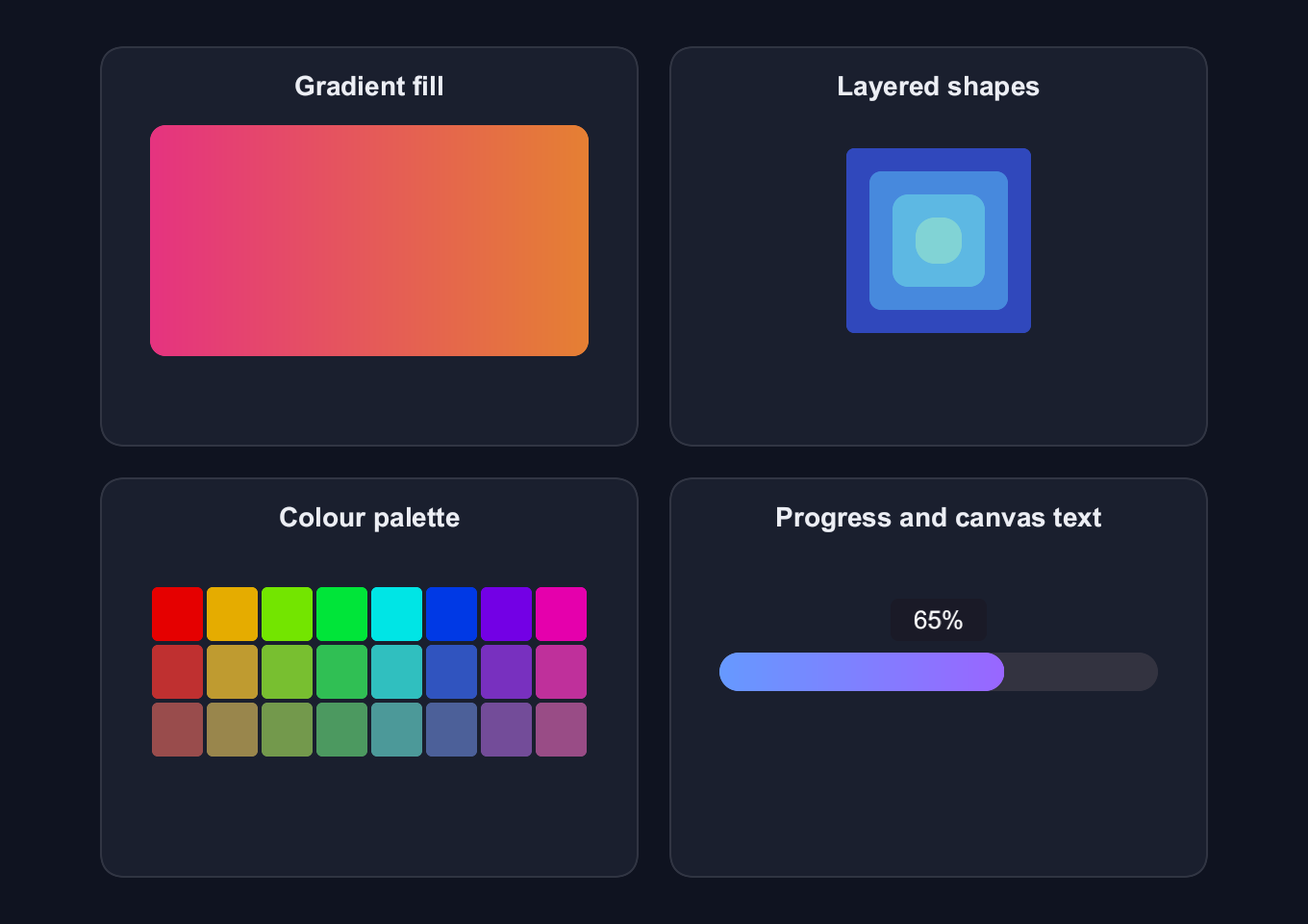
Canvas
Draw gradient fills, layered shapes, a colour palette and a progress bar with canvas-rendered text.
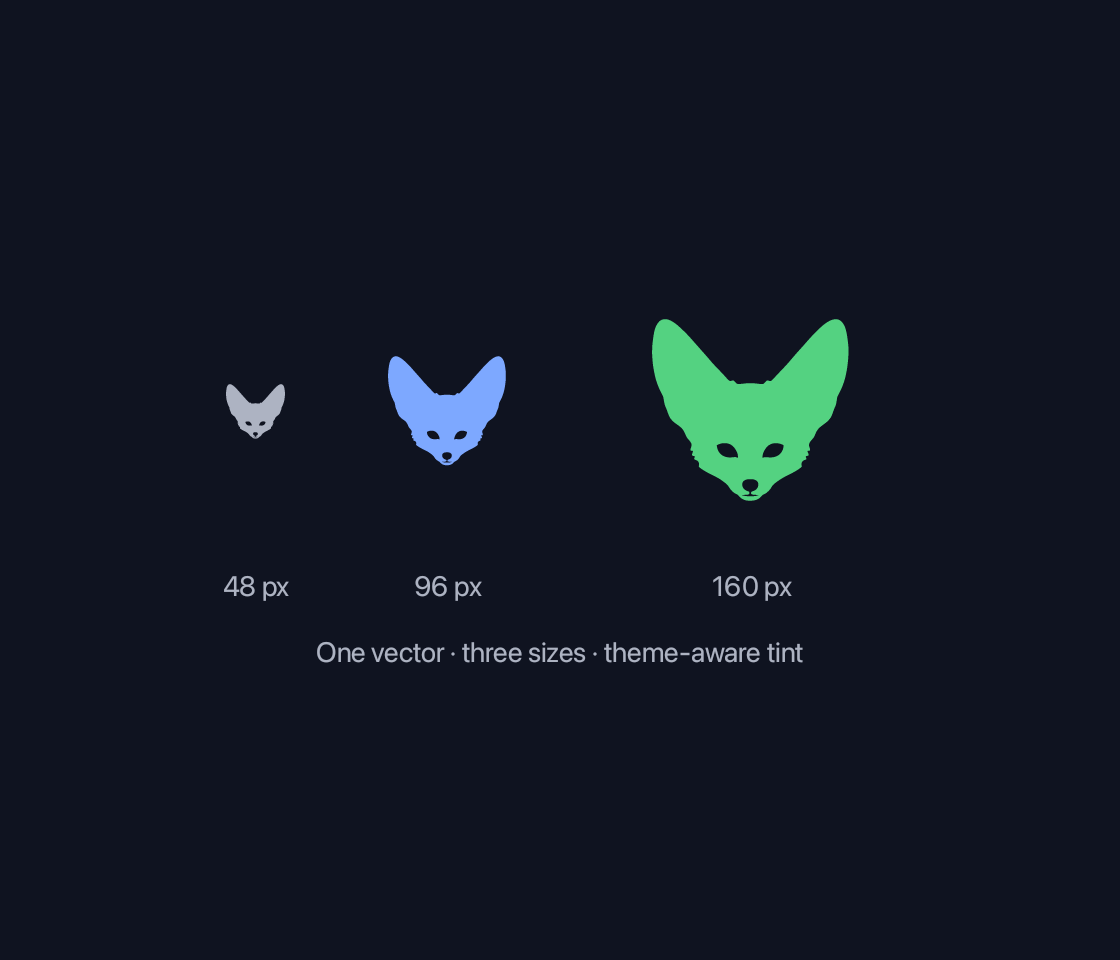
SVG
The detailed Fennec fox from the original SVG gallery, rendered at three sizes with theme-aware tints.
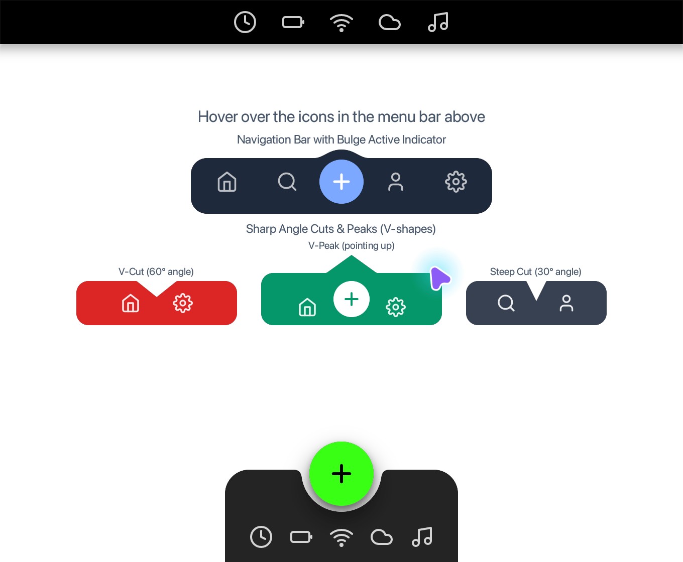
Notch
Explore the interactive notched menu bar, bulge navigation, angle cuts and scooped dock from the Notch example.

Image
Display raster images with fitting, cropping and theme-aware surfaces.
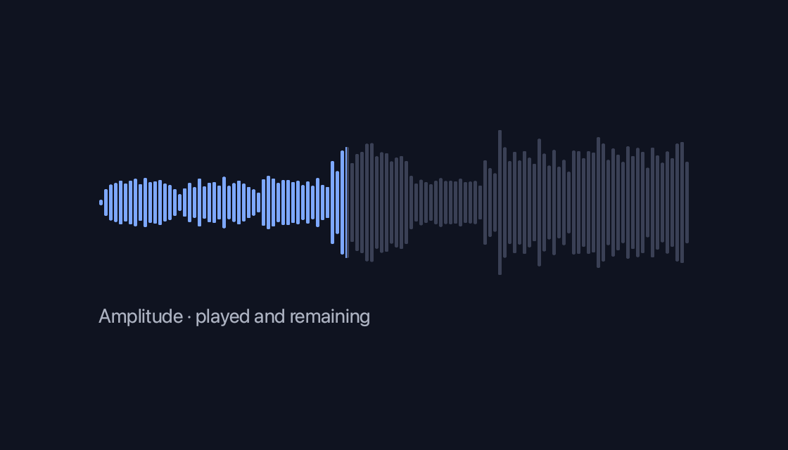
Waveform
Display audio amplitude and played progress with theme-aware colours.
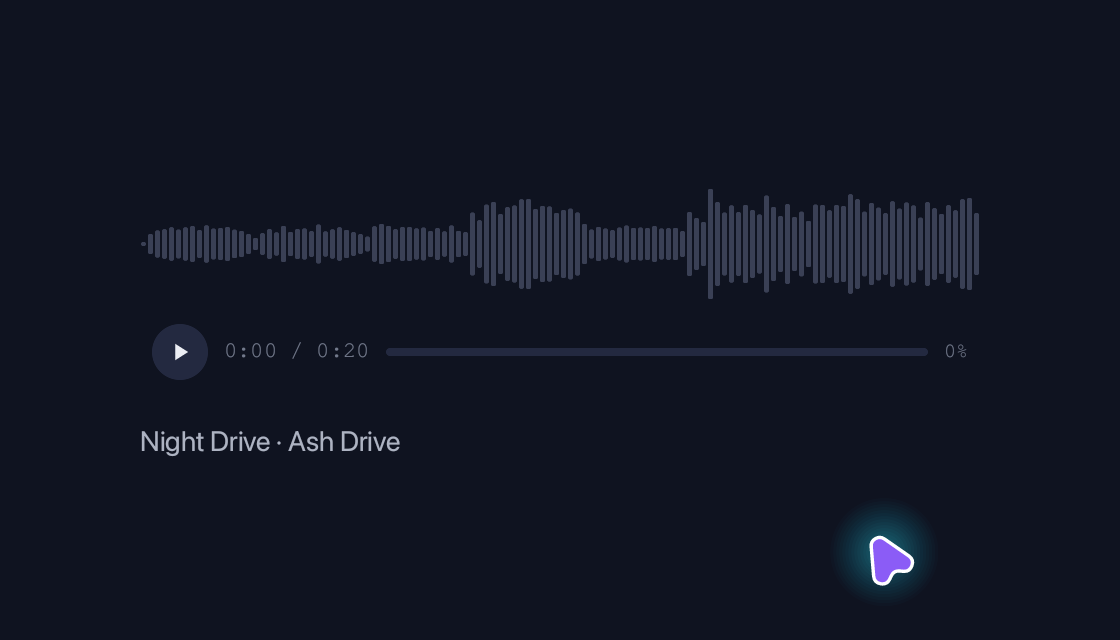
Audio Player
Audio transport, volume controls and an optional waveform.
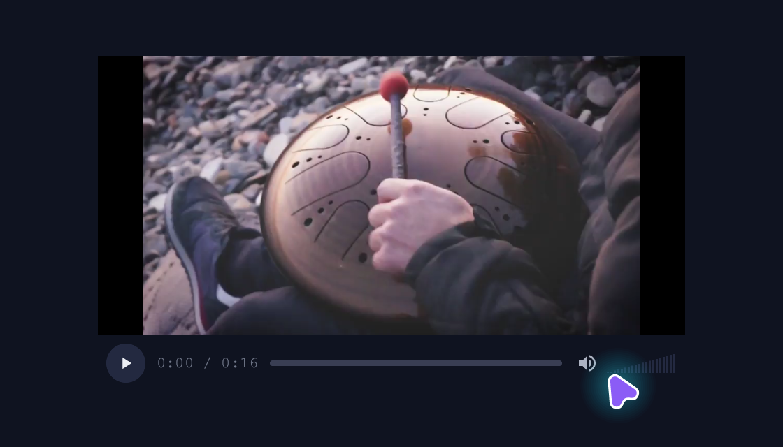
Video Player
Native video surfaces with shared transport, seeking and volume controls.
Gestures
Recognise taps, long presses and directional swipes.
Motion
Reveal a workspace activity feed with staggered entrance and fade-out motion.
No components match. Try a different search.