
Color Picker
Choose a colour with a saturation field, hue, opacity and saved swatches.
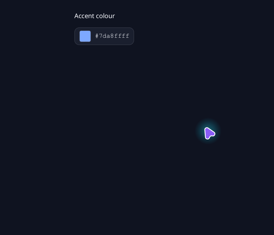
use blinc_cn as cn;
use blinc_core::reactive::Signal;
use blinc_layout::prelude::*;

pub fn color_picker_demo(color: Signal<blinc_core::Color>, disabled: Signal<bool>) -> Div {
    div().class("demo-stack").child(cn::label("Accent colour")).child(
        cn::color_picker(color).alpha(true).disabled(disabled).swatches(vec![
            blinc_core::Color::from_hex(0x7da8ff),
            blinc_core::Color::from_hex(0x2dd4bf),
            blinc_core::Color::from_hex(0xfbbf24),
        ]),
    )
}
@layer components {
  :root {
    --cn-color-picker-checker-light: #ffffff;
    --cn-color-picker-checker-dark: #b8b8b8;
  }

  .cn-color-picker-trigger,
  .cn-color-picker-panel {
    font-family: var(--font-sans);
    color: var(--text-primary);
  }

  .cn-color-picker-trigger {
    gap: 8px;
    padding: 6px 10px;
    border: 1px solid var(--cn-color-picker-border, var(--border));
    border-radius: var(--cn-color-picker-radius, var(--radius-md));
    background: var(--cn-color-picker-bg, var(--input-bg));
    cursor: pointer;
    transition: background var(--duration-fast) var(--ease-state), border-color var(--duration-fast) var(--ease-state);
  }

  .cn-color-picker-trigger:hover {
    background: var(--surface-overlay);
  }

  .cn-color-picker-trigger:focus-visible {
    outline: 2px solid var(--focus-ring);
    outline-offset: 2px;
  }

  .cn-color-picker-trigger:disabled {
    opacity: 0.5;
    cursor: not-allowed;
    background: var(--input-bg);
  }

  .cn-color-picker-value {
    font-family: var(--font-mono);
    font-size: 13px;
  }

  .cn-color-picker-swatch {
    width: 24px;
    height: 24px;
    flex-shrink: 0;
    border: 1px solid var(--border);
    border-radius: var(--radius-sm);
  }

  .cn-color-picker-panel {
    width: 256px;
    padding: 16px;
    gap: 8px;
    border: 1px solid var(--cn-color-picker-border, var(--border));
    border-radius: var(--cn-color-picker-radius, var(--radius-md));
    background: var(--cn-color-picker-panel-bg, var(--surface-elevated));
    box-shadow: var(--shadow-md);
  }

  .cn-color-picker-panel:disabled {
    opacity: 0.5;
  }

  .cn-color-picker-sv {
    height: 160px;
    cursor: crosshair;
    border-radius: var(--radius-sm);
  }

  .cn-color-picker-white {
    background: linear-gradient(to right, #ffffff, #ffffff00);
    border-radius: var(--radius-sm);
  }

  .cn-color-picker-black {
    background: linear-gradient(to bottom, #00000000, #000000);
    border-radius: var(--radius-sm);
  }

  .cn-color-picker-hue {
    height: 16px;
    cursor: pointer;
    border-radius: 999px;
  }

  .cn-color-picker-hue-segment[data-sector="0"] {
    background: linear-gradient(to right, #ff0000, #ffff00);
    border-radius: 999px 0 0 999px;
  }

  .cn-color-picker-hue-segment[data-sector="1"] {
    background: linear-gradient(to right, #ffff00, #00ff00);
  }

  .cn-color-picker-hue-segment[data-sector="2"] {
    background: linear-gradient(to right, #00ff00, #00ffff);
  }

  .cn-color-picker-hue-segment[data-sector="3"] {
    background: linear-gradient(to right, #00ffff, #0000ff);
  }

  .cn-color-picker-hue-segment[data-sector="4"] {
    background: linear-gradient(to right, #0000ff, #ff00ff);
  }

  .cn-color-picker-hue-segment[data-sector="5"] {
    background: linear-gradient(to right, #ff00ff, #ff0000);
    border-radius: 0 999px 999px 0;
  }

  .cn-color-picker-alpha {
    height: 16px;
    cursor: pointer;
    background: var(--surface-overlay);
    border-radius: 999px;
  }

  .cn-color-picker-alpha > div {
    border-radius: 999px;
  }

  .cn-color-picker-sv:focus-visible,
  .cn-color-picker-hue:focus-visible,
  .cn-color-picker-alpha:focus-visible,
  .cn-color-picker-sv[data-focus-visible],
  .cn-color-picker-hue[data-focus-visible],
  .cn-color-picker-alpha[data-focus-visible] {
    outline: 2px solid var(--focus-ring);
    outline-offset: 3px;
  }

  .cn-color-picker-sv:disabled,
  .cn-color-picker-hue:disabled,
  .cn-color-picker-alpha:disabled {
    cursor: not-allowed;
  }

  .cn-color-picker-marker {
    width: 10px;
    height: 10px;
    border: 2px solid var(--cn-color-picker-marker, #ffffff);
    border-radius: 999px;
    box-shadow: 0 0 2px 1px #00000080;
    left: -5px;
    top: -5px;
  }

  .cn-color-picker-label {
    font-size: 12px;
    color: var(--text-secondary);
  }

  .cn-color-picker-entry {
    gap: 8px;
  }

  .cn-color-picker-hex {
    width: 100%;
    height: 32px;
    font-family: var(--font-mono);
    font-size: 13px;
    color: var(--text-primary);
    background: var(--input-bg);
    border: 1px solid var(--border);
    border-radius: var(--radius-sm);
  }

  .cn-color-picker-hex:focus {
    border-color: var(--focus-ring);
    outline: 2px solid var(--focus-ring);
    outline-offset: -2px;
  }

  .cn-color-picker-hex--invalid {
    border-color: var(--error);
  }

  .cn-color-picker-swatches {
    gap: 8px;
  }

  .cn-color-picker-preset {
    width: 24px;
    height: 24px;
    border-radius: 999px;
    cursor: pointer;
    border: 1px solid var(--border);
  }

  .cn-color-picker-preset[data-state="selected"] {
    outline: 2px solid var(--focus-ring);
    outline-offset: 2px;
  }

  .cn-color-picker-preset:focus-visible {
    outline: 2px solid var(--focus-ring);
    outline-offset: 2px;
  }

  .cn-color-picker-preset:disabled {
    cursor: not-allowed;
  }
}
Usage and properties
Choose a colour with a saturation field, hue, opacity and saved swatches. Apply CSS after the component layer to restyle the documented parts.
Use the installation guide to add blinc_cn and its component stylesheet. Create the fixture bindings once, and return the demo from your UI builder. Values marked Bound accept Signal/Computed sources where the API supports them; structural options configure the component at construction.
| Property | Type | Update model | This example |
|---|---|---|---|
value | Signal<Color> | Bound | theme-blue sample |
swatches | Vec<Color> or reactive source | Bound | Blue / teal / amber |
alpha | bool | Construction | true |
disabled | bool or IntoReactive<bool> | Bound | values.disabled |
Keyboard and interaction
Tab moves between the coordinate fields, the hex editor and the presets. Arrow keys adjust saturation, brightness, hue or opacity by 1 (Shift: 10); Home and End jump to the ends. Hex entry is a draft until Enter. Enter or Space opens the trigger or selects a preset. :focus-visible marks keyboard focus.
Customizing it
Add application CSS after the default component layer. These selectors are the restyling surface for this component:
.cn-color-picker-trigger.cn-color-picker-swatch.cn-color-picker.cn-color-picker-value.cn-color-picker-panel.cn-color-picker-label.cn-color-picker-swatches.cn-color-picker-preset.cn-color-picker-entry.cn-color-picker-hex.cn-color-picker-hex-wrap
Theme and component variables: --primary, --text-primary, --text-secondary, --surface, --border, --radius-default, --duration-fast, --ease-state.
Built-in themes
The Live theme control installs Blinc's own theme bundles, including their colours, focus rings, corner shapes and motion tokens.
pub fn theme_bundle_for(name: &str) -> blinc_theme::ThemeBundle {
    match name {
        "restrained" => blinc_theme::RestrainedTheme::bundle(),
        "expressive" => blinc_theme::ExpressiveTheme::bundle(),
        _ => blinc_theme::HybridTheme::bundle(),
    }
    .with_css(blinc_cn::cn_styles::CN_STYLES)
}
Download the default widget and component stylesheets. Sample assets and licenses are available in the asset guide.
Documentation
From the canonical component guide.
use blinc::cn::prelude::*;
use blinc::core::{Color, reactive::signal};

let color = signal(Color::from_hex(0x6366f1));
let disabled = signal(false);
let favorites = signal(vec![Color::RED, Color::GREEN, Color::BLUE]);

let picker = cn::color_picker(color)
    .alpha(true)
    .swatches(favorites)
    .disabled(disabled)
    .on_change(|color| tracing::info!(hex = %color.to_hex_string(true), "Colour selected"));

// The same editor embedded directly into a settings panel.
let inline = cn::color_picker(color).alpha(true).inline();
The default trigger shows a swatch and hex value. It opens a popover with a
saturation/brightness field, hue strip and hex editor. .inline() shows the
panel directly. .alpha(true) adds an opacity strip. With alpha hidden,
editing RGB or selecting a swatch preserves the bound opacity.
Drag the selection ring or press anywhere on a field to select a value. Arrow keys adjust saturation/brightness by 1%, hue by 1 degree, or opacity by 1%; Shift increases the step to 10. Home/End select the endpoints of a strip, or the saturation endpoints in the two-dimensional field. The hue and saturation selection survives moving through grey or black. Tab moves between the coordinate fields, hex editor and presets. Arrow keys act only on the current field; navigating inside the hex editor leaves the selected colour unchanged. Enter/Space opens the focused swatch trigger or selects a focused preset.
Hex entry is a draft until Enter. It accepts #RGB, #RGBA, #RRGGBB
and #RRGGBBAA, with an optional #. Invalid input keeps the selected colour
and shows an error border. RGB-only input preserves opacity; an alpha-bearing
form changes opacity when .alpha(true) is enabled. An external colour write
replaces the draft with the new canonical hex value.
swatches takes a Vec<Color>, Signal or Computed. It supplies selectable
presets; the application owns persistence. No palette is imposed by default.
Disabled pickers reject pointer, keyboard and hex edits. Disabling an open
picker closes its popover. Clicking outside dismisses the panel.
Colour styling
The selected colour and coordinate gradients visualize the value. Widget chrome, focus, disabled appearance and motion follow CSS rules and theme tokens.
| Class | Part |
|---|---|
.cn-color-picker-trigger | Swatch trigger; data-state="open", :focus-visible, :disabled |
.cn-color-picker-panel | Inline or detached popup panel; disabled |
.cn-color-picker-swatch, .cn-color-picker-value | Preview swatch and trigger hex label |
.cn-color-picker-sv | Saturation/brightness field |
.cn-color-picker-white, .cn-color-picker-black | Field gradient layers |
.cn-color-picker-hue, .cn-color-picker-alpha | Hue and opacity strips |
.cn-color-picker-hue-segment | Hue spectrum sectors, data-sector="0" through "5" |
.cn-color-picker-marker | Selection rings |
.cn-color-picker-label | Strip labels |
.cn-color-picker-entry, .cn-color-picker-hex-wrap | Hex row and field wrapper |
.cn-color-picker-hex, .cn-color-picker-hex--invalid | Hex editor and invalid draft |
.cn-color-picker-swatches, .cn-color-picker-preset | Palette and swatches; data-state="selected" |
The coordinate fields expose disabled, tabindex="0" and
data-focus-visible. Presets expose disabled and tabindex="0" too.
The fields and hex entry retain their node identities during value updates.
.class(...) and .id(...) apply to the trigger, or to the panel in inline
mode. A popup is mounted in the overlay layer, so style it using its own part
classes rather than a descendant selector from the trigger.
.cn-color-picker-panel {
    --cn-color-picker-border: var(--border-secondary);
    border-radius: 16px;
    width: 280px;
}
.cn-color-picker-sv { height: 180px; }
.cn-color-picker-marker { border-color: white; }
Variables are --cn-color-picker-bg, --cn-color-picker-panel-bg,
--cn-color-picker-border, --cn-color-picker-radius and
--cn-color-picker-marker. The checker canvas reads the global
--cn-color-picker-checker-light and --cn-color-picker-checker-dark colours.
Use --duration-fast and --ease-state to change interaction transitions.
Run the native example with
cargo run -p blinc_app_examples --features cn --example cn_pickers_demo.
The Colour Picker section in cn_demo also shows linked inline and popover
editors, a bound disabled switch and a reactive palette with a save button.
Its Time Picker section shows linked 12/24-hour editors and sizes, and its
Date Picker section shows default and custom-formatted calendar popovers.
The inline calendar is documented in Form Components.
Platforms and version
The component API is available in Blinc 0.6.0. The Live example runs in a dedicated worker and requires a compatible GPU surface. Preview and Code remain available when Live cannot start. The canvas has a descriptive label; a full screen-reader DOM mirror is not provided. The gallery integration is based on revision e2e55c24e078.
Recordings and live demos use the default Hybrid theme with bundled Noto Sans. The recording uses a 560 × 480 logical viewport at twice that resolution. Live follows its container and actual display density. Source base revision · Exact build source · Artifact versions and checksums · Font license.