
Separator
Separate related groups of content with a themed divider.
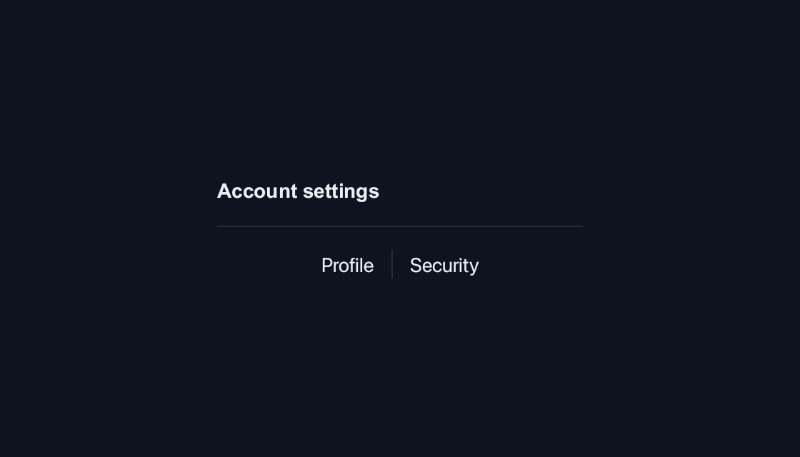
use blinc_cn as cn;
use blinc_layout::prelude::*;

pub fn separator_demo() -> Div {
    div()
        .class("demo-stack")
        .child(text("Account settings").class("demo-label"))
        .child(cn::separator())
        .child(
            div()
                .class("demo-row")
                .child(text("Profile"))
                .child(cn::separator().vertical().h(20.0))
                .child(text("Security")),
        )
}
@layer components {
  .cn-separator {
    background: var(--cn-separator-color, var(--border));
  }
}
Usage and properties
Separate related groups of content with a themed divider. Apply CSS after the component layer to restyle the documented parts.
Use the installation guide to add blinc_cn and its component stylesheet. Create the fixture bindings once, and return the demo from your UI builder. Values marked Bound accept Signal/Computed sources where the API supports them; structural options configure the component at construction.
| Property | Type | Update model | This example |
|---|---|---|---|
orientation | SeparatorOrientation | Construction | Horizontal and vertical |
Keyboard and interaction
Informational content; no activation or Tab stop is required.
Customizing it
Add application CSS after the default component layer. These selectors are the restyling surface for this component:
.cn-separator
Theme and component variables: --primary, --text-primary, --text-secondary, --surface, --border, --radius-default, --duration-fast, --ease-state.
Built-in themes
The Live theme control installs Blinc's own theme bundles, including their colours, focus rings, corner shapes and motion tokens.
pub fn theme_bundle_for(name: &str) -> blinc_theme::ThemeBundle {
    match name {
        "restrained" => blinc_theme::RestrainedTheme::bundle(),
        "expressive" => blinc_theme::ExpressiveTheme::bundle(),
        _ => blinc_theme::HybridTheme::bundle(),
    }
    .with_css(blinc_cn::cn_styles::CN_STYLES)
}
Download the default widget and component stylesheets. Sample assets and licenses are available in the asset guide.
Documentation
From the canonical component guide.
The default separator is horizontal. Set an explicit height on a vertical separator:
div().flex_row().items_center().gap(2.0)
    .child(text("Account"))
    .child(separator().vertical().h(24.0))
    .child(text("Settings"))
A labelled horizontal divider uses flexible containers around the lines:
div().flex_row().items_center().gap(2.0)
    .child(div().flex_grow().child(separator()))
    .child(muted("or"))
    .child(div().flex_grow().child(separator()))
The separator carries data-orientation. Its .cn-separator rule reads
--cn-separator-color.
Platforms and version
The component API is available in Blinc 0.6.0. The Live example runs in a dedicated worker and requires a compatible GPU surface. Preview and Code remain available when Live cannot start. The canvas has a descriptive label; a full screen-reader DOM mirror is not provided. The gallery integration is based on revision e2e55c24e078.
Recordings and live demos use the default Hybrid theme with bundled Noto Sans. The recording uses a 560 × 320 logical viewport at twice that resolution. Live follows its container and actual display density. Source base revision · Exact build source · Artifact versions and checksums · Font license.