
Toggle
Keep an independent action selected or unselected.
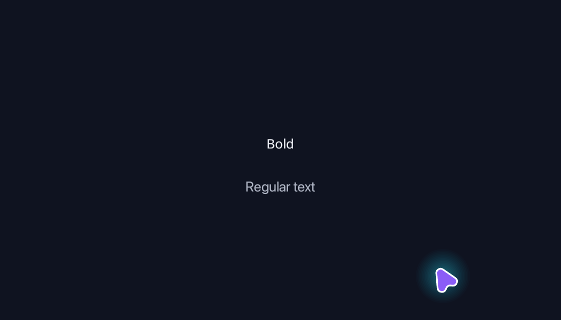
use blinc_cn as cn;
use blinc_core::reactive::{Signal, computed};
use blinc_layout::{binding::IntoReactive, prelude::*};

pub fn toggle_demo(confirmed: Signal<bool>, disabled: Signal<bool>) -> Div {
    let checked = confirmed;
    div()
        .class("demo-stack")
        .class("demo-stack--center")
        .child(cn::toggle(checked).label("Bold").disabled(disabled))
        .child(
            bound_text(computed(move |g| {
                if g.get(checked).unwrap_or(false) {
                    "Bold text enabled"
                } else {
                    "Regular text"
                }
                .into()
            }))
            .class("demo-caption"),
        )
}

fn bound_text(value: impl IntoReactive<String>) -> Text {
    Text::bound(value.into_reactive())
}
@layer components {
  .blinc-toggle {
    flex-direction: row;
    align-items: center;
    justify-content: center;
    gap: 6px;
    height: 36px;
    min-width: 36px;
    padding: 0 12px;
    font-size: var(--text-sm);
    font-weight: 500;
    border: 1px solid transparent;
    border-radius: var(--radius-default);
    background: transparent;
    color: var(--text-primary);
    cursor: pointer;
    transition:
      background-color var(--duration-fast) var(--ease-state),
      border-color var(--duration-fast) var(--ease-state),
      transform var(--duration-faster) var(--ease-state);
  }

  .blinc-toggle:hover:not(:disabled) {
    background: color-mix(in srgb, var(--text-primary) 5%, transparent);
  }

  .blinc-toggle:active:not(:disabled) {
    background: color-mix(in srgb, var(--text-primary) 10%, transparent);
    transform: scale(0.97);
  }

  .blinc-toggle[data-state="on"] {
    background: color-mix(in srgb, var(--text-primary) 10%, var(--background));
  }

  .blinc-toggle[data-state="on"]:hover:not(:disabled) {
    background: color-mix(in srgb, var(--text-primary) 14%, var(--background));
  }

  .blinc-toggle:disabled {
    opacity: 0.5;
    cursor: not-allowed;
  }

  .blinc-toggle[data-variant="outline"] {
    border-color: var(--border-secondary);
  }

  .blinc-toggle[data-size="sm"] {
    height: 32px;
    min-width: 32px;
    padding: 0 8px;
    font-size: var(--text-xs);
    border-radius: var(--radius-sm);
  }

  .blinc-toggle[data-size="lg"] {
    height: 40px;
    min-width: 40px;
    padding: 0 16px;
    font-size: var(--text-base);
  }

  .blinc-toggle > svg {
    flex-shrink: 0;
  }

  .cn-toggle {
    font-family: var(--font-sans);
  }

  .cn-toggle:focus-visible {
    outline: 2px solid var(--focus-ring);
    outline-offset: 2px;
  }

  .cn-toggle[data-state="on"] {
    background: var(--cn-toggle-selected-bg, color-mix(in srgb, var(--text-primary) 10%, var(--background))) !important;
    color: var(--cn-toggle-selected-color, var(--text-primary)) !important;
  }

  .cn-toggle[data-state="on"]:hover:not(:disabled) {
    background: var(--cn-toggle-selected-hover-bg, color-mix(in srgb, var(--text-primary) 14%, var(--background))) !important;
  }
}
Usage and properties
Keep an independent action selected or unselected. Apply CSS after the component layer to restyle the documented parts.
Use the installation guide to add blinc_cn and its component stylesheet. Create the fixture bindings once, and return the demo from your UI builder. Values marked Bound accept Signal/Computed sources where the API supports them; structural options configure the component at construction.
| Property | Type | Update model | This example |
|---|---|---|---|
value | Signal<bool> | Bound | values.confirmed |
disabled | bool or IntoReactive<bool> | Bound | values.disabled |
Keyboard and interaction
Tab reaches the control; Enter or Space activates it. :focus-visible marks keyboard focus.
Customizing it
Add application CSS after the default component layer. These selectors are the restyling surface for this component:
.cn-toggle
Theme and component variables: --cn-toggle-selected-bg, --cn-toggle-selected-hover-bg, --cn-toggle-selected-color, --primary, --text-primary, --text-secondary, --surface, --border, --radius-default, --duration-fast, --ease-state.
Built-in themes
The Live theme control installs Blinc's own theme bundles, including their colours, focus rings, corner shapes and motion tokens.
pub fn theme_bundle_for(name: &str) -> blinc_theme::ThemeBundle {
    match name {
        "restrained" => blinc_theme::RestrainedTheme::bundle(),
        "expressive" => blinc_theme::ExpressiveTheme::bundle(),
        _ => blinc_theme::HybridTheme::bundle(),
    }
    .with_css(blinc_cn::cn_styles::CN_STYLES)
}
Download the default widget and component stylesheets. Sample assets and licenses are available in the asset guide.
Documentation
From the canonical component guide.
A button that stays pressed: a formatting toggle in a toolbar, or a filter.
let bold = ctx.use_signal(false);

toggle(bold)
    .label("B")
    .on_change(|on| println!("bold: {on}"))
// An icon, with or without a label
toggle(bold).icon(to_svg(icons::BOLD, 16.0))

// Outline variant: a hairline in both states
toggle(bold).label("B").variant(ToggleVariant::Outline)

// Sizes: Small (32px), Medium (36px), Large (40px)
toggle(bold).label("B").size(ToggleSize::Small)

toggle(bold).label("B").disabled(locked)   // a bool, Signal or Computed
Styling
A toggle is one element carrying data-state="on" or "off" (and a
checked attribute while on), data-variant, data-size and disabled.
Its look is the .blinc-toggle rules of the layout stylesheet: transparent
when off, a faint wash of the text colour when on, a
lighter wash on hover, and a slight shrink while pressed, all eased by a
transition. Sizes and variants are attribute selectors, so your own rules
can use them the same way:
@layer components {
    .my-toggle[data-state="on"] {
        background: #16a34a !important;
        color: white !important;
    }
}
.my-toggle[data-size="lg"] { min-width: 48px; }
toggle(bold).class("my-toggle")
Platforms and version
The component API is available in Blinc 0.6.0. The Live example runs in a dedicated worker and requires a compatible GPU surface. Preview and Code remain available when Live cannot start. The canvas has a descriptive label; a full screen-reader DOM mirror is not provided. The gallery integration is based on revision e2e55c24e078.
Recordings and live demos use the default Hybrid theme with bundled Noto Sans. The recording uses a 560 × 320 logical viewport at twice that resolution. Live follows its container and actual display density. Source base revision · Exact build source · Artifact versions and checksums · Font license.