
Typography
Build a readable hierarchy with a shared type scale.
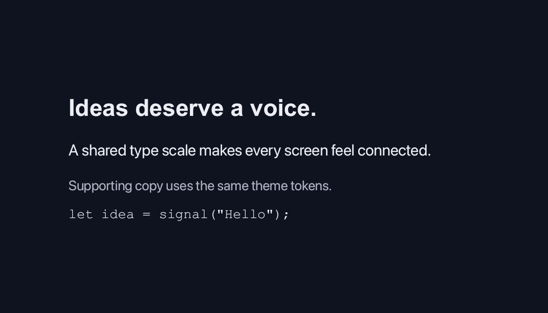
use blinc_cn as cn;
use blinc_layout::prelude::*;

pub fn typography_demo() -> Div {
    div()
        .class("demo-wide")
        .child(cn::h2("Ideas deserve a voice."))
        .child(cn::p("A shared type scale makes every screen feel connected."))
        .child(cn::muted("Supporting copy uses the same theme tokens."))
        .child(cn::inline_code("let idea = signal(\"Hello\");"))
}
Usage and properties
Use h1–h6 for the heading hierarchy, p for wrapping copy, and muted, caption or small for supporting text. Inline helpers and chained_text compose short fragments; the guide below documents every helper and its styling hooks.
Use the installation guide to add blinc_cn and its component stylesheet. Create the fixture bindings once, and return the demo from your UI builder. Values marked Bound accept Signal/Computed sources where the API supports them; structural options configure the component at construction.
| Property | Type | Update model | This example |
|---|---|---|---|
content | impl Into<String> | Construction | Heading, paragraph and muted text |
heading(level, content) | u8, impl IntoReactive<String> | Bound content; construction-time level | heading(2, title_signal) |
Keyboard and interaction
Informational content; no activation or Tab stop is required.
Customizing it
Add application CSS after the default component layer. These selectors are the restyling surface for this component:
.cn-h1.cn-h2.cn-h3.cn-h4.cn-h5.cn-h6.cn-p.cn-muted.cn-caption
Theme and component variables: --text-primary, --text-secondary, --text-tertiary, --text-base, --text-sm, --space-2.
Built-in themes
The Live theme control installs Blinc's own theme bundles, including their colours, focus rings, corner shapes and motion tokens.
pub fn theme_bundle_for(name: &str) -> blinc_theme::ThemeBundle {
    match name {
        "restrained" => blinc_theme::RestrainedTheme::bundle(),
        "expressive" => blinc_theme::ExpressiveTheme::bundle(),
        _ => blinc_theme::HybridTheme::bundle(),
    }
    .with_css(blinc_cn::cn_styles::CN_STYLES)
}
Download the default widget and component stylesheets. Sample assets and licenses are available in the asset guide.
Documentation
From the canonical component guide.
Typography helpers provide defaults for headings, body copy and short inline
fragments. They return Text, except chained_text, which groups fragments in a
Div. Import them through blinc::cn::cn or the component prelude. Install
cn_bundle() as described in Getting Started.
Headings
Use a level that reflects the content hierarchy. The named helpers and
heading(level, content) share these defaults; application CSS can override them.
| Helper | Default size / weight | CSS class |
|---|---|---|
cn::h1 | 32px / bold | .cn-h1 |
cn::h2 | 24px / bold | .cn-h2 |
cn::h3 | 20px / semibold | .cn-h3 |
cn::h4 | 18px / semibold | .cn-h4 |
cn::h5 | 16px / medium | .cn-h5 |
cn::h6 | 14px / medium | .cn-h6 |
use blinc::cn::cn;
use blinc::layout::prelude::*;

div().flex_col().gap(3.0)
    .child(cn::h1("Project overview"))
    .child(cn::h2("Recent activity"))
    .child(cn::h3("Design reviews"))
    .child(cn::h4("Comments"))
    .child(cn::h5("Resolved"))
    .child(cn::h6("Earlier updates"))
cn::heading(2, content) chooses the same heading level and .cn-h2 class as
cn::h2(content). Its level is a construction option from 1 to 6; its content
also accepts a Signal or Computed.
Body and supporting text
cn::p(content): wrapping body copy; 16px, line-height 1.5. Class:.cn-p.cn::muted(content): short secondary information; secondary text colour, no wrapping. Class:.cn-muted.cn::caption(content): captions and footnotes; 12px, tertiary text colour, no wrapping. Class:.cn-caption.cn::small(content): short fine print; 12px, no wrapping. No automatic class.
use blinc::cn::cn;
use blinc::layout::prelude::*;

div().flex_col().gap(2.0)
    .child(cn::p("Keep project notes, decisions and next steps together."))
    .child(cn::muted("Updated a few minutes ago"))
    .child(cn::caption("Figure 1: Workspace layout"))
    .child(cn::small("Changes are saved automatically."))
All of these return Text and support its fluent methods. For supporting copy
that needs multiple lines, enable wrapping with .wrap(true).
Inline helpers and composition
cn::span(content): neutral inline text fragment.cn::b(content): bold fragment.cn::strong(content): alias forb.cn::inline_code(content): monospace fragment, such as a filename or identifier.cn::chained_text([fragments]): aDivcontaining a baseline-aligned row ofTextfragments.
use blinc::cn::cn;

cn::chained_text([
    cn::span("Saved to "),
    cn::strong("Design system"),
    cn::span(" as "),
    cn::inline_code("theme.css"),
])
Include spaces in the fragments where needed. Inline helpers do not wrap by
default, and chained_text lays out separate elements in a row. For a paragraph
that wraps mixed styles as flowing text, use
rich_text(). For syntax-highlighted code blocks,
use code().
The plain blinc::layout::typography::label(content) helper returns 14px,
medium-weight inline Text; it is also re-exported from
blinc::cn::components::typography. cn::label(content) instead creates the
themed form Label component, with required and disabled options.
Reactive text
heading accepts impl IntoReactive<String>. The named h1–h6, p, muted,
caption and inline helpers take construction-time strings. For other live
text, bind a Signal or Computed with Text::bound and give it a CSS class:
use blinc::cn::cn;
use blinc::core::{computed, signal};
use blinc::layout::{binding::IntoReactive, prelude::*};

let title = signal("Project overview".to_string());
let pending = signal(3usize);
let summary = computed(move |g| {
    format!("{} files awaiting review", g.get(pending).unwrap_or_default())
});

let header = div().class("project-copy")
    .child(cn::heading(2, title))
    .child(Text::bound(summary.into_reactive()).class("project-summary"));

pending.set(5);
Create these bindings once, or use ctx.use_signal(...) when retaining them
across UI builds. Updating either source replaces the bound text in place.
Restyling
The heading, paragraph, muted and caption classes listed above are styling
hooks. span, b, strong, small, inline_code and chained_text do not add
cn-* classes; attach your own with .class(...). The equivalent helpers in
blinc::layout::typography have the same text defaults without the CN classes.
Add overrides after the component stylesheet, using the theme's root variables:
.cn-h2 {
  font-size: 28px;
  font-weight: 700;
  color: var(--text-primary);
}

.cn-p {
  font-size: var(--text-base);
  line-height: 1.6;
}

.project-copy {
  flex-direction: column;
  gap: var(--space-2);
}

.project-summary {
  font-size: var(--text-sm);
  color: var(--text-secondary);
}
Scope shared classes to an application container when only one section should
change, for example .project-copy .cn-h2.
Platforms and version
The component API is available in Blinc 0.6.0. The Live example runs in a dedicated worker and requires a compatible GPU surface. Preview and Code remain available when Live cannot start. The canvas has a descriptive label; a full screen-reader DOM mirror is not provided. The gallery integration is based on revision e2e55c24e078.
Recordings and live demos use the default Hybrid theme with bundled Noto Sans. The recording uses a 560 × 320 logical viewport at twice that resolution. Live follows its container and actual display density. Source base revision · Exact build source · Artifact versions and checksums · Font license.