
Calendar
Browse months, select a date and mark events in an inline calendar.
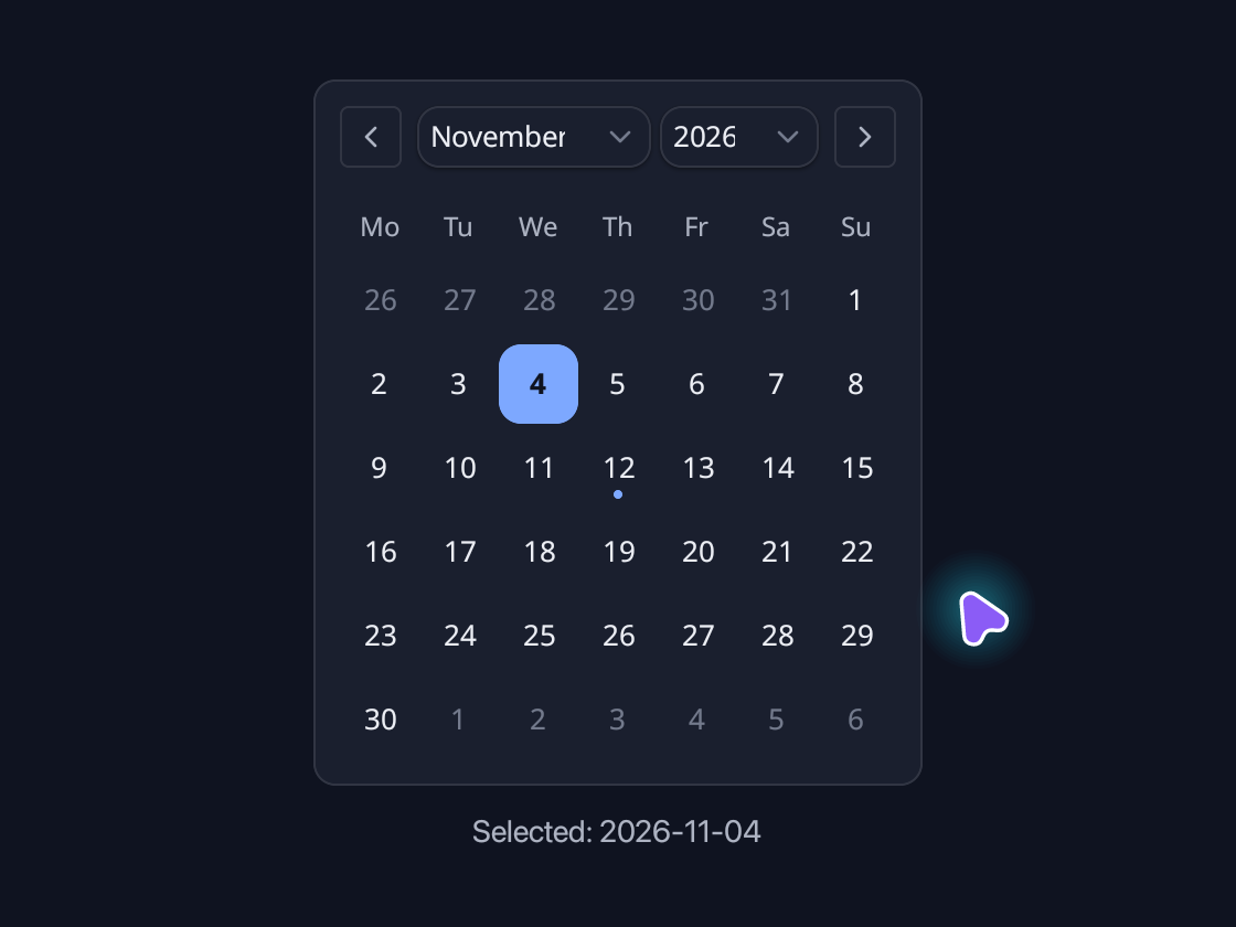
use blinc_cn as cn;
use blinc_core::reactive::{Signal, computed};
use blinc_layout::{binding::IntoReactive, prelude::*};

pub fn calendar_demo(date: Signal<Option<cn::CalendarDay>>) -> Div {
    div()
        .class("demo-calendar")
        .child(
            cn::calendar(date)
                .today(cn::CalendarDay::new(2026, 11, 4))
                .week_start(1)
                .events(vec![cn::CalendarEvent::new(
                    cn::CalendarDay::new(2026, 11, 12),
                    "Design review",
                )]),
        )
        .child(
            bound_text(computed(move |g| {
                g.get(date)
                    .flatten()
                    .map(|day| format!("Selected: {:04}-{:02}-{:02}", day.year, day.month, day.day))
                    .unwrap_or_else(|| "Choose a date".into())
            }))
            .class("demo-caption"),
        )
}

fn bound_text(value: impl IntoReactive<String>) -> Text {
    Text::bound(value.into_reactive())
}
@layer components {
  .cn-calendar {
    flex-direction: column;
    gap: 12px;
    align-self: flex-start;
    padding: 12px;
    border: 1px solid var(--border);
    border-radius: var(--radius-md);
    background: var(--surface);
    color: var(--text-primary);
    font-family: var(--font-sans);
  }

  .cn-calendar-header {
    flex-direction: row;
    align-items: center;
    justify-content: space-between;
  }

  .cn-calendar-caption {
    flex-direction: row;
    align-items: center;
    gap: 4px;
  }

  .cn-calendar-caption .cn-select-trigger {
    height: 28px;
    padding: 0 6px;
  }

  .cn-calendar-caption .cn-select-item {
    justify-content: center;
  }

  .cn-calendar-nav {
    width: 28px;
    height: 28px;
    align-items: center;
    justify-content: center;
    border: 1px solid var(--border);
    border-radius: var(--radius-sm);
    background: transparent;
    color: var(--text-secondary);
    cursor: pointer;
    transition: background var(--duration-fast) var(--ease-state),
      color var(--duration-fast) var(--ease-state);
  }

  .cn-calendar-nav:hover {
    background: color-mix(in srgb, var(--text-primary) 6%, transparent);
    color: var(--text-primary);
  }

  .cn-calendar-nav:disabled {
    opacity: 0.4;
    cursor: default;
  }

  .cn-calendar-body {
    flex-direction: column;
    gap: 2px;
  }

  .cn-calendar-body:focus-visible {
    outline: 2px solid var(--focus-ring);
    outline-offset: 2px;
  }

  .cn-calendar-weekdays {
    display: grid;
    grid-template-columns: repeat(7, 36px);
  }

  .cn-calendar-months {
    overflow: hidden;
    margin: -4px;
    padding: 4px;
  }

  .cn-calendar-grid {
    display: grid;
    grid-template-columns: repeat(7, 36px);
    row-gap: 2px;
  }

  .cn-calendar-grid[data-enter="next"] {
    animation: cn-calendar-from-next var(--duration-normal) var(--ease-nav);
  }

  .cn-calendar-grid[data-enter="prev"] {
    animation: cn-calendar-from-prev var(--duration-normal) var(--ease-nav);
  }

  .cn-calendar-grid[data-leaving="next"] {
    animation: cn-calendar-to-prev var(--duration-normal) var(--ease-nav) forwards;
  }

  .cn-calendar-grid[data-leaving="prev"] {
    animation: cn-calendar-to-next var(--duration-normal) var(--ease-nav) forwards;
  }

  @keyframes cn-calendar-from-next {
    from {
      transform: translateX(260px);
      opacity: 0.4;
    }
    to {
      transform: translateX(0);
      opacity: 1;
    }
  }

  @keyframes cn-calendar-from-prev {
    from {
      transform: translateX(-260px);
      opacity: 0.4;
    }
    to {
      transform: translateX(0);
      opacity: 1;
    }
  }

  @keyframes cn-calendar-to-prev {
    from {
      transform: translateX(0);
      opacity: 1;
    }
    to {
      transform: translateX(-260px);
      opacity: 0.4;
    }
  }

  @keyframes cn-calendar-to-next {
    from {
      transform: translateX(0);
      opacity: 1;
    }
    to {
      transform: translateX(260px);
      opacity: 0.4;
    }
  }

  .cn-calendar-weekday {
    height: 28px;
    align-items: center;
    justify-content: center;
    color: var(--text-secondary);
  }

  .cn-calendar-day {
    width: 36px;
    height: 36px;
    align-items: center;
    justify-content: center;
    border-radius: var(--radius-md);
    background: transparent;
    color: var(--text-primary);
    cursor: pointer;
    outline: 0 solid var(--focus-ring);
    outline-offset: 1px;
    transition: background var(--duration-fast) var(--ease-state),
      color var(--duration-fast) var(--ease-state);
  }

  .cn-calendar-day:hover {
    background: color-mix(in srgb, var(--text-primary) 7%, transparent);
  }

  .cn-calendar-day:active {
    transform: scale(0.94);
  }

  .cn-calendar-day[data-outside] {
    color: var(--text-tertiary);
  }

  .cn-calendar-day[data-today] {
    background: var(--accent-subtle);
    color: var(--accent);
    font-weight: 600;
  }

  .cn-calendar-day[data-selected],
  .cn-calendar-day[data-selected]:hover {
    background: var(--cn-calendar-selected-bg, var(--primary)) !important;
    color: var(--cn-calendar-selected-color, var(--text-inverse)) !important;
  }

  .cn-calendar-day[data-focus-visible] {
    outline-width: 2px;
  }

  .cn-calendar-day:disabled {
    opacity: 0.4;
    cursor: default;
  }

  .cn-calendar-event {
    width: 4px;
    height: 4px;
    border-radius: 9999px;
    background: var(--primary);
  }

  .cn-calendar-event--icon {
    width: 8px;
    height: 8px;
    border-radius: 0;
    background: transparent;
    color: var(--primary);
  }

  .cn-calendar-day[data-selected] .cn-calendar-event {
    background: var(--cn-calendar-selected-color, var(--text-inverse)) !important;
  }

  .cn-calendar-day[data-selected] .cn-calendar-event--icon {
    background: transparent !important;
    color: var(--cn-calendar-selected-color, var(--text-inverse)) !important;
  }
}
Usage and properties
Browse months, select a date and mark events in an inline calendar. Apply CSS after the component layer to restyle the documented parts.
Use the installation guide to add blinc_cn and its component stylesheet. Create the fixture bindings once, and return the demo from your UI builder. Values marked Bound accept Signal/Computed sources where the API supports them; structural options configure the component at construction.
| Property | Type | Update model | This example |
|---|---|---|---|
selected | Signal<Option<CalendarDay>> | Bound | 2026-11-04 |
today / week_start | CalendarDay / u32 | Construction | 2026-11-04 / Monday |
events | Vec<CalendarEvent> | Construction | Design review |
Keyboard and interaction
Tab to the day grid, or click a day. Arrows move by a day or a week, Page Up and Page Down by a month, Home and End to the ends of the week; Enter or Space chooses. :focus-visible marks keyboard focus.
Customizing it
Add application CSS after the default component layer. These selectors are the restyling surface for this component:
.cn-calendar.cn-calendar-weekdays.cn-calendar-weekday.cn-calendar-months.cn-calendar-body.cn-calendar-year-picker.cn-calendar-header.cn-calendar-caption.cn-calendar-month-picker.cn-calendar-nav.cn-calendar-grid.cn-calendar-page.cn-calendar-day.cn-calendar-events.cn-calendar-event.cn-calendar-event--icon
Theme and component variables: --cn-calendar-selected-bg, --cn-calendar-selected-color, --primary, --text-primary, --text-secondary, --surface, --border, --radius-default, --duration-fast, --ease-state.
Built-in themes
The Live theme control installs Blinc's own theme bundles, including their colours, focus rings, corner shapes and motion tokens.
pub fn theme_bundle_for(name: &str) -> blinc_theme::ThemeBundle {
    match name {
        "restrained" => blinc_theme::RestrainedTheme::bundle(),
        "expressive" => blinc_theme::ExpressiveTheme::bundle(),
        _ => blinc_theme::HybridTheme::bundle(),
    }
    .with_css(blinc_cn::cn_styles::CN_STYLES)
}
Download the default widget and component stylesheets. Sample assets and licenses are available in the asset guide.
Documentation
From the canonical component guide.
A month of days to pick a date from, bound to a Signal<Option<CalendarDay>>:
let picked = ctx.use_signal(None::<CalendarDay>);

cn::calendar(picked)
    .week_start(1)          // Monday first; 0 (Sunday) is the default
    .min_year(2020)
    .max_year(2030)
    .on_change(|day| println!("{}-{}-{}", day.year, day.month, day.day))
CalendarDay holds a year, a month from 1 to 12 and a day. CalendarDay::today()
is the local date, and add_days, add_months and weekday do the date
arithmetic. The month and year selects, or the buttons either side of them,
turn the month. Dragging or a two-finger swipe across the days moves the
month with it; let go far enough and it turns (leftward for the next), or it
springs back. Moving the pointer off the days cancels it. Scrolling up and down still moves the page;
choosing a day of the month before or after turns to it.
Tab to the day grid, or click a day: the arrows move by a day or a week, Page Up and
Page Down by a month, Home and End to the ends of the week, and Enter or Space
choose.
For a compact trigger that opens this calendar in a popover, use
Date Picker.
Events
.events(..) marks days with what is on them: meetings, the weather,
deadlines. It takes a list, or a Signal or Computed of one, and the marks
follow it in place. Up to three show along the bottom of a day, each a dot or,
with .icon(..), the event's icon:
let events = ctx.use_signal(vec![
    CalendarEvent::new(CalendarDay::new(2026, 11, 3), "Standup").kind("meeting"),
    CalendarEvent::new(CalendarDay::new(2026, 11, 4), "Rain")
        .kind("rain")
        .icon(to_svg(icons::CLOUD_RAIN, 8.0)),
]);

cn::calendar(picked).events(events)
events_on(&events, day) lists what is on a day, for showing beside the
calendar.
Styling
The parts are .cn-calendar, -header, -caption, -nav (with
data-step="prev" or "next"), -body, -weekdays, -weekday, -months,
-page, -grid and -day. A day carries data-outside, data-today,
data-selected, data-events, data-focus-visible while the keys are on it,
and disabled outside the allowed years. A turning month's grid carries
data-enter while it slides in and data-leaving while it slides out, each
"next" or "prev", and slides by the cn-calendar-* keyframes. An event's
mark is .cn-calendar-event with its data-kind, and .cn-calendar-event--icon
when it is an icon; a dot takes its background, an icon its color:
.cn-calendar-event[data-kind="rain"] { color: #38bdf8; }
.cn-calendar-event[data-kind="deadline"] { background: var(--error); }
.cn-calendar-day[data-today] { background: transparent; }
Platforms and version
The component API is available in Blinc 0.6.0. The Live example runs in a dedicated worker and requires a compatible GPU surface. Preview and Code remain available when Live cannot start. The canvas has a descriptive label; a full screen-reader DOM mirror is not provided. The gallery integration is based on revision e2e55c24e078.
Recordings and live demos use the default Hybrid theme with bundled Noto Sans. The recording uses a 560 × 420 logical viewport at twice that resolution. Live follows its container and actual display density. Source base revision · Exact build source · Artifact versions and checksums · Font license.