
Card
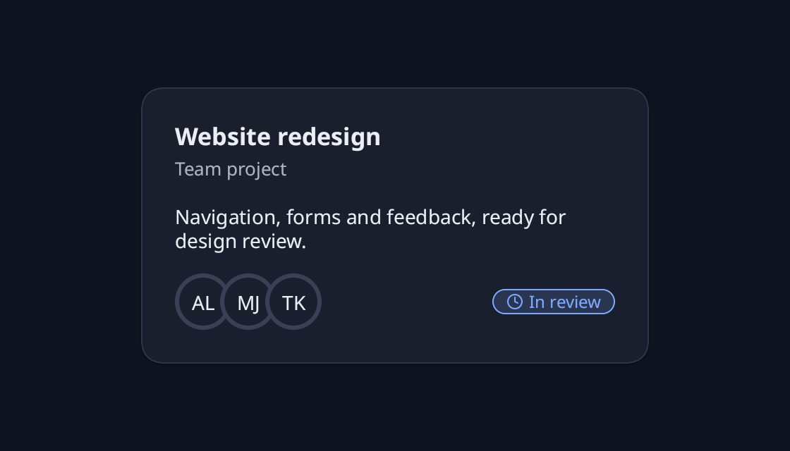
A project summary with a clear heading, a short brief, reviewer avatars and its current review status.
use blinc_cn as cn;
use blinc_layout::prelude::*;

pub fn card_demo() -> Div {
    div().class("demo-card-width").child(
        cn::card()
            .w_full()
            .class("demo-workspace-card")
            .child(cn::card_header().title("Website redesign").description("Team project"))
            .child(cn::card_content().child(text("Navigation, forms and feedback, ready for design review.")))
            .child(
                cn::card_footer().child(
                    div()
                        .w_full()
                        .flex_row()
                        .items_center()
                        .justify_between()
                        .child(
                            cn::avatar_group()
                                .child(cn::avatar().fallback("AL"))
                                .child(cn::avatar().fallback("MJ"))
                                .child(cn::avatar().fallback("TK")),
                        )
                        .child(cn::badge("In review").icon(
                            svg(blinc_icons::to_svg_with_stroke(blinc_icons::icons::CLOCK, 12.0, 2.0)).square(12.0),
                        )),
                ),
            ),
    )
}
@layer components {
  .cn-card,
  .cn-card-header,
  .cn-card-footer {
    font-family: var(--font-sans);
  }

  .cn-card {
    background: var(--cn-card-bg, var(--surface));
    border: 1px solid var(--cn-card-border, var(--border));
    border-radius: var(--cn-card-radius, var(--radius-xl));
    padding: var(--space-6);
    gap: var(--space-4);
  }

  .cn-card-header {
    gap: var(--space-1-5);
  }

  .cn-card-footer {
    gap: var(--space-2);
  }

  .cn-card-title {
    color: var(--text-primary);
  }

  .cn-card-description {
    color: var(--text-secondary);
  }
}
Usage and properties
Compose a surface with a header, content and footer. Apply CSS after the component layer to restyle the documented parts.
Use the installation guide to add blinc_cn and its component stylesheet. Create the fixture bindings once, and return the demo from your UI builder. Values marked Bound accept Signal/Computed sources where the API supports them; structural options configure the component at construction.
| Property | Type | Update model | This example |
|---|---|---|---|
title / description | strings | Construction | Project summary |
content | child content | Construction | Project details |
Keyboard and interaction
Informational content; no activation or Tab stop is required.
Customizing it
Add application CSS after the default component layer. These selectors are the restyling surface for this component:
.cn-card.cn-card-header.cn-card-title.cn-card-description.cn-card-footer
Theme and component variables: --primary, --text-primary, --text-secondary, --surface, --border, --radius-default, --duration-fast, --ease-state.
Built-in themes
The Live theme control installs Blinc's own theme bundles, including their colours, focus rings, corner shapes and motion tokens.
pub fn theme_bundle_for(name: &str) -> blinc_theme::ThemeBundle {
    match name {
        "restrained" => blinc_theme::RestrainedTheme::bundle(),
        "expressive" => blinc_theme::ExpressiveTheme::bundle(),
        _ => blinc_theme::HybridTheme::bundle(),
    }
    .with_css(blinc_cn::cn_styles::CN_STYLES)
}
Download the default widget and component stylesheets. Sample assets and licenses are available in the asset guide.
Documentation
From the canonical component guide.
Cards group related content and actions.
Basic Usage
use blinc::cn::prelude::*;

card()
    .child(card_header()
        .child(card_title("Card Title"))
        .child(card_description("Card description text")))
    .child(card_content()
        .child(text("Card content goes here.")))
    .child(card_footer()
        .child(button("Action")))
Card Parts
card()
The container that wraps all card content.
card()
    .w(400.0)  // Custom width
    .child(/* card parts */)
card_header()
Contains the title and description.
card_header()
    .title("Title")
    .description("Description")
The title is .cn-card-title and the description .cn-card-description;
their colours are those rules. Either takes a string or a signal; a signal
replaces the text in place when it changes.
card_title()
The main heading of the card.
card_title("Account Settings")
card_description()
Secondary text below the title.
card_description("Manage your account preferences")
card_content()
The main content area.
card_content()
    .child(/* any content */)
card_footer()
Actions and secondary information at the bottom.
card_footer()
    .child(button("Cancel").variant(ButtonVariant::Outline))
    .child(button("Save"))
Examples
Simple Card
card()
    .child(card_header()
        .child(card_title("Notifications"))
        .child(card_description("Configure notification settings")))
    .child(card_content()
        .child(
            div()
                .flex_col()
                .gap(12.0)
                .child(checkbox().checked(true).child(label("Email notifications")))
                .child(checkbox().child(label("Push notifications")))
        ))
Card with Image
card()
    .overflow_clip()
    .child(
        img("cover.jpg")
            .w_full()
            .h(200.0)
            .cover()
    )
    .child(card_header()
        .child(card_title("Beautiful Sunset"))
        .child(card_description("Photo by @photographer")))
    .child(card_footer()
        .child(button("View").variant(ButtonVariant::Outline))
        .child(button("Download")))
Card with Form
card()
    .w(350.0)
    .child(card_header()
        .child(card_title("Login"))
        .child(card_description("Enter your credentials")))
    .child(card_content()
        .child(
            div()
                .flex_col()
                .gap(16.0)
                .child(
                    div()
                        .flex_col()
                        .gap(4.0)
                        .child(label("Email"))
                        .child(input().placeholder("name@example.com"))
                )
                .child(
                    div()
                        .flex_col()
                        .gap(4.0)
                        .child(label("Password"))
                        .child(input().input_type("password"))
                )
        ))
    .child(card_footer()
        .child(button("Sign in").full_width(true)))
Card Grid
div()
    .grid()
    .grid_cols(3)
    .gap(16.0)
    .child(
        card()
            .child(card_header().child(card_title("Plan A")))
            .child(card_content().child(text("$9/month")))
            .child(card_footer().child(button("Select")))
    )
    .child(
        card()
            .child(card_header().child(card_title("Plan B")))
            .child(card_content().child(text("$19/month")))
            .child(card_footer().child(button("Select")))
    )
    .child(
        card()
            .child(card_header().child(card_title("Plan C")))
            .child(card_content().child(text("$29/month")))
            .child(card_footer().child(button("Select")))
    )
Interactive Card
card()
    .on_click(|| navigate_to("/details"))
    .cursor("pointer")
    .child(card_header()
        .child(card_title("Click Me"))
        .child(card_description("This entire card is clickable")))
    .child(card_content()
        .child(text("Card content...")))
Styling
Cards automatically use theme tokens:
- Background:
theme.colors.card - Border:
theme.colors.border - Radius:
theme.radius.lg - Shadow:
theme.shadows.sm
Override with custom styles:
card()
    .bg(Color::rgb(0.1, 0.1, 0.1))
    .border(2.0, Color::BLUE)
    .rounded(16.0)
    .shadow(Shadow::lg())
API Reference
card()
| Prop | Type | Description |
|---|---|---|
| Standard div props | - | All div styling props |
card_header()
| Prop | Type | Description |
|---|---|---|
| Standard div props | - | All div styling props |
card_title()
| Prop | Type | Description |
|---|---|---|
| Text content | &str | Title text |
card_description()
| Prop | Type | Description |
|---|---|---|
| Text content | &str | Description text |
Platforms and version
The component API is available in Blinc 0.6.0. The Live example runs in a dedicated worker and requires a compatible GPU surface. Preview and Code remain available when Live cannot start. The canvas has a descriptive label; a full screen-reader DOM mirror is not provided. The gallery integration is based on revision e2e55c24e078.
Recordings and live demos use the default Hybrid theme with bundled Noto Sans. The recording uses a 560 × 320 logical viewport at twice that resolution. Live follows its container and actual display density. Source base revision · Exact build source · Artifact versions and checksums · Font license.