
Time Picker
Time Picker built with Blinc.
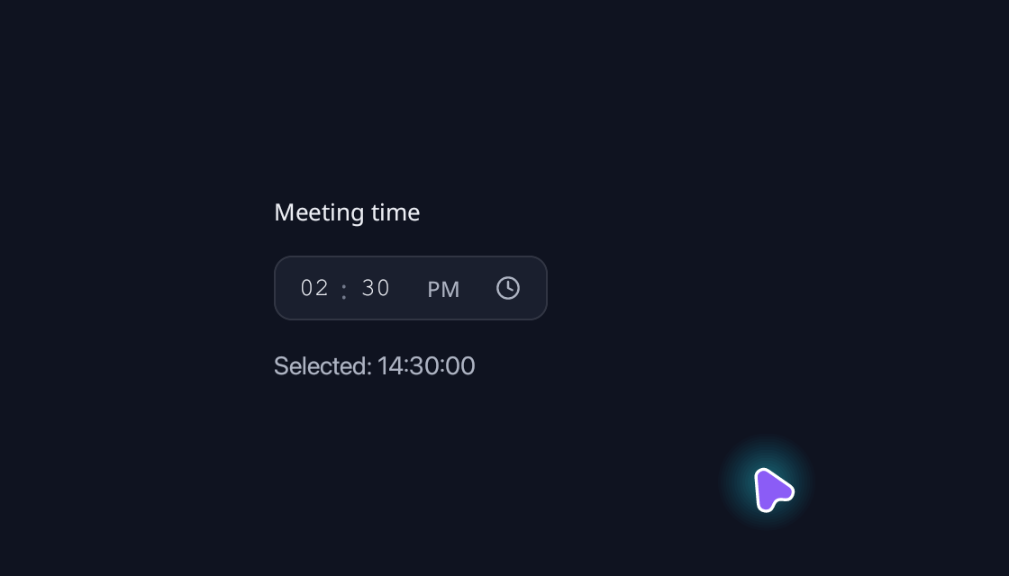
use blinc_cn as cn;
use blinc_core::reactive::{Signal, computed};
use blinc_layout::{binding::IntoReactive, prelude::*};

pub fn time_picker_demo(time: Signal<cn::TimeOfDay>, disabled: Signal<bool>) -> Div {
    div()
        .class("demo-stack")
        .child(cn::label("Meeting time"))
        .child(
            cn::time_picker(time)
                .format(cn::TimeFormat::TwelveHour)
                .minute_step(5)
                .disabled(disabled),
        )
        .child(
            bound_text(computed(move |g| {
                format!("Selected: {}", g.get(time).unwrap_or_default())
            }))
            .class("demo-caption"),
        )
}

fn bound_text(value: impl IntoReactive<String>) -> Text {
    Text::bound(value.into_reactive())
}
@layer components {
  .cn-time-picker {
    font-family: var(--font-sans);
    color: var(--text-primary);
  }

  .cn-time-picker {
    height: 36px;
    gap: 0;
    padding: 0 8px;
    border: 1px solid var(--cn-time-picker-border, var(--border));
    border-radius: var(--cn-time-picker-radius, var(--radius-md));
    background: var(--cn-time-picker-bg, var(--input-bg));
    transition: border-color var(--duration-fast) var(--ease-state);
  }

  .cn-time-picker[data-size="sm"] {
    height: 32px;
    padding: 0 6px;
  }

  .cn-time-picker[data-size="lg"] {
    height: 40px;
  }

  .cn-time-picker[data-focus-within] {
    border-color: var(--focus-ring);
    outline: 2px solid var(--focus-ring);
    outline-offset: 2px;
  }

  .cn-time-picker-segment {
    width: 28px;
    height: 28px;
    padding: 0 2px;
    border: 0;
    border-radius: 3px;
    background: transparent;
    color: var(--text-primary);
    font-family: var(--font-mono);
    font-size: 14px;
    transition: background var(--duration-fast) var(--ease-state);
  }

  .cn-time-picker-segment:hover {
    background: var(--cn-time-picker-field-hover, color-mix(in srgb, var(--text-primary) 5%, transparent));
  }

  .cn-time-picker-segment:focus {
    background: var(--cn-time-picker-field-focus, color-mix(in srgb, var(--primary) 10%, transparent));
    outline: none;
  }

  .cn-time-picker-segment--sm {
    width: 24px;
    height: 24px;
    font-size: 12px;
  }

  .cn-time-picker-segment--lg {
    width: 32px;
    height: 32px;
    font-size: 16px;
  }

  .cn-time-picker-separator {
    width: 6px;
    text-align: center;
    color: var(--text-tertiary);
    font-size: 14px;
  }

  .cn-time-picker[data-size="sm"] .cn-time-picker-separator {
    font-size: 12px;
  }

  .cn-time-picker[data-size="lg"] .cn-time-picker-separator {
    font-size: 16px;
  }

  .cn-time-picker-period {
    width: 36px;
    height: 28px;
    padding: 0;
    margin-left: 6px;
    border-radius: 3px;
    background: transparent;
    cursor: pointer;
    font-size: 12px;
    font-weight: 500;
    color: var(--text-secondary);
    transition: background var(--duration-fast) var(--ease-state);
  }

  .cn-time-picker[data-size="sm"] .cn-time-picker-period {
    width: 32px;
    height: 24px;
    font-size: 11px;
  }

  .cn-time-picker[data-size="lg"] .cn-time-picker-period {
    width: 40px;
    height: 32px;
    font-size: 14px;
  }

  .cn-time-picker-period:hover {
    color: var(--text-primary);
    background: color-mix(in srgb, var(--text-primary) 6%, transparent);
  }

  .cn-time-picker-period:focus-visible {
    outline: 1px solid var(--focus-ring);
    outline-offset: -1px;
  }

  .cn-time-picker:disabled {
    opacity: 0.65;
  }

  .cn-time-picker-segment:disabled,
  .cn-time-picker-period:disabled {
    cursor: not-allowed;
    background: transparent;
    opacity: 1;
  }

  .cn-time-picker-clock {
    width: 28px;
    height: 28px;
    margin-left: 4px;
    border-radius: 3px;
    color: var(--text-secondary);
    background: transparent;
    cursor: pointer;
    transition: background var(--duration-fast) var(--ease-state), color var(--duration-fast) var(--ease-state);
  }

  .cn-time-picker-clock:hover,
  .cn-time-picker-clock[data-state="open"] {
    color: var(--primary);
    background: color-mix(in srgb, var(--primary) 10%, transparent);
  }

  .cn-time-picker-clock:focus-visible {
    outline: 1px solid var(--focus-ring);
    outline-offset: -1px;
  }

  .cn-time-picker-clock:disabled {
    color: var(--text-tertiary);
    cursor: not-allowed;
    background: transparent;
  }

  .cn-time-picker[data-size="sm"] .cn-time-picker-clock {
    width: 24px;
    height: 24px;
  }

  .cn-time-picker[data-size="lg"] .cn-time-picker-clock {
    width: 32px;
    height: 32px;
  }

  .cn-time-picker-wheel {
    width: 232px;
    padding: 12px;
    gap: 12px;
    color: var(--text-primary);
    font-family: var(--font-sans);
  }

  .cn-time-picker-wheel[data-seconds] {
    width: 288px;
  }

  .cn-time-picker-wheel-header {
    gap: 8px;
  }

  .cn-time-picker-wheel-title {
    font-size: 14px;
    font-weight: 500;
  }

  .cn-time-picker-wheels {
    height: calc(var(--cn-time-picker-wheel-row-height, 32px) * 5);
  }

  .cn-time-picker-wheel-selection {
    left: 0;
    right: 0;
    top: calc(var(--cn-time-picker-wheel-row-height, 32px) * 2);
    height: var(--cn-time-picker-wheel-row-height, 32px);
    border: 1px solid var(--cn-time-picker-wheel-border, var(--border));
    border-radius: var(--radius-lg);
    background: var(--cn-time-picker-wheel-selection-bg, var(--input-bg));
  }

  .cn-time-picker-wheel-column {
    flex-grow: 1;
    flex-basis: 0;
    height: 100%;
    border-radius: var(--radius-sm);
    cursor: ns-resize;
  }

  .cn-time-picker-wheel-column:focus-visible {
    outline: 2px solid var(--focus-ring);
    outline-offset: 2px;
  }

  .cn-time-picker-wheel-list {
    padding-top: calc(var(--cn-time-picker-wheel-row-height, 32px) * 2);
    padding-bottom: calc(var(--cn-time-picker-wheel-row-height, 32px) * 2);
  }

  .cn-time-picker-wheel-column {
    overflow-fade: var(--cn-time-picker-wheel-fade, 64px) 0;
    scrollbar-width: none;
  }

  .cn-time-picker-wheel-option {
    width: 100%;
    height: var(--cn-time-picker-wheel-row-height, 32px);
    font-size: var(--cn-time-picker-wheel-font-size, 22px);
    color: var(--text-primary);
  }

  .cn-time-picker-wheel-separator {
    width: 12px;
    height: 100%;
    font-size: 20px;
    color: var(--text-tertiary);
  }

  .cn-time-picker-wheel-period {
    gap: 2px;
    padding: 2px;
    border-radius: var(--radius-sm);
    background: var(--surface-overlay);
  }

  .cn-time-picker-wheel-period-option {
    width: 36px;
    height: 24px;
    border-radius: var(--radius-sm);
    font-size: 12px;
    color: var(--text-secondary);
    cursor: pointer;
  }

  .cn-time-picker-wheel-period-option:hover {
    color: var(--text-primary);
  }

  .cn-time-picker-wheel-period-option[data-selected] {
    color: var(--text-primary) !important;
    background: var(--surface-elevated) !important;
    box-shadow: var(--shadow-sm);
  }

  .cn-time-picker-wheel-period-option:focus-visible {
    outline: 2px solid var(--focus-ring);
    outline-offset: 1px;
  }

  .cn-time-picker-wheel-footer {
    gap: 8px;
  }
}
Usage and properties
Time Picker built with Blinc. Apply CSS after the component layer to restyle the documented parts.
Use the installation guide to add blinc_cn and its component stylesheet. Create the fixture bindings once, and return the demo from your UI builder. Values marked Bound accept Signal/Computed sources where the API supports them; structural options configure the component at construction.
| Property | Type | Update model | This example |
|---|---|---|---|
value | Signal<TimeOfDay> | Bound | 14:30:00 |
format | TimeFormat | Construction | TwelveHour |
minute_step | u8 | Construction | 5 |
disabled | bool or IntoReactive<bool> | Bound | values.disabled |
Keyboard and interaction
Tab moves between the fields and the AM/PM period; Enter or Space toggles the period. In the popup Tab reaches each column and the footer; Up and Down step a column, Page Up and Page Down step five times, Home and End jump to the first and last value. Escape cancels the draft. :focus-visible marks keyboard focus.
Customizing it
Add application CSS after the default component layer. These selectors are the restyling surface for this component:
.cn-time-picker.cn-time-picker-separator.cn-time-picker-period.cn-time-picker-clock.cn-time-picker-segment.cn-time-picker-part
Theme and component variables: --primary, --text-primary, --text-secondary, --surface, --border, --radius-default, --duration-fast, --ease-state.
Built-in themes
The Live theme control installs Blinc's own theme bundles, including their colours, focus rings, corner shapes and motion tokens.
pub fn theme_bundle_for(name: &str) -> blinc_theme::ThemeBundle {
    match name {
        "restrained" => blinc_theme::RestrainedTheme::bundle(),
        "expressive" => blinc_theme::ExpressiveTheme::bundle(),
        _ => blinc_theme::HybridTheme::bundle(),
    }
    .with_css(blinc_cn::cn_styles::CN_STYLES)
}
Download the default widget and component stylesheets. Sample assets and licenses are available in the asset guide.
Documentation
From the canonical component guide.
use blinc::cn::prelude::*;
use blinc::core::reactive::{computed, signal};

let time = signal(TimeOfDay::new(14, 30, 0).unwrap());
let disabled = signal(false);
let picker = cn::time_picker(time)
    .format(TimeFormat::TwelveHour)
    .seconds(true)
    .minute_step(5)
    .size(InputSize::Medium)
    .disabled(disabled)
    .on_change(|time| tracing::info!(%time, "Time selected"));

let caption = computed(move |g| {
    g.get(time).unwrap_or_default().format(TimeFormat::TwelveHour, true)
});
TimeOfDay::new(hour, minute, second) validates a 24-hour time and returns
None for out-of-range parts. The value has hour(), minute() and
second() accessors, implements Display as HH:MM:SS, and carries no
date or time zone. The default picker shows hours and minutes in 24-hour form.
Hiding seconds preserves their stored value. Midnight is 12 AM; noon is
12 PM. Clicking the period toggles AM/PM. Tab moves between the fields and
the period; Shift+Tab moves back. Enter/Space activates the focused period.
The clock button opens a compact wheel popup over the control, kept within the window edges, with five visible rows for each numeric field. The middle row marks the draft selection and neighbouring values fade out toward the edges. Scroll a column with the mouse wheel or trackpad, drag it vertically, or click a nearby value. In 12-hour mode, separate AM and PM buttons sit above the wheels. They preserve the selected hour while switching periods. Seconds add a third numeric column when enabled.
Save writes the draft to the bound signal and calls on_change once if
it changed. Cancel, Escape, clicking outside, or disabling the picker
discards the draft. External writes update the open draft without calling
on_change. The compact fields continue to commit edits immediately.
Tab reaches each column and the footer actions; Shift+Tab goes back.
Up/Down step the focused column, Page Up/Down step five times, and Home/End
select its first/last value. minute_step and second_step apply to keyboard
stepping and the compact fields’ wheel input. Popup columns are native scroll
containers with every valid value and stop at their ends; keyboard stepping
wraps. Other fields and hidden seconds are preserved. Leaving a column
centres its nearest value.
Use .popup(false) for the compact editor without a clock button.
Type up to two digits per field, or use Up/Down and the mouse wheel to step.
Stepping wraps within that field without carrying into neighbouring fields.
minute_step and second_step affect stepping; typing accepts any valid
value. Enter restores the field's two-digit presentation. Invalid or partial
text leaves the selected time unchanged.
Time styling
.class(...) and .id(...) apply to the outer .cn-time-picker, which
exposes data-size="sm|md|lg", data-format="12|24" and disabled.
The control heights are 32, 36 and 40px. Numeric fields share the outer
focus ring (data-focus-within); their local highlight identifies the part
being edited. Selection highlighting clears when a field loses focus.
| Class | Part |
|---|---|
.cn-time-picker-part | Field wrapper |
.cn-time-picker-segment | Editable field; :hover, :focus, :disabled |
.cn-time-picker-segment--sm, --md, --lg | Field size classes |
.cn-time-picker-hour, .cn-time-picker-minute, .cn-time-picker-second | Individual fields |
.cn-time-picker-separator | Colon |
.cn-time-picker-period | AM/PM button; :focus-visible, :disabled |
.cn-time-picker-clock | Wheel popup trigger; data-state="open", :focus-visible, :disabled |
.cn-time-picker-wheel | Detached popup; `data-format="12 |
.cn-time-picker-wheel-header, .cn-time-picker-wheel-title | Heading |
.cn-time-picker-wheels | Five-row numeric viewport |
.cn-time-picker-wheel-selection | Shared selected-row border and fill |
.cn-time-picker-wheel-column | Native scroll, drag and keyboard target; :focus-visible, overflow-fade, scrollbar-width: none |
.cn-time-picker-wheel-hour, .cn-time-picker-wheel-minute, .cn-time-picker-wheel-second | Individual columns |
.cn-time-picker-wheel-list, .cn-time-picker-wheel-option | Scrollable number list and static value rows |
.cn-time-picker-wheel-separator | Colon between columns |
.cn-time-picker-wheel-period, .cn-time-picker-wheel-period-option | Separate period control; options expose data-selected, :focus-visible |
.cn-time-picker-wheel-am, .cn-time-picker-wheel-pm | Individual period choices |
.cn-time-picker-wheel-footer, .cn-time-picker-wheel-cancel, .cn-time-picker-wheel-save | Footer and actions |
Override --cn-time-picker-bg, --cn-time-picker-border,
--cn-time-picker-radius, --cn-time-picker-field-hover and
--cn-time-picker-field-focus, or write rules:
.appointment .cn-time-picker-segment { width: 48px; }
.appointment[data-focus-within] { outline-color: #6366f1; }
The popup lives in the overlay layer, outside the trigger's descendants.
Style its classes directly. Define size/colour variables in :root before
loading CN_STYLES.
--cn-time-picker-wheel-row-height (32px) scales
all five rows together, and --cn-time-picker-wheel-font-size (22px) sets
the digits. --cn-time-picker-wheel-border and
--cn-time-picker-wheel-selection-bg style the selected row. Layout and
typography are CSS rules. Columns use Blinc’s overflow-fade for their edge
fade; --cn-time-picker-wheel-fade defaults to 64px. The default popup is 232px wide (288px with seconds), with 32px
rows and small footer actions.
:root { --cn-time-picker-wheel-row-height: 36px; }
.cn-time-picker-wheel-selection { border-color: var(--primary); }
.cn-time-picker-wheel-period-option[data-selected] { color: var(--primary); }
Platforms and version
The component API is available in Blinc 0.6.0. The Live example runs in a dedicated worker and requires a compatible GPU surface. Preview and Code remain available when Live cannot start. The canvas has a descriptive label; a full screen-reader DOM mirror is not provided. The gallery integration is based on revision e2e55c24e078.
Recordings and live demos use the default Hybrid theme with bundled Noto Sans. The recording uses a 560 × 320 logical viewport at twice that resolution. Live follows its container and actual display density. Source base revision · Exact build source · Artifact versions and checksums · Font license.