
Canvas
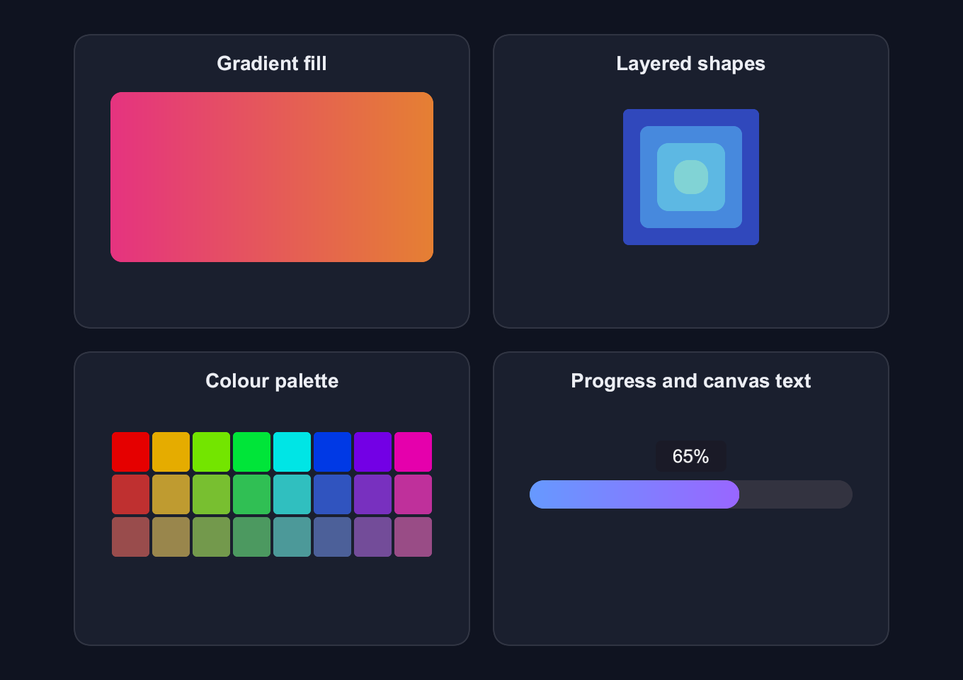
Draw gradient fills, layered shapes, a colour palette and a progress bar with canvas-rendered text.
use blinc_cn::progress;
use blinc_core::{Brush, Color, CornerRadius, DrawContext, Gradient, Point, Rect, TextAlign, TextBaseline, TextStyle};
use blinc_layout::prelude::*;
use blinc_layout::prelude::*;

pub fn canvas_demo() -> Div {
    div()
        .class("demo-canvas-examples")
        .max_w(600.0)
        .overflow_y_scroll()
        .child(sample("Gradient fill", gradient_canvas()))
        .child(sample("Layered shapes", nested_shapes_canvas()))
        .child(sample("Colour palette", color_palette_canvas()))
        .child(sample("Progress and canvas text", progress_bar_canvas(0.65)))
}

fn sample(label: &'static str, drawing: Canvas) -> Div {
    div()
        .class("demo-canvas-sample")
        .child(text(label).class("demo-label"))
        .child(div().class("demo-canvas-artwork").child(drawing))
}

fn gradient_canvas() -> Canvas {
    canvas(|ctx: &mut dyn DrawContext, bounds| {
        let gradient = Brush::Gradient(Gradient::linear(
            Point::new(0.0, bounds.height / 2.0),
            Point::new(bounds.width, bounds.height / 2.0),
            Color::rgba(0.9, 0.2, 0.5, 1.0),
            Color::rgba(0.9, 0.5, 0.2, 1.0),
        ));
        ctx.fill_rect(
            Rect::new(0.0, 0.0, bounds.width, bounds.height),
            CornerRadius::uniform(8.0),
            gradient,
        );
    })
    .w(228.0)
    .h(120.0)
}

fn nested_shapes_canvas() -> Canvas {
    canvas(|ctx: &mut dyn DrawContext, bounds| {
        let cx = bounds.width / 2.0;
        let cy = bounds.height / 2.0;
        let colors = [
            Color::rgba(0.2, 0.3, 0.8, 0.9),
            Color::rgba(0.3, 0.6, 0.9, 0.8),
            Color::rgba(0.4, 0.8, 0.9, 0.7),
            Color::rgba(0.6, 0.9, 0.8, 0.6),
        ];
        for (i, color) in colors.iter().enumerate() {
            let size = (4 - i) as f32 * 24.0;
            ctx.fill_rect(
                Rect::new(cx - size / 2.0, cy - size / 2.0, size, size),
                CornerRadius::uniform(4.0 + i as f32 * 2.0),
                Brush::Solid(*color),
            );
        }
    })
    .w(228.0)
    .h(120.0)
}

fn color_palette_canvas() -> Canvas {
    canvas(|ctx: &mut dyn DrawContext, bounds| {
        let cols = 8;
        let rows = 3;
        let cell_w = bounds.width / cols as f32;
        let cell_h = bounds.height / rows as f32;
        let gap = 2.0;
        for row in 0..rows {
            for col in 0..cols {
                let hue = col as f32 / cols as f32;
                let sat = 1.0 - (row as f32 * 0.25);
                let val = 0.9 - (row as f32 * 0.15);
                let color = hsv_to_rgb(hue, sat, val);
                let x = col as f32 * cell_w + gap / 2.0;
                let y = row as f32 * cell_h + gap / 2.0;
                ctx.fill_rect(
                    Rect::new(x, y, cell_w - gap, cell_h - gap),
                    CornerRadius::uniform(3.0),
                    Brush::Solid(color),
                );
            }
        }
    })
    .w(228.0)
    .h(90.0)
}

fn progress_bar_canvas(progress: f32) -> Canvas {
    canvas(move |ctx: &mut dyn DrawContext, bounds| {
        let bar_height = 20.0;
        let bar_y = (bounds.height - bar_height) / 2.0;
        let radius = CornerRadius::uniform(bar_height / 2.0);
        ctx.fill_rect(
            Rect::new(0.0, bar_y, bounds.width, bar_height),
            radius,
            Brush::Solid(Color::rgba(0.2, 0.2, 0.25, 1.0)),
        );
        let fill_width = bounds.width * progress.clamp(0.0, 1.0);
        if fill_width > 0.0 {
            let gradient = Brush::Gradient(Gradient::linear(
                Point::new(0.0, bar_y),
                Point::new(fill_width, bar_y),
                Color::rgba(0.4, 0.6, 1.0, 1.0),
                Color::rgba(0.6, 0.4, 1.0, 1.0),
            ));
            ctx.fill_rect(Rect::new(0.0, bar_y, fill_width, bar_height), radius, gradient);
        }
        let percent = (progress * 100.0) as i32;
        let bubble = Rect::new(bounds.width / 2.0 - 25.0, bar_y - 28.0, 50.0, 22.0);
        ctx.fill_rect(
            bubble,
            CornerRadius::uniform(4.0),
            Brush::Solid(Color::rgba(0.1, 0.1, 0.15, 0.9)),
        );
        ctx.draw_text(
            &format!("{}%", percent),
            Point::new(bubble.x() + bubble.width() / 2.0, bubble.y() + bubble.height() / 2.0),
            &TextStyle::new(13.0)
                .with_color(Color::WHITE)
                .with_align(TextAlign::Center)
                .with_baseline(TextBaseline::Middle),
        );
    })
    .w(228.0)
    .h(80.0)
}

fn hsv_to_rgb(h: f32, s: f32, v: f32) -> Color {
    let c = v * s;
    let x = c * (1.0 - ((h * 6.0) % 2.0 - 1.0).abs());
    let m = v - c;
    let (r, g, b) = match (h * 6.0) as i32 {
        0 => (c, x, 0.0),
        1 => (x, c, 0.0),
        2 => (0.0, c, x),
        3 => (0.0, x, c),
        4 => (x, 0.0, c),
        _ => (c, 0.0, x),
    };
    Color::rgba(r + m, g + m, b + m, 1.0)
}
Usage and properties
These four samples adapt the original canvas_demo application. On narrow screens the drawing gallery scrolls. Drawing is configured through DrawContext, so this page has no custom CSS editor.
Use the installation guide to create a Blinc application. This widget is available from blinc_layout; the demo uses the same Hybrid theme as the component library. Create the fixture bindings once, and return the demo from your UI builder. Values marked Bound accept Signal/Computed sources where the API supports them; structural options configure the component at construction.
| Property | Type | Update model | This example |
|---|---|---|---|
draw | Fn(&mut dyn DrawContext, CanvasBounds) | Construction | Theme-coloured circles and strokes |
width / height | f32 | Construction | container width / 200 |
Keyboard and interaction
Informational content; no activation or Tab stop is required.
Customizing it
Add application CSS after the default component layer. These selectors are the restyling surface for this component:
.demo-canvas-examples.demo-canvas-sample.demo-canvas-artwork
Theme and component variables: --primary, --text-primary, --text-secondary, --surface, --border, --radius-default, --duration-fast, --ease-state.
Built-in themes
The Live theme control installs Blinc's own theme bundles, including their colours, focus rings, corner shapes and motion tokens.
pub fn theme_bundle_for(name: &str) -> blinc_theme::ThemeBundle {
    match name {
        "restrained" => blinc_theme::RestrainedTheme::bundle(),
        "expressive" => blinc_theme::ExpressiveTheme::bundle(),
        _ => blinc_theme::HybridTheme::bundle(),
    }
    .with_css(blinc_cn::cn_styles::CN_STYLES)
}
Download the default widget and component stylesheets. Sample assets and licenses are available in the asset guide.
Documentation
From the canonical component guide.
The canvas() element provides direct GPU drawing access for custom graphics, charts, and procedural content.
Basic Usage
use blinc::core::{DrawContext, Rect, Brush, Color, CornerRadius};

canvas(|ctx: &mut dyn DrawContext, bounds| {
    // bounds contains the canvas size
    ctx.fill_rect(
        Rect::new(0.0, 0.0, bounds.width, bounds.height),
        CornerRadius::uniform(8.0),
        Brush::Solid(Color::RED),
    );
})
.w(200.0)
.h(100.0)
Drawing Primitives
Filled Rectangles
ctx.fill_rect(
    Rect::new(x, y, width, height),
    CornerRadius::uniform(8.0),  // Corner radius
    Brush::Solid(Color::BLUE),
);

// No corner radius
ctx.fill_rect(
    Rect::new(10.0, 10.0, 100.0, 50.0),
    CornerRadius::default(),
    Brush::Solid(Color::GREEN),
);
Stroked Rectangles
ctx.stroke_rect(
    Rect::new(x, y, width, height),
    CornerRadius::uniform(4.0),
    2.0,  // Stroke width
    Brush::Solid(Color::WHITE),
);
Circles
// Filled circle
ctx.fill_circle(
    Point::new(cx, cy),  // Center
    radius,
    Brush::Solid(Color::BLUE),
);

// Stroked circle
ctx.stroke_circle(
    Point::new(cx, cy),
    radius,
    2.0,  // Stroke width
    Brush::Solid(Color::WHITE),
);
Text
use blinc::core::TextStyle;

ctx.draw_text(
    "Hello, Canvas!",
    Point::new(x, y),
    &TextStyle::new(16.0).with_color(Color::WHITE),
);
Gradients
use blinc::core::{Gradient, GradientStop, Point};

// Linear gradient
let gradient = Brush::Gradient(Gradient::linear(
    Point::new(0.0, 0.0),      // Start
    Point::new(200.0, 0.0),    // End
    Color::rgba(0.9, 0.2, 0.5, 1.0),
    Color::rgba(0.2, 0.8, 0.6, 1.0),
));

ctx.fill_rect(
    Rect::new(0.0, 0.0, 200.0, 100.0),
    CornerRadius::default(),
    gradient,
);

// Multi-stop gradient
let gradient = Brush::Gradient(Gradient::linear_with_stops(
    Point::new(0.0, 0.0),
    Point::new(200.0, 0.0),
    vec![
        GradientStop::new(0.0, Color::RED),
        GradientStop::new(0.5, Color::YELLOW),
        GradientStop::new(1.0, Color::GREEN),
    ],
));
Transforms
use blinc::core::Transform;

// Push transform
ctx.push_transform(Transform::translate(50.0, 50.0));

// Draw in transformed space
ctx.fill_rect(/* ... */);

// Pop transform
ctx.pop_transform();

// Rotation
ctx.push_transform(Transform::rotate(angle_radians));
// ... draw ...
ctx.pop_transform();

// Scale
ctx.push_transform(Transform::scale(2.0, 2.0));
// ... draw ...
ctx.pop_transform();
Clipping
// Push clip region
ctx.push_clip(Rect::new(10.0, 10.0, 100.0, 100.0));

// Only content within clip region is visible
ctx.fill_rect(/* ... */);

// Pop clip
ctx.pop_clip();
Example: Animated Spinner
use std::f32::consts::PI;

fn spinner(ctx: &WindowedContext) -> impl ElementBuilder {
    let timeline = ctx.use_animated_timeline();

    let entry_id = timeline.lock().unwrap().configure(|t| {
        let id = t.add(0, 1000, 0.0, 360.0);
        t.set_loop(-1);
        t.start();
        id
    });

    let render_timeline = Arc::clone(&timeline);

    canvas(move |draw_ctx, bounds| {
        let angle_deg = render_timeline.lock().unwrap().get(entry_id).unwrap_or(0.0);
        let angle_rad = angle_deg * PI / 180.0;

        let cx = bounds.width / 2.0;
        let cy = bounds.height / 2.0;
        let radius = 30.0;

        // Draw spinning segments
        for i in 0..8 {
            let segment_angle = angle_rad + (i as f32 * PI / 4.0);
            let alpha = 1.0 - (i as f32 * 0.1);

            let x = cx + segment_angle.cos() * radius;
            let y = cy + segment_angle.sin() * radius;

            draw_ctx.fill_circle(
                Point::new(x, y),
                4.0,
                Brush::Solid(Color::rgba(0.4, 0.6, 1.0, alpha)),
            );
        }
    })
    .w(80.0)
    .h(80.0)
}
Example: Progress Ring
fn progress_ring(progress: f32) -> impl ElementBuilder {
    canvas(move |ctx, bounds| {
        let cx = bounds.width / 2.0;
        let cy = bounds.height / 2.0;
        let radius = bounds.width.min(bounds.height) / 2.0 - 4.0;

        // Background ring
        ctx.stroke_circle(
            Point::new(cx, cy),
            radius,
            4.0,
            Brush::Solid(Color::rgba(0.2, 0.2, 0.25, 1.0)),
        );

        // Progress arc (simplified - actual arc drawing would need path API)
        // For now, draw segments
        let segments = 32;
        let filled = (segments as f32 * progress) as i32;

        for i in 0..filled {
            let angle = (i as f32 / segments as f32) * 2.0 * PI - PI / 2.0;
            let x = cx + angle.cos() * radius;
            let y = cy + angle.sin() * radius;

            ctx.fill_circle(
                Point::new(x, y),
                3.0,
                Brush::Solid(Color::rgba(0.4, 0.6, 1.0, 1.0)),
            );
        }

        // Center text
        ctx.draw_text(
            &format!("{}%", (progress * 100.0) as i32),
            Point::new(cx - 15.0, cy + 6.0),
            &TextStyle::new(16.0).with_color(Color::WHITE),
        );
    })
    .w(80.0)
    .h(80.0)
}
Example: Color Palette
fn color_palette() -> impl ElementBuilder {
    canvas(|ctx, bounds| {
        let cols = 8;
        let rows = 3;
        let cell_w = bounds.width / cols as f32;
        let cell_h = bounds.height / rows as f32;

        for row in 0..rows {
            for col in 0..cols {
                let hue = col as f32 / cols as f32;
                let sat = 1.0 - (row as f32 * 0.25);
                let color = hsv_to_rgb(hue, sat, 0.9);

                ctx.fill_rect(
                    Rect::new(
                        col as f32 * cell_w,
                        row as f32 * cell_h,
                        cell_w - 2.0,
                        cell_h - 2.0,
                    ),
                    CornerRadius::uniform(4.0),
                    Brush::Solid(color),
                );
            }
        }
    })
    .w(240.0)
    .h(90.0)
}
Best Practices
-
Set explicit size - Canvas needs width and height to render.
-
Use bounds parameter - Draw relative to
bounds.widthandbounds.height. -
Clone Arcs for closures - Animation values need
Arc::clone()before the render closure. -
Push/pop transforms - Always pop what you push to avoid state leaks.
-
Prefer elements when possible - Use
div(),text()for standard UI; canvas for custom graphics.
Platforms and version
The component API is available in Blinc 0.6.0. The Live example runs in a dedicated worker and requires a compatible GPU surface. Preview and Code remain available when Live cannot start. The canvas has a descriptive label; a full screen-reader DOM mirror is not provided. The gallery integration is based on revision e2e55c24e078.
Recordings and live demos use the default Hybrid theme with bundled Noto Sans. The recording uses a 680 × 480 logical viewport at twice that resolution. Live follows its container and actual display density. Source base revision · Exact build source · Artifact versions and checksums · Font license.