
Link
Connect content with an accessible, theme-aware inline link.
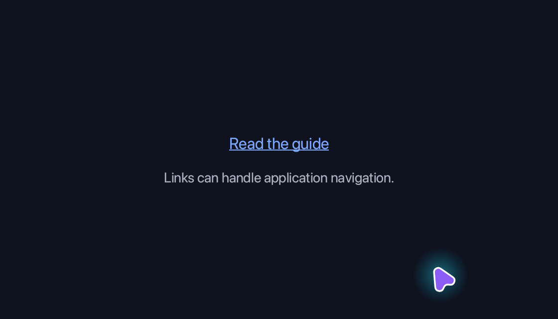
use blinc_core::reactive::{Signal, computed};
use blinc_layout::{binding::IntoReactive, prelude::*};

pub fn link_demo(confirmed: Signal<bool>) -> Div {
    let clicked = confirmed;
    div()
        .class("demo-stack")
        .class("demo-stack--center")
        .child(
            link("Read the guide", "https://blinc.rs/components/installation/")
                .underline_on_hover()
                .on_click(move |_, _| clicked.set(true))
                .id("demo-action"),
        )
        .child(
            bound_text(computed(move |g| {
                if g.get(clicked).unwrap_or(false) {
                    "Link activated"
                } else {
                    "Links can handle application navigation."
                }
                .into()
            }))
            .class("demo-caption"),
        )
}

fn bound_text(value: impl IntoReactive<String>) -> Text {
    Text::bound(value.into_reactive())
}
@layer components {
  .blinc-link {
    color: var(--text-link);
  }

  .blinc-link:hover {
    color: var(--primary-hover);
  }

  .blinc-link:focus-visible {
    outline: 2px solid var(--focus-ring);
    outline-offset: 2px;
  }
}
Usage and properties
Connect content with an accessible, theme-aware inline link. This built-in widget is provided by blinc_layout; the polished action controls in the example use blinc_cn.
Use the installation guide to create a Blinc application. This widget is available from blinc_layout; the demo uses the same Hybrid theme as the component library. Create the fixture bindings once, and return the demo from your UI builder. Values marked Bound accept Signal/Computed sources where the API supports them; structural options configure the component at construction.
| Property | Type | Update model | This example |
|---|---|---|---|
label / url | strings | Construction | Read the guide / installation |
on_click | Fn(&str, &EventContext) | Callback | Updates the in-app feedback label |
Keyboard and interaction
Tab reaches a link; Enter or Space follows it. :focus-visible marks keyboard focus.
Customizing it
Add application CSS after the default component layer. These selectors are the restyling surface for this component:
.blinc-link
Theme and component variables: --primary, --text-primary, --text-secondary, --surface, --border, --radius-default, --duration-fast, --ease-state.
Built-in themes
The Live theme control installs Blinc's own theme bundles, including their colours, focus rings, corner shapes and motion tokens.
pub fn theme_bundle_for(name: &str) -> blinc_theme::ThemeBundle {
    match name {
        "restrained" => blinc_theme::RestrainedTheme::bundle(),
        "expressive" => blinc_theme::ExpressiveTheme::bundle(),
        _ => blinc_theme::HybridTheme::bundle(),
    }
    .with_css(blinc_cn::cn_styles::CN_STYLES)
}
Download the default widget and component stylesheets. Sample assets and licenses are available in the asset guide.
Documentation
From the canonical component guide.
Blinc provides two main elements for displaying text: text() for plain text and rich_text() for inline-formatted text with HTML-like markup.
For headings, paragraphs, captions and inline composition, see the Typography helpers guide.
Plain Text
The text() element is the simplest way to display text:
use blinc::layout::prelude::*;

// Basic text
text("Hello, World!")

// Styled text
text("Styled text")
    .size(24.0)
    .color(Color::BLUE)
    .bold()
    .italic()

// Text with decorations
text("Underlined and struck")
    .underline()
    .strikethrough()
Text Properties
| Method | Description |
|---|---|
.size(f32) | Font size in pixels |
.color(Color) | Text color |
.bold() | Bold weight |
.italic() | Italic style |
.underline() | Underline decoration |
.strikethrough() | Strikethrough decoration |
.align(TextAlign) | Horizontal alignment (Left, Center, Right) |
.v_align(TextVerticalAlign) | Vertical alignment (Top, Middle, Bottom) |
.font_family(FontFamily) | Custom font family |
.line_height(f32) | Line height multiplier (default: 1.2) |
.wrap(bool) | Enable/disable text wrapping |
Rich Text
The rich_text() element supports inline formatting using HTML-like tags. This is ideal for text that needs mixed styling within a single block.
use blinc::layout::prelude::*;

// Basic formatting
rich_text("This has <b>bold</b> and <i>italic</i> text.")
    .size(16.0)
    .default_color(Color::WHITE)

// Nested tags
rich_text("<b>Bold with <i>nested italic</i></b>")

// Inline colors
rich_text(r#"Colors: <span color="#FF0000">red</span> and <span color="blue">blue</span>"#)

// Links (clickable, opens in browser)
rich_text(r#"Visit <a href="https://example.com">our website</a> for more info."#)
Supported Tags
| Tag | Effect |
|---|---|
<b>, <strong> | Bold text |
<i>, <em> | Italic text |
<u> | Underlined text |
<s>, <strike>, <del> | Strikethrough text |
<a href="url"> | Clickable link (auto-underlined) |
<span color="..."> | Inline color |
Color Formats
The <span color="..."> tag supports multiple color formats:
// Hex colors
rich_text(r#"<span color="#FF0000">Red</span>"#)
rich_text(r#"<span color="#F00">Short hex</span>"#)
rich_text(r#"<span color="#FF000080">With alpha</span>"#)

// Named colors (CSS subset)
rich_text(r#"<span color="crimson">Crimson</span>"#)
rich_text(r#"<span color="steelblue">Steel Blue</span>"#)

// RGB/RGBA
rich_text(r#"<span color="rgb(255, 128, 0)">Orange</span>"#)
Supported named colors: black, white, red, green, blue, yellow, cyan, magenta, gray, silver, maroon, olive, navy, purple, teal, orange, pink, brown, lime, coral, gold, indigo, violet, crimson, salmon, tomato, skyblue, steelblue, transparent
HTML Entity Decoding
Rich text automatically decodes common HTML entities:
rich_text("Use <b> for bold") // Renders: Use <b> for bold
rich_text("© 2024 • All Rights Reserved ™")
rich_text("“Smart quotes” — and …")
Supported entities: <, >, &, ", ', , ©, ®, ™, —, –, …, ‘, ’, “, ”, •, ·, and numeric entities (A, A)
Range-Based API
For programmatic control, use the range-based API with byte indices:
// Style specific byte ranges
rich_text("Hello World")
    .bold_range(0..5)           // "Hello" is bold
    .color_range(6..11, Color::CYAN)  // "World" is cyan
    .size(18.0)
    .default_color(Color::WHITE)

// Multiple overlapping styles
rich_text("Important Notice: Please read carefully!")
    .bold_range(0..16)           // "Important Notice" bold
    .color_range(0..9, Color::ORANGE)  // "Important" orange
    .underline_range(18..39)     // "Please read carefully" underlined
Available range methods:
.bold_range(Range<usize>).italic_range(Range<usize>).underline_range(Range<usize>).strikethrough_range(Range<usize>).color_range(Range<usize>, Color).link_range(Range<usize>, url: &str)
Interactive Links
Links in rich text are fully interactive:
- Click to open: Clicking a link opens the URL in the system's default browser
- Pointer cursor: The cursor changes to a pointer when hovering over links
- Auto-underlined: Links are automatically underlined for visibility
rich_text(r#"
    Check the <a href="https://docs.example.com">documentation</a>
    or view the <a href="https://github.com/example">source code</a>.
"#)
    .size(14.0)
    .default_color(Color::WHITE)
Standalone Links
For simple clickable text, use the link() widget:
// Default behavior - opens URL in browser
link("Click here", "https://example.com")

// Custom styling
link("Styled link", "https://example.com")
    .font_size(18.0)
    .text_color(Color::CYAN)
    .no_underline()

// Underline only on hover
link("Hover to see underline", "https://example.com")
    .underline_on_hover()
Default colours
Links, blockquotes, rules, lists and tables take their colours from the default stylesheet's rules, so a stylesheet restyles them:
| Class | Element | Default |
|---|---|---|
blinc-link | a link() | --text-link, --primary-hover on hover |
blinc-blockquote | a blockquote() | --surface-overlay fill, --border left edge |
blinc-hr | an hr() | --border |
blinc-list-marker | a bullet or number | --text-tertiary |
blinc-task-box | a task item's box, checked when done | --text-tertiary |
blinc-thead, blinc-tfoot | a table's head and foot | --surface-overlay |
blinc-th, blinc-td | text from th_text(), td_text() | --text-primary, --text-secondary |
blinc-tr-alt | an odd row from striped_tr() | --accent-subtle |
.blinc-link { color: #0ea5e9; }
.blinc-tr-alt { background: transparent; }
A colour given to the widget (text_color, hr_color, header_bg, a config
colour) is set on the element and wins over the rule.
From StyledText
For integration with syntax highlighting or markdown rendering, create rich text from a pre-built StyledText:
use blinc::layout::styled_text::{StyledText, StyledLine, TextSpan};

let styled = StyledText {
    lines: vec![
        StyledLine {
            text: "Hello World".to_string(),
            spans: vec![
                TextSpan {
                    start: 0,
                    end: 5,
                    bold: true,
                    color: Color::RED,
                    ..Default::default()
                },
            ],
        },
    ],
};

rich_text_styled(styled)
    .size(16.0)
    .default_color(Color::WHITE)
Example
Here's a complete example demonstrating various text features:
use blinc::app::prelude::*;
use blinc::core::Color;

fn demo_ui() -> impl ElementBuilder {
    div()
        .flex_col()
        .gap(16.0)
        .p(20.0)
        // Plain text
        .child(
            text("Plain Text Example")
                .size(24.0)
                .color(Color::WHITE)
                .bold()
        )
        // Rich text with inline formatting
        .child(
            rich_text("This is <b>bold</b>, <i>italic</i>, and <span color=\"#00FF00\">green</span>.")
                .size(16.0)
                .default_color(Color::WHITE)
        )
        // Interactive link
        .child(
            rich_text(r#"Visit <a href="https://github.com">GitHub</a> for more."#)
                .size(16.0)
                .default_color(Color::WHITE)
        )
        // Range-based styling
        .child(
            rich_text("Programmatic styling with ranges")
                .bold_range(0..13)
                .color_range(14..21, Color::CYAN)
                .underline_range(22..32)
                .size(16.0)
                .default_color(Color::WHITE)
        )
}
Run the rich text demo to see all features in action:
cargo run -p blinc_app_examples --example rich_text_demo --features windowed
Platforms and version
The component API is available in Blinc 0.6.0. The Live example runs in a dedicated worker and requires a compatible GPU surface. Preview and Code remain available when Live cannot start. The canvas has a descriptive label; a full screen-reader DOM mirror is not provided. The gallery integration is based on revision e2e55c24e078.
Recordings and live demos use the default Hybrid theme with bundled Noto Sans. The recording uses a 560 × 320 logical viewport at twice that resolution. Live follows its container and actual display density. Source base revision · Exact build source · Artifact versions and checksums · Font license.