
Motion
Reveal a workspace activity feed with staggered entrance and fade-out motion.
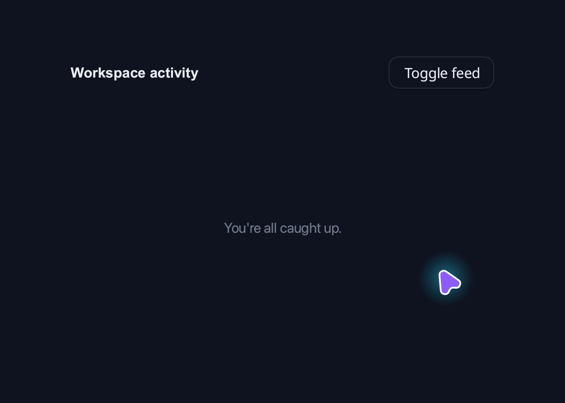
use blinc_cn as cn;
use blinc_core::reactive::Signal;
use blinc_layout::prelude::*;

pub fn motion_demo(confirmed: Signal<bool>) -> Div {
    use blinc_animation::AnimationPreset;
    use blinc_layout::motion::StaggerConfig;
    let visible = confirmed;
    div()
        .class("demo-wide")
        .class("demo-activity")
        .child(
            div()
                .class("demo-activity-heading")
                .child(text("Workspace activity").class("demo-label"))
                .child(
                    cn::button("Toggle feed")
                        .variant(cn::ButtonVariant::Outline)
                        .on_click(move |_| visible.set(!visible.get()))
                        .build_component()
                        .id("demo-action"),
                ),
        )
        .child(div().class("demo-activity-feed").show_or(
            visible,
            || {
                motion()
                    .id("demo-activity-motion")
                    .gap(8.0)
                    .stagger(StaggerConfig::new(90, AnimationPreset::fade_in(320)))
                    .exit_animation(AnimationPreset::fade_out(180))
                    .children(
                        [
                            ("Design review", "Maya shared the updated layouts", "2 min ago"),
                            ("Build passed", "All checks are ready for review", "8 min ago"),
                            ("Release notes", "Alex added the latest changes", "15 min ago"),
                        ]
                        .map(|(title, detail, time)| {
                            div()
                                .class("demo-activity-item")
                                .child(text(title).class("demo-label"))
                                .child(text(detail).class("demo-caption"))
                                .child(text(time).class("demo-activity-time"))
                        }),
                    )
            },
            || {
                div()
                    .class("demo-activity-empty")
                    .child(text("You're all caught up.").class("demo-caption"))
            },
        ))
}
Usage and properties
Replay declarative motion through CSS and bound attributes. This built-in widget is provided by blinc_layout; the polished action controls in the example use blinc_cn.
Use the installation guide to create a Blinc application. This widget is available from blinc_layout; the demo uses the same Hybrid theme as the component library. Create the fixture bindings once, and return the demo from your UI builder. Values marked Bound accept Signal/Computed sources where the API supports them; structural options configure the component at construction.
| Property | Type | Update model | This example |
|---|---|---|---|
data-replay | Signal<bool> and Computed<bool> | Bound | Alternates between two CSS animation names |
id | string | Construction | gallery-motion |
Keyboard and interaction
Use the control’s documented keyboard commands; Tab reaches enabled controls and :focus-visible marks keyboard focus.
Customizing it
Add application CSS after the default component layer. These selectors are the restyling surface for this component:
.demo-activity.demo-activity-heading.demo-activity-item.demo-activity-time
Theme and component variables: --primary, --text-primary, --text-secondary, --surface, --border, --radius-default, --duration-fast, --ease-state.
Built-in themes
The Live theme control installs Blinc's own theme bundles, including their colours, focus rings, corner shapes and motion tokens.
pub fn theme_bundle_for(name: &str) -> blinc_theme::ThemeBundle {
    match name {
        "restrained" => blinc_theme::RestrainedTheme::bundle(),
        "expressive" => blinc_theme::ExpressiveTheme::bundle(),
        _ => blinc_theme::HybridTheme::bundle(),
    }
    .with_css(blinc_cn::cn_styles::CN_STYLES)
}
Download the default widget and component stylesheets. Sample assets and licenses are available in the asset guide.
Documentation
From the canonical component guide.
The motion() element provides declarative enter/exit animations for content. It's ideal for animated lists, page transitions, and conditional rendering.
Basic Usage
use blinc::layout::motion::motion;

motion()
    .fade_in(300)     // Duration in milliseconds
    .child(my_content())
Animation Presets
Fade
motion()
    .fade_in(300)
    .fade_out(200)
    .child(content)
Scale
motion()
    .scale_in(300)    // Scale from 0 to 1
    .scale_out(200)   // Scale from 1 to 0
    .child(content)
Slide
use blinc::layout::motion::SlideDirection;

motion()
    .slide_in(SlideDirection::Left, 300)
    .slide_out(SlideDirection::Right, 200)
    .child(content)

// Available directions:
// SlideDirection::Top
// SlideDirection::Bottom
// SlideDirection::Left
// SlideDirection::Right
Bounce
motion()
    .bounce_in(400)   // Bouncy entrance
    .bounce_out(200)
    .child(content)
Pop
motion()
    .pop_in(300)      // Scale with overshoot
    .pop_out(200)
    .child(content)
Combining Animations
Apply multiple effects:
motion()
    .fade_in(300)
    .scale_in(300)
    .child(content)
Staggered Lists
Animate list items with delays between each:
use blinc::layout::motion::{motion, StaggerConfig, AnimationPreset};

let items = vec!["Item 1", "Item 2", "Item 3", "Item 4"];

motion()
    .stagger(
        StaggerConfig::new(100, AnimationPreset::fade_in(300))
    )
    .children(
        items.iter().map(|item| {
            div()
                .p(12.0)
                .bg(Color::rgba(0.2, 0.2, 0.25, 1.0))
                .child(text(*item).color(Color::WHITE))
        })
    )
Stagger Configuration
StaggerConfig::new(delay_ms, preset)
    .reverse()          // Animate last to first
    .from_center()      // Animate from center outward
    .limit(10)          // Only stagger first N items
Stagger Directions
// Forward (default): 0, 1, 2, 3, 4...
StaggerConfig::new(100, preset)

// Reverse: 4, 3, 2, 1, 0...
StaggerConfig::new(100, preset).reverse()

// From center: 2, 1/3, 0/4 (for 5 items)
StaggerConfig::new(100, preset).from_center()
Binding to AnimatedValue
For continuous animation control, bind motion transforms to AnimatedValue:
fn pull_to_refresh(ctx: &WindowedContext) -> impl ElementBuilder {
    let offset_y = ctx.use_animated_value(0.0, SpringConfig::wobbly());
    let icon_scale = ctx.use_animated_value(0.5, SpringConfig::snappy());
    let icon_opacity = ctx.use_animated_value(0.0, SpringConfig::snappy());

    stack()
        // Refresh icon (behind content)
        .child(
            motion()
                .scale(icon_scale.clone())
                .opacity(icon_opacity.clone())
                .child(refresh_icon())
        )
        // Content (translates down to reveal icon)
        .child(
            motion()
                .translate_y(offset_y.clone())
                .child(content_list())
        )
}
Example: Animated Card List
Use a stateful element with .deps() to react to visibility state changes:
fn animated_card_list(show_cards: State<bool>) -> impl ElementBuilder {
    stateful::<ButtonState>()
        .flex_col()
        .gap(16.0)
        .deps([show_cards.signal_id()])
        .on_state(move |ctx| {
            let visible = show_cards.get();
            let label = if visible { "Hide Cards" } else { "Show Cards" };

            let bg = match ctx.state() {
                ButtonState::Idle => Color::rgba(0.3, 0.5, 0.9, 1.0),
                ButtonState::Hovered => Color::rgba(0.4, 0.6, 1.0, 1.0),
                _ => Color::rgba(0.3, 0.5, 0.9, 1.0),
            };

            div().bg(bg).px(16.0).py(8.0).rounded(8.0)
                .child(text(label).color(Color::WHITE))
        })
        .on_click(move |_| {
            show_cards.update(|v| !v);
        })
        .child(card_list())
}

fn card_list() -> impl ElementBuilder {
    // Cards with staggered animation
    motion()
        .stagger(StaggerConfig::new(80, AnimationPreset::fade_in(300)))
        .children(
            (0..5).map(|i| {
                div()
                    .w(300.0)
                    .p(16.0)
                    .rounded(12.0)
                    .bg(Color::rgba(0.15, 0.15, 0.2, 1.0))
                    .child(text(&format!("Card {}", i + 1)).color(Color::WHITE))
            })
        )
}
Example: Page Transition
Use a custom state type for page navigation:
use blinc::layout::stateful::{stateful, StateTransitions};

#[derive(Clone, Copy, PartialEq, Eq, Hash, Default)]
enum Page {
    #[default]
    Home,
    Settings,
    Profile,
}

// Pages don't auto-transition - we change them programmatically
impl StateTransitions for Page {
    fn on_event(&self, _event: u32) -> Option<Self> {
        None  // No automatic transitions
    }
}

fn page_transition(current_page: State<u8>) -> impl ElementBuilder {
    stateful::<NoState>()
        .w_full()
        .h_full()
        .deps([current_page.signal_id()])
        .on_state(move |_ctx| {
            // Render different content based on current page signal
            let content = match current_page.get() {
                0 => div().child(text("Home Page").color(Color::WHITE)),
                1 => div().child(text("Settings Page").color(Color::WHITE)),
                _ => div().child(text("Profile Page").color(Color::WHITE)),
            };

            div().child(
                motion()
                    .fade_in(200)
                    .slide_in(SlideDirection::Right, 200)
                    .child(content)
            )
        })
}

// Navigate programmatically using a shared signal
fn nav_button(current_page: State<u8>, target: u8, label: &str) -> impl ElementBuilder {
    stateful::<ButtonState>()
        .px(16.0)
        .py(8.0)
        .rounded(8.0)
        .on_state(|ctx| {
            let bg = match ctx.state() {
                ButtonState::Idle => Color::rgba(0.3, 0.5, 0.9, 1.0),
                ButtonState::Hovered => Color::rgba(0.4, 0.6, 1.0, 1.0),
                _ => Color::rgba(0.3, 0.5, 0.9, 1.0),
            };
            div().bg(bg)
        })
        .on_click(move |_| {
            current_page.set(target);
        })
        .child(text(label).color(Color::WHITE))
}
Motion vs Manual Animation
| Feature | Motion | AnimatedValue |
|---|---|---|
| Setup | Declarative | Imperative |
| Control | Preset-based | Full control |
| Enter/Exit | Built-in | Manual |
| Lists | Stagger support | Manual delays |
| Use case | Transitions | Interactive |
Use motion for:
- List item animations
- Page transitions
- Conditional content
- Staggered reveals
Use AnimatedValue for:
- Drag interactions
- Hover effects
- Custom physics
- Continuous binding
Platforms and version
The component API is available in Blinc 0.6.0. The Live example runs in a dedicated worker and requires a compatible GPU surface. Preview and Code remain available when Live cannot start. The canvas has a descriptive label; a full screen-reader DOM mirror is not provided. The gallery integration is based on revision e2e55c24e078.
Recordings and live demos use the default Hybrid theme with bundled Noto Sans. The recording uses a 560 × 400 logical viewport at twice that resolution. Live follows its container and actual display density. Source base revision · Exact build source · Artifact versions and checksums · Font license.