
Notch
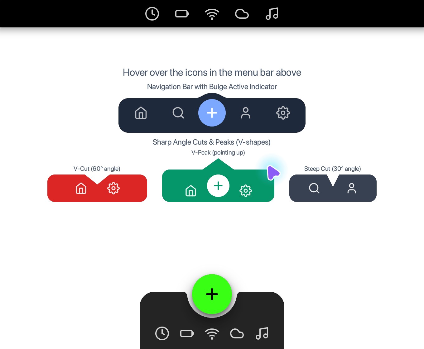
Explore the interactive notched menu bar, bulge navigation, angle cuts and scooped dock from the Notch example.
use blinc_animation::SpringConfig;
use blinc_app::prelude::*;
use blinc_core::{Color, Shadow};
use blinc_layout::prelude::*;
use blinc_layout::stateful::NoState;
use blinc_theme::{ColorToken, ThemeState};
const MENU_BAR_HEIGHT: f32 = 44.0;
const ICON_SIZE: f32 = 24.0;
const ICON_GAP: f32 = 16.0;
const DOCK_PADDING: f32 = 24.0;
const DOCK_BUTTON_SIZE: f32 = 64.0;
fn notch_radius() -> f32 {
blinc_layout::css_parser::active_stylesheet()
.and_then(|s| s.get_variable("--gallery-notch-radius").map(str::to_owned))
.and_then(|s| s.trim().trim_end_matches("px").parse::<f32>().ok())
.filter(|r| r.is_finite() && *r >= 8.0 && *r <= 40.0)
.unwrap_or(32.0)
}
fn notch_ink(token: &str, fallback: Color) -> Color {
blinc_layout::css_parser::active_stylesheet()
.and_then(|s| s.resolve_color(&format!("var({token})")))
.unwrap_or(fallback)
}
const DROPDOWN_BODY_HEIGHT: f32 = 20.0;
const DROPDOWN_WIDTH: f32 = 340.0;
fn dropdown_full_height() -> f32 {
DROPDOWN_BODY_HEIGHT + notch_radius() * 2.0
}
fn menu_stack_height() -> f32 {
MENU_BAR_HEIGHT + DROPDOWN_BODY_HEIGHT + notch_radius() + 10.0
}
const CLOCK_SVG: &str = r#"<svg xmlns="http://www.w3.org/2000/svg" width="24" height="24" viewBox="0 0 24 24" fill="none" stroke="currentColor" stroke-width="2" stroke-linecap="round" stroke-linejoin="round"><circle cx="12" cy="12" r="10"/><polyline points="12 6 12 12 16 14"/></svg>"#;
const BATTERY_SVG: &str = r#"<svg xmlns="http://www.w3.org/2000/svg" width="24" height="24" viewBox="0 0 24 24" fill="none" stroke="currentColor" stroke-width="2" stroke-linecap="round" stroke-linejoin="round"><rect x="2" y="7" width="18" height="10" rx="2" ry="2"/><line x1="22" y1="11" x2="22" y2="13"/></svg>"#;
const WIFI_SVG: &str = r#"<svg xmlns="http://www.w3.org/2000/svg" width="24" height="24" viewBox="0 0 24 24" fill="none" stroke="currentColor" stroke-width="2" stroke-linecap="round" stroke-linejoin="round"><path d="M5 12.55a11 11 0 0 1 14.08 0"/><path d="M1.42 9a16 16 0 0 1 21.16 0"/><path d="M8.53 16.11a6 6 0 0 1 6.95 0"/><circle cx="12" cy="20" r="1"/></svg>"#;
const WEATHER_SVG: &str = r#"<svg xmlns="http://www.w3.org/2000/svg" width="24" height="24" viewBox="0 0 24 24" fill="none" stroke="currentColor" stroke-width="2" stroke-linecap="round" stroke-linejoin="round"><path d="M17.5 19H9a7 7 0 1 1 6.71-9h1.79a4.5 4.5 0 1 1 0 9Z"/></svg>"#;
const MUSIC_SVG: &str = r#"<svg xmlns="http://www.w3.org/2000/svg" width="24" height="24" viewBox="0 0 24 24" fill="none" stroke="currentColor" stroke-width="2" stroke-linecap="round" stroke-linejoin="round"><path d="M9 18V5l12-2v13"/><circle cx="6" cy="18" r="3"/><circle cx="18" cy="16" r="3"/></svg>"#;
const PLUS_SVG: &str = r#"<svg xmlns="http://www.w3.org/2000/svg" width="24" height="24" viewBox="0 0 24 24" fill="none" stroke="currentColor" stroke-width="2.5" stroke-linecap="round" stroke-linejoin="round"><line x1="12" y1="5" x2="12" y2="19"/><line x1="5" y1="12" x2="19" y2="12"/></svg>"#;
const HOME_SVG: &str = r#"<svg xmlns="http://www.w3.org/2000/svg" width="24" height="24" viewBox="0 0 24 24" fill="none" stroke="currentColor" stroke-width="2" stroke-linecap="round" stroke-linejoin="round"><path d="m3 9 9-7 9 7v11a2 2 0 0 1-2 2H5a2 2 0 0 1-2-2z"/><polyline points="9 22 9 12 15 12 15 22"/></svg>"#;
const SEARCH_SVG: &str = r#"<svg xmlns="http://www.w3.org/2000/svg" width="24" height="24" viewBox="0 0 24 24" fill="none" stroke="currentColor" stroke-width="2" stroke-linecap="round" stroke-linejoin="round"><circle cx="11" cy="11" r="8"/><path d="m21 21-4.3-4.3"/></svg>"#;
const USER_SVG: &str = r#"<svg xmlns="http://www.w3.org/2000/svg" width="24" height="24" viewBox="0 0 24 24" fill="none" stroke="currentColor" stroke-width="2" stroke-linecap="round" stroke-linejoin="round"><path d="M19 21v-2a4 4 0 0 0-4-4H9a4 4 0 0 0-4 4v2"/><circle cx="12" cy="7" r="4"/></svg>"#;
const SETTINGS_SVG: &str = r#"<svg xmlns="http://www.w3.org/2000/svg" width="24" height="24" viewBox="0 0 24 24" fill="none" stroke="currentColor" stroke-width="2" stroke-linecap="round" stroke-linejoin="round"><circle cx="12" cy="12" r="3"/><path d="M19.4 15a1.65 1.65 0 0 0 .33 1.82l.06.06a2 2 0 0 1 0 2.83 2 2 0 0 1-2.83 0l-.06-.06a1.65 1.65 0 0 0-1.82-.33 1.65 1.65 0 0 0-1 1.51V21a2 2 0 0 1-2 2 2 2 0 0 1-2-2v-.09A1.65 1.65 0 0 0 9 19.4a1.65 1.65 0 0 0-1.82.33l-.06.06a2 2 0 0 1-2.83 0 2 2 0 0 1 0-2.83l.06-.06a1.65 1.65 0 0 0 .33-1.82 1.65 1.65 0 0 0-1.51-1H3a2 2 0 0 1-2-2 2 2 0 0 1 2-2h.09A1.65 1.65 0 0 0 4.6 9a1.65 1.65 0 0 0-.33-1.82l-.06-.06a2 2 0 0 1 0-2.83 2 2 0 0 1 2.83 0l.06.06a1.65 1.65 0 0 0 1.82.33H9a1.65 1.65 0 0 0 1-1.51V3a2 2 0 0 1 2-2 2 2 0 0 1 2 2v.09a1.65 1.65 0 0 0 1 1.51 1.65 1.65 0 0 0 1.82-.33l.06-.06a2 2 0 0 1 2.83 0 2 2 0 0 1 0 2.83l-.06.06a1.65 1.65 0 0 0-.33 1.82V9a1.65 1.65 0 0 0 1.51 1H21a2 2 0 0 1 2 2 2 2 0 0 1-2 2h-.09a1.65 1.65 0 0 0-1.51 1z"/></svg>"#;
#[derive(Clone, Copy, PartialEq, Eq, Debug)]
enum MenuItem {
Clock,
Battery,
Wifi,
Weather,
Music,
}
impl MenuItem {
const ALL: [MenuItem; 5] = [Self::Clock, Self::Battery, Self::Wifi, Self::Weather, Self::Music];
fn icon_svg(self) -> &'static str {
match self {
Self::Clock => CLOCK_SVG,
Self::Battery => BATTERY_SVG,
Self::Wifi => WIFI_SVG,
Self::Weather => WEATHER_SVG,
Self::Music => MUSIC_SVG,
}
}
}
#[derive(Clone, Copy, Debug, Default)]
struct DropdownState {
item: Option<MenuItem>,
center_x: f32,
}
pub fn notch_demo(viewport: (f32, f32)) -> Div {
let theme = ThemeState::get();
let text_secondary = theme.color(ColorToken::TextSecondary);
div()
.class("demo-notch-stage")
.w(viewport.0)
.h(viewport.1)
.flex_col()
.child(menu_bar_section(viewport.0))
.child(
div()
.w_full()
.flex_grow()
.min_h(0.0)
.overflow_y_scroll()
.flex_col()
.items_center()
.justify_start()
.gap_px(6.0)
.child(
text("Hover over the icons in the menu bar above")
.size(16.0)
.class("demo-notch-label")
.color(text_secondary),
)
.child(labeled_section(
"Navigation Bar with Bulge Active Indicator",
text_secondary,
active_nav_bar(),
))
.child(labeled_section(
"Sharp Angle Cuts & Peaks (V-shapes)",
text_secondary,
sharp_angle_demo(),
)),
)
.child(bottom_dock_bar())
}
fn labeled_section<C: ElementBuilder + 'static>(
label: &'static str,
label_color: Color,
content: C,
) -> impl ElementBuilder + use<C> {
div()
.flex_col()
.items_center()
.gap_px(4.0)
.child(text(label).size(12.0).color(label_color).class("demo-notch-label"))
.child(content)
}
fn menu_bar_section(viewport_width: f32) -> impl ElementBuilder + use<> {
stateful::<NoState>().on_state(move |ctx| {
let state = ctx
.use_signal::<DropdownState, _>("dropdown_state", DropdownState::default)
.signal();
let open_gen = ctx.use_signal("open_gen", || 0u32);
let was_open = ctx.use_signal("was_open", || false);
let snapshot = state.get();
let is_open = snapshot.item.is_some();
if is_open != was_open.get() {
was_open.set(is_open);
if is_open {
open_gen.set(open_gen.get() + 1);
}
}
let open_gen_id = open_gen.get();
let panel_width = DROPDOWN_WIDTH.min((viewport_width - notch_radius() * 2.0).max(1.0));
let target_width = if is_open { panel_width } else { panel_width * 0.3 };
let target_height = if is_open { dropdown_full_height() } else { 0.0 };
let center_x = ctx.use_spring(
&format!("dropdown_x_{open_gen_id}"),
snapshot.center_x,
SpringConfig::gentle(),
);
let dropdown_width = ctx.use_spring(
&format!("dropdown_w_{open_gen_id}"),
target_width,
SpringConfig::snappy(),
);
let dropdown_height = ctx.use_spring("dropdown_h", target_height, SpringConfig::snappy());
let opacity = (dropdown_height / 0.5).clamp(0.0, 1.0);
let menu_bar_bg = notch_ink("--gallery-notch-bar", Color::BLACK);
let state_for_leave = state.clone();
div().w_full().flex_shrink_0().child(
stack()
.w_full()
.h(menu_stack_height())
.child(menu_bar(&state, menu_bar_bg))
.when(dropdown_height > 0.6, |s| {
s.child(notched_dropdown(NotchedDropdownArgs {
item: snapshot.item,
viewport_width,
center_x,
width: dropdown_width.min(panel_width),
height: dropdown_height,
opacity,
bg: menu_bar_bg,
}))
})
.on_hover_leave(move |_| {
let mut s = state_for_leave.get();
s.item = None;
state_for_leave.set(s);
}),
)
})
}
fn menu_bar(state: &blinc_core::reactive::Signal<DropdownState>, bg: Color) -> Div {
let mut bar = div()
.w_full()
.h(MENU_BAR_HEIGHT)
.bg(bg)
.shadow(Shadow {
offset_x: 0.0,
offset_y: 4.0,
blur: 12.0,
spread: 0.0,
color: Color::BLACK.with_alpha(0.35),
})
.flex_row()
.items_center()
.justify_center()
.gap_px(ICON_GAP);
for item in MenuItem::ALL {
bar = bar.child(menu_icon_button(item, state.clone()));
}
bar
}
fn menu_icon_button(item: MenuItem, state: blinc_core::reactive::Signal<DropdownState>) -> impl ElementBuilder + use<> {
let state_for_hover = state;
div()
.class("demo-notch-icon")
.w(32.0)
.h(32.0)
.flex_row()
.items_center()
.justify_center()
.child(svg(item.icon_svg()).square(ICON_SIZE).class("demo-notch-glyph"))
.on_hover_enter(move |evt| {
state_for_hover.set(DropdownState {
item: Some(item),
center_x: evt.bounds_x + evt.bounds_width / 2.0,
});
})
}
struct NotchedDropdownArgs {
item: Option<MenuItem>,
viewport_width: f32,
center_x: f32,
width: f32,
height: f32,
opacity: f32,
bg: Color,
}
fn notched_dropdown(args: NotchedDropdownArgs) -> Notch {
let top_radius = notch_radius();
let bottom_radius = (notch_radius() - 16.0).max(8.0);
let height_ratio = (args.height / dropdown_full_height()).clamp(0.0, 1.0);
let left = (args.center_x - args.width / 2.0).clamp(
top_radius,
(args.viewport_width - args.width - top_radius).max(top_radius),
);
notch()
.concave_top(top_radius)
.rounded_bottom(bottom_radius)
.bg(args.bg)
.shadow(Shadow {
offset_x: 0.0,
offset_y: 6.0,
blur: 8.0,
spread: 0.0,
color: Color::BLACK.with_alpha(0.12),
})
.opacity(args.opacity)
.pointer_events_none()
.absolute()
.top(MENU_BAR_HEIGHT - top_radius)
.bottom(12.0)
.left(left)
.w(args.width)
.h(args.height)
.overflow_clip()
.pt(top_radius + 12.0 * height_ratio)
.pb(12.0 * height_ratio)
.px(16.0)
.child(
div()
.px(6.0)
.class("demo-notch-status")
.w_full()
.justify_center()
.overflow_clip()
.child(dropdown_content(args.item)),
)
}
fn dropdown_content(item: Option<MenuItem>) -> Div {
const TEXT_PRIMARY: Color = Color::WHITE;
let text_secondary = Color::rgba(1.0, 1.0, 1.0, 0.6);
match item {
Some(MenuItem::Clock) => labeled_row(
"Wed Nov 4",
Color::from_hex(0xf59e0b),
"10:42 AM",
TEXT_PRIMARY,
text_secondary,
),
Some(MenuItem::Battery) => labeled_row(
"Battery",
Color::from_hex(0x10b981),
"87% Charged",
TEXT_PRIMARY,
text_secondary,
),
Some(MenuItem::Wifi) => labeled_row(
"Network",
Color::from_hex(0x3b82f6),
"Home WiFi",
TEXT_PRIMARY,
text_secondary,
),
Some(MenuItem::Weather) => weather_row(text_secondary),
Some(MenuItem::Music) => music_row(text_secondary),
None => div(),
}
}
fn labeled_row(label: &str, label_color: Color, value: &str, value_color: Color, sep_color: Color) -> Div {
div()
.flex_row()
.items_center()
.justify_center()
.gap_px(8.0)
.overflow_clip()
.child(text(label).size(14.0).color(label_color))
.child(text("|").size(14.0).color(sep_color))
.child(text(value).size(14.0).color(value_color))
}
fn weather_row(text_secondary: Color) -> Div {
let cyan = Color::from_hex(0x06b6d4);
div()
.flex_row()
.gap_px(8.0)
.w_full()
.overflow_clip()
.justify_center()
.child(
div()
.flex_row()
.items_center()
.gap_px(8.0)
.child(svg(WEATHER_SVG).square(20.0).color(cyan))
.child(text("Cloudy").size(14.0).color(Color::WHITE)),
)
.child(text("|").size(14.0).color(text_secondary))
.child(
div()
.flex_row()
.items_center()
.gap_px(8.0)
.child(text("80°F").size(14.0).color(Color::WHITE))
.child(text("•").size(14.0).color(text_secondary))
.child(text("San Francisco").size(14.0).color(text_secondary)),
)
}
fn music_row(text_secondary: Color) -> Div {
let purple = Color::from_hex(0xa855f7);
let bar = |h: f32| div().w(3.0).h(h).bg(purple).rounded(1.0);
div()
.flex_col()
.gap_px(4.0)
.child(
div()
.flex_row()
.items_center()
.gap_px(8.0)
.child(
div()
.flex_row()
.items_end()
.gap_px(2.0)
.h(16.0)
.child(bar(8.0))
.child(bar(14.0))
.child(bar(10.0))
.child(bar(16.0)),
)
.child(text("Now Playing").size(12.0).color(text_secondary)),
)
.child(text("Ash Drive · Night Drive").size(14.0).color(Color::WHITE))
}
fn active_nav_bar() -> impl ElementBuilder + use<> {
let nav_bg = Color::from_hex(0x1e293b);
let active_bg = notch_ink("--gallery-notch-active", ThemeState::get().color(ColorToken::Primary));
let icon_color = Color::WHITE.with_alpha(0.7);
let bulge_height = 8.5;
let bulge_width = 40.0;
let bulge_corner_radius = 6.0;
div().flex_row().justify_center().child(
notch()
.center_bulge_top_rounded(bulge_width, bulge_height, bulge_corner_radius)
.rounded(16.0)
.bg(nav_bg)
.h(56.0 + bulge_height)
.px(8.0)
.flex_row()
.items_center()
.gap(4.0)
.child(nav_icon_cell(HOME_SVG, icon_color))
.child(nav_icon_cell(SEARCH_SVG, icon_color))
.child(
div()
.w(44.0)
.h(44.0)
.rounded_full()
.bg(active_bg)
.flex()
.items_center()
.justify_center()
.child(svg(PLUS_SVG).square(24.0).color(Color::WHITE)),
)
.child(nav_icon_cell(USER_SVG, icon_color))
.child(nav_icon_cell(SETTINGS_SVG, icon_color)),
)
}
fn nav_icon_cell(svg_src: &'static str, color: Color) -> Div {
div()
.w(56.0)
.h(44.0)
.flex()
.items_center()
.justify_center()
.child(svg(svg_src).square(22.0).color(color))
}
fn sharp_angle_demo() -> impl ElementBuilder + use<> {
let bar_bg = Color::from_hex(0x374151);
let peak_bg = Color::from_hex(0x059669);
let cut_bg = Color::from_hex(0xdc2626);
let icon_color = Color::WHITE.with_alpha(0.9);
div()
.flex_row()
.items_end()
.justify_center()
.flex_wrap()
.w_full()
.gap_px(24.0)
.child(labeled_demo(
"V-Cut (60° angle)",
notch()
.center_cut_top(40.0, 16.0)
.rounded(12.0)
.bg(cut_bg)
.w(160.0)
.h(44.0)
.flex_row()
.items_center()
.justify_center()
.gap(32.0)
.child(svg(HOME_SVG).square(20.0).color(icon_color))
.child(svg(SETTINGS_SVG).square(20.0).color(icon_color)),
))
.child(labeled_demo(
"V-Peak (pointing up)",
div().h(70.0).child(
notch()
.center_peak_top(50.0, 18.0)
.rounded(12.0)
.bg(peak_bg)
.w(180.0)
.h(52.0 + 18.0)
.flex_row()
.items_end()
.justify_center()
.pb(8.0)
.gap(16.0)
.child(svg(HOME_SVG).square(20.0).color(icon_color))
.child(
div()
.w(36.0)
.h(36.0)
.rounded_full()
.bg(Color::WHITE)
.flex()
.items_center()
.justify_center()
.child(svg(PLUS_SVG).square(20.0).color(peak_bg)),
)
.child(svg(SETTINGS_SVG).square(20.0).color(icon_color)),
),
))
.child(labeled_demo(
"Steep Cut (30° angle)",
notch()
.center_cut_top(20.0, 20.0)
.rounded(12.0)
.bg(bar_bg)
.w(140.0)
.h(44.0)
.flex_row()
.items_center()
.justify_center()
.gap(40.0)
.child(svg(SEARCH_SVG).square(20.0).color(icon_color))
.child(svg(USER_SVG).square(20.0).color(icon_color)),
))
}
fn labeled_demo<D: ElementBuilder + 'static>(label: &'static str, demo: D) -> impl ElementBuilder + use<D> {
div()
.flex_col()
.items_center()
.gap_px(4.0)
.child(text(label).size(10.0).class("demo-notch-label"))
.child(demo)
}
fn bottom_dock_bar() -> impl ElementBuilder + use<> {
let dock_bg = Color::rgba(0.1, 0.1, 0.1, 0.95);
let icon_color = Color::rgba(1.0, 1.0, 1.0, 0.8);
let scoop_width: f32 = 80.0;
let scoop_depth: f32 = 42.0;
let scoop_corner_radius = 8.0;
div()
.class("demo-notch-dock")
.w_full()
.flex_shrink_0()
.flex_row()
.justify_center()
.child(
notch()
.center_scoop_top_rounded(scoop_width, scoop_depth, scoop_corner_radius)
.rounded_top(24.0)
.bg(dock_bg)
.w_fit()
.h(50.0 + scoop_depth)
.child(dock_icon_row(icon_color))
.child(dock_fab()),
)
}
fn dock_icon_row(icon_color: Color) -> Div {
div()
.w_full()
.flex_row()
.items_center()
.justify_center()
.gap_px(ICON_GAP)
.p_px(DOCK_PADDING)
.child(svg(CLOCK_SVG).square(ICON_SIZE).color(icon_color))
.child(svg(BATTERY_SVG).square(ICON_SIZE).color(icon_color))
.child(svg(WIFI_SVG).square(ICON_SIZE).color(icon_color))
.child(svg(WEATHER_SVG).square(ICON_SIZE).color(icon_color))
.child(svg(MUSIC_SVG).square(ICON_SIZE).color(icon_color))
}
fn dock_fab() -> Div {
div()
.absolute()
.top(-28.0)
.left(
(MenuItem::ALL.len() as f32 * ICON_SIZE + (MenuItem::ALL.len() - 1) as f32 * ICON_GAP + DOCK_PADDING * 2.0
- DOCK_BUTTON_SIZE)
/ 2.0,
)
.rounded_full()
.w(64.0)
.h(64.0)
.bg(Color::from_hex(0x39FF14))
.shadow_lg()
.flex()
.items_center()
.justify_center()
.child(svg(PLUS_SVG).square(28.0).color(Color::BLACK))
}
Usage and properties
The original Notch example combines concave corners, bulges, cuts, peaks and a scooped dock. Hover the menu icons to reveal their status; the middle examples scroll in shorter viewports.
Use the installation guide to create a Blinc application. This widget is available from blinc_layout; the demo uses the same Hybrid theme as the component library. Create the fixture bindings once, and return the demo from your UI builder. Values marked Bound accept Signal/Computed sources where the API supports them; structural options configure the component at construction.
| Property | Type | Update model | This example |
|---|---|---|---|
concave_top / rounded_bottom | f32 | Construction | 32 / 16 |
center_scoop_top_rounded | width, depth, radius | Construction | 80, 42, 8 |
Keyboard and interaction
Informational content; no activation or Tab stop is required.
Customizing it
Add application CSS after the default component layer. These selectors are the restyling surface for this component:
.demo-notch-icon.demo-notch-status.demo-notch-dock.demo-notch-stage.demo-notch-label.demo-notch-glyph
Theme and component variables: --gallery-notch-radius (8–40px), --gallery-notch-bar and --gallery-notch-active. Shape tokens are read when the UI refreshes, keeping the existing spring and hover behaviour..
Built-in themes
The Live theme control installs Blinc's own theme bundles, including their colours, focus rings, corner shapes and motion tokens.
pub fn theme_bundle_for(name: &str) -> blinc_theme::ThemeBundle {
    match name {
        "restrained" => blinc_theme::RestrainedTheme::bundle(),
        "expressive" => blinc_theme::ExpressiveTheme::bundle(),
        _ => blinc_theme::HybridTheme::bundle(),
    }
    .with_css(blinc_cn::cn_styles::CN_STYLES)
}
Download the default widget and component stylesheets. Sample assets and licenses are available in the asset guide.
Documentation
From the canonical component guide.
notch creates concave, rounded and stepped corners. Shape is configured by the builder; keep the surface's colours in CSS.
use blinc::layout::prelude::*;

let fill = blinc::layout::css_parser::active_stylesheet()
    .and_then(|sheet| sheet.resolve_color("var(--shaped-panel-fill)"))
    .unwrap_or(blinc::core::Color::TRANSPARENT);
let panel = notch().w(280.0).h(160.0)
    .concave_tr(32.0).rounded_bl(24.0)
    .bg(fill)
    .child(div().child(text("A different kind of corner")));
:root { --shaped-panel-fill: var(--primary); }
The custom canvas fill reads the application’s root variable when the widget is built. Its children are regular elements with their own classes and bindings. A shaped surface has no keyboard action unless you add interactive content to it.
Interactive gallery
The component page adapts examples/blinc_app_examples/examples/notch_demo.rs: hover the menu icons to reveal and slide the concave dropdown. The navigation bulge, angle cuts, peak and scooped dock demonstrate different edge treatments in context.
The gallery exposes --gallery-notch-radius (8–40px), --gallery-notch-bar and --gallery-notch-active as CSS variables. Applying CSS refreshes the geometry while preserving the current demo instance:
:root {
    --gallery-notch-radius: 24px;
    --gallery-notch-active: var(--success);
}
Platforms and version
The component API is available in Blinc 0.6.0. The Live example runs in a dedicated worker and requires a compatible GPU surface. Preview and Code remain available when Live cannot start. The canvas has a descriptive label; a full screen-reader DOM mirror is not provided. The gallery integration is based on revision e2e55c24e078.
Recordings and live demos use the default Hybrid theme with bundled Noto Sans. The recording uses a 680 × 560 logical viewport at twice that resolution. Live follows its container and actual display density. Source base revision · Exact build source · Artifact versions and checksums · Font license.